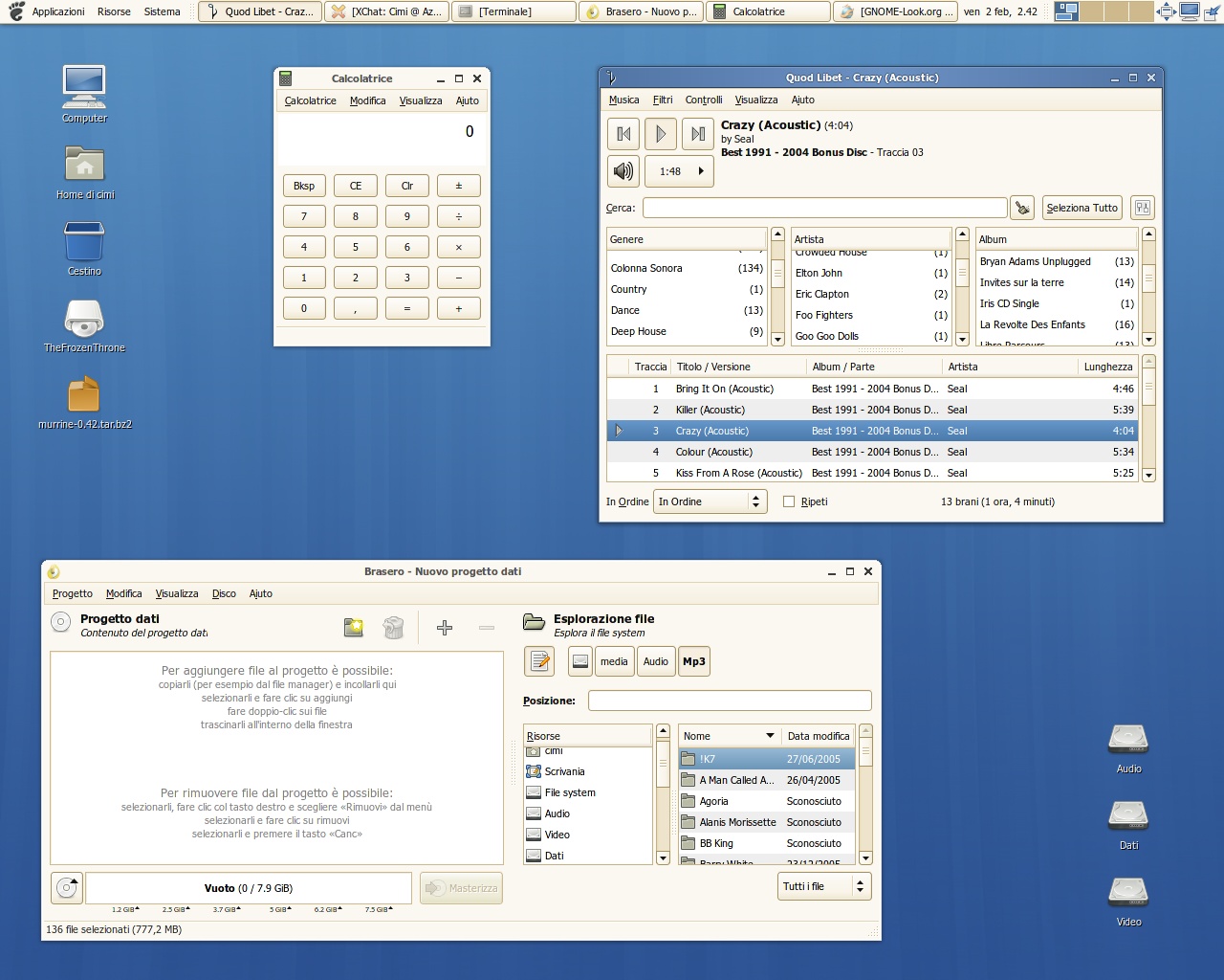
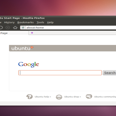
Description: Hi all. I want to advice you I'm currently working together with the GNOME team to refine gnome styles, and clearlooks is the first thing to improve there. As you might have noticed in the last year clearlooks was ported to cairo rendering library but this came together with a worst look. The first goal is to make clearlooks at least like the old wonderful one. And that's what I'm working on... see the screenshots... probably better than ever =)
I'd like to receive feedbacks, comments, suggestions, ideas, whatever you think that could be done to improve Clearlooks. My future goal is to work on a second style for clearlooks, probably written from scratch.
That's why I need you... but don't worry, murrine development will _never_ stops, since it's my favorite engine and I hope yours too.
looking much better, Cimi.
the menubar items in clearlooks cairo look so flat - nice to see you have fixed that in the updated version.
do you know if the updated svn version is available yet in the ubuntu gutsy official repos? if so, that's enough reason for me to upgrade!!
Very nice indeed, however, while you're at it, you and the CL guys could work in rendering dark themes as the original one used to do it. Cairo CL renders dark themes like crap, which is yet another reason to use murrine (with the right theme options) instead of CL, in fact for old clearlooks dark color scheems, the only option seems to be porting them to use murrine... but whatever, you should fix that, and everybody using crts would be sooooo pleased ;D
While you're at it, maybe you could fix the flat tabs in clearlooks-cairo. Original CL had beveled tabs but the cairo version has flat ones for some reason.
Uhm, could you perhaps explain what exactly the improvements over stock Clearlooks are? Just looking at the screenshots, none jump into my eyes, and I use Clearlooks daily.
(Also, I never perceived any significant regressions in Clearlooks-Cairo anyway.)
I'm happy to hear this! I was a fan of the pre-Cairo Clearlooks, and after the port... well, it's depressed me a bit. I'd been considering switching over to KDE to take advantage of the work being done on the QtCurve theme which is really starting to become the nicest Clearlooks-y theme these days.
Cairo version features just bad things except colored scrollbars and new progressbar (that are still available of course), but the rendering was worst compared to the non-cairo version.
I'm fixing that part of the look since people appreciate my works


Ratings & Comments
13 Comments
looking much better, Cimi. the menubar items in clearlooks cairo look so flat - nice to see you have fixed that in the updated version. do you know if the updated svn version is available yet in the ubuntu gutsy official repos? if so, that's enough reason for me to upgrade!!
Can you tell us where you have found you wallpaper? And the background color you are using in the 2nd screenshot? Thanks.
Very nice indeed, however, while you're at it, you and the CL guys could work in rendering dark themes as the original one used to do it. Cairo CL renders dark themes like crap, which is yet another reason to use murrine (with the right theme options) instead of CL, in fact for old clearlooks dark color scheems, the only option seems to be porting them to use murrine... but whatever, you should fix that, and everybody using crts would be sooooo pleased ;D
I am unable to find where to get the theme, the download link gets me to a screenshot.
While you're at it, maybe you could fix the flat tabs in clearlooks-cairo. Original CL had beveled tabs but the cairo version has flat ones for some reason.
they got fixed in gnome svn
Cool! :) Ohh, and keep up the good work hehe!
Uhm, could you perhaps explain what exactly the improvements over stock Clearlooks are? Just looking at the screenshots, none jump into my eyes, and I use Clearlooks daily. (Also, I never perceived any significant regressions in Clearlooks-Cairo anyway.)
I don't see any differences from the usual clearlooks theme (that I am using). I didn't see a regression when the engine was ported to cairo either.
you're a little bit blind... :D
I'm happy to hear this! I was a fan of the pre-Cairo Clearlooks, and after the port... well, it's depressed me a bit. I'd been considering switching over to KDE to take advantage of the work being done on the QtCurve theme which is really starting to become the nicest Clearlooks-y theme these days.
what worst look? what the hell are you talking about? where are the blue scrollbars? WHAT HAVE YOU DONE!
Cairo version features just bad things except colored scrollbars and new progressbar (that are still available of course), but the rendering was worst compared to the non-cairo version. I'm fixing that part of the look since people appreciate my works