
kontact design
Source (link to git-repo or to original if based on someone elses unmodified work):
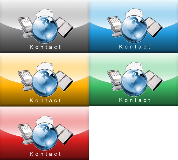
v.0.2: Completely new icon-look. Used the "beauty"-globe insted of blue one, added pda and organizer, resized letter, removed text, changed Kontact-text.
Download button provides picture theming four colors (Blue, green, red and gray).
v.0.3: added .zip file for download
v.0.4: changed color saturation, reworked text.
v.0.5: Added 3rd screenshot, featuring a colored globe for discussion. So, should the globe be blue or gray/crystal? Comments please.
v.0.6: Changed globes in all design-versions from gray to crystal-blue, added a gold-splash. The zip-file now contains red, green, blue & gold.png. Grey-version.png (the most beautyful one, IMO) can be obtained via ->1st screenshot-link.














Ratings & Comments
25 Comments
First of all I have to say that your splash is really awesome. But there's a tiny problem before we can consider using it in Kontact. The globe or more precisely the view of the globe. The problem is that some people might not like North America to be centered. Would it be possible to create a few different views of the globe (centering on other parts of the world)? In Kontact we could then compose the splash from the background (probably colored according to the user's color scheme), the PIM gadgets and a randomly chosen view of the globe.
The grey and the blue one look so damn good. How about making the other things cycling around the world icon? And how about adding animations to it (as far as this is possible)?
well... it is impossible to add animations, because this is a simple *.png splash screen for kontact. nothing more, nothing less. and even if it would be possible, it would eat up lots of memory without adding functionality to kontact. ; )
Just as lovely as my desktop (which has the grey splash-screen). I am glad that you like it (like some other guys, too). : )
Oh, yeaaaaaaah...check out that stylish splash screen starting up on my desktop:
http://www.wislug.net/kontact.jpg
the *only* part of the design I would change would be the text. The current font looks professional, but somewhat out of place. Instead of wide spacing between the letters, you might want to try a slightly larger font size. Otherwise, very nice. :)
The blue looks nice with the all grey background but, what about the other backgrounds? IMHO, this is still the best entry in the Kontact contest to date. Keep up the great work and thanks for posting the files. I couldn't replace the "default" fast enough! ;-)
Hi, I've modified your kontact splash screen, here is a sample : http://data.inzenet.org/artwork/splashs/kontact.png (change png to xcf for the gimp version) Thanks.
Interesting idea, but I prefer my design. ; )
but the world needs a little bit more color .. a smooth blue & green color upgrade to the centered world ... would be nice. (The world is gray enough ..)
I am not sure if I should colorize the globe, as it would make it too dominant (imo), but I will add a 3rd screenshot soon, just for discussing it.
I think that the Kontact text shouldn't be squished..
but why in b/w ? Why not using all 4 colour in one splash, with each object having its own colour? I think it would be really attractive and fresh if you tried it.
Good job!! Can't be too picky!! Looks much better than the default.
It is indeed a great splash screen, alas I would suggest a small change in your work: Expand vertically the font you use. Excellent work. By the way, it looks wonderful combined with the Reinhardt icons/style.
Just what I am looking for! Looks really very good! When will there be a download version?
IMHO, this is the quality splash screen that Kontact SHOULD be using instead of the goofy one that comes with it by default. Keep up the good work and hurry up and release this so I can change it here :-)
I like the gray subtleness of it, it would fit in very nicely with my desktop :) I like the fact that my system doesn't look like a kid has gone crazy with the crayons - not everything need be in primary colours. This splash feels grown up. I like it very much.
and package it properly please... doing it your way sucks...
one thing that i think is that it is very well made but it is a very mac look. it is a fantastic splash for mac fan's.
Looks better but still like someone has died ;). Put some live in it.
oh Emon!!! All your work is usually exciting and well done. But this is very drab and uninspiring. I'll be straightforward and tell you my initial thoughts: 1. The small blue world on the grey background didnt look good to me. 2. The envelope was too large. 3. The contest said the only wording they wanted on the splash screen was only 'Kontact' and nothing else because they wanted to minimalise translations...... Although, what you've got there was fine to me if its not being entered into the competition. Anyhow, I know you can do better than this... I mean, I do use your wallpapers! :)
Thanks for the comment. It was just a very rough sketch in order to see if the "basic" design-idea was okay. The globe used here is a small globus in my office that I photographed. So nothing more than a sketch that need lots of improvement. : ) Btw.: The more I look at it, the more it reminds me of a simple mailing program and not Kontact. *g* Okay, I am off for working on it.
I like the concept but it is still a bit empty thoug. Quick question: could you provide the little earth you use. I think it is the same as in Beauty as a name wallpaper. Thanks in advance.
Errm... no, the globe is not the same as on the "beauty has a name" wallpaper. It is a photo i took of a little toy-globe. ; )