


Let me now if you like it or not. Please give some feedback. Thanks!

I can't wait to see the KDE3 final!
Install instructions:
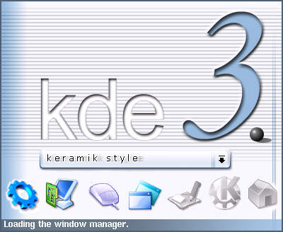
- Download: 1210ksplash_keramik_ian.tar.gz
- gzip -d 1210ksplash_keramik_ian.tar.gz
- tar -xvf 1210ksplash_keramik_ian.tar
- type cd /ksplash_keramik_ian/
- type ./install.pl
- Voila!
Have fun!
ian!


Ratings & Comments
22 Comments
While this style is ubber cool, be advised that it is not very stable. Also I can't seem to find the matching window decorations. The style is slick, but really needs the matching windecs. Anyone know if it will be included at some point?
I really hope someone ports this excellent style to 2.2 as well.
could you tell me how to pull keramik from CVS? I've never downloadet something from CVS... I really love that style ;-)
I have KDE 3 rc3 on my MDK 8.2, but I can't find keramik style anywhere. Where is it? Anybody can help me?
Go to webcvs.kde.org then go into kdelibs/kstyles/keramik enjoy
Does anyone know where is qwertz's screenshot of his wonderful keramik theme, which was on kde-look.org some hours ago? I found new links to these shots for guys who haven't seen them yet: http://qwertz.r--e.net/s1.png http://qwertz.r--e.net/s2.png http://qwertz.r--e.net/s3.png I hope this theme will be ready as soon as possible. qwertz is the lord!
he's back. pardon
Please pardon me, whilst I go fetch a bib. I use some very slick themes/msstyles in WinXP and I'm telling you they don't have anything over keramik. The crystal icons are nice, but the window decs are outstanding!
You've chosen the right icons! Now it looks perfect for me! It's all what I want! But, of course, you should make it even better. For example the "dot" could be improved...
fantastic! Is the other keramik splash from you aswell?
you mean the liquid adopted splash for keramik? than the answer must be "no". ian
I LOVE the KDE3 text. Sexy. :o) Ditto regarding the icons. It would probably be a good idea to maybe fade/ghost the combobox a bit (in stylish manner, maybe very subtle, slight motion blur in both directions or however you get that effect), so people (newbies) don't mistake it for an actual combobox and thinking this is where they can changwe the style. Sounds dumb, I know, but I bet ya ten dollars to a doughnut somebody will. Did I say that I love that KDE3 text?
i thought about this too. but then i asked myself if i would fade or smear the combobox if the whole splash wouldn't be too "smooth" at all. i think that then it would lack of crispness. same with the "k e r a m i c s t y l e" text in the combobox. i antialiased it first but it looked not sharp enougth to me. so i let the text and the combobox the way it is now. ian
The only thing that I think could be improved is the icons.
I agree 100%
I agree very nice, I like it.
Great!!!!! ~:}
Actually, I kind of like the 3 the way it is. Too much 3D can ruin something. This is nice and subtle. But I do agree about the icons, especially the second one and the fifth. They just don't quite all match. Now... if only I can get KDE3 running!
But you should change the icons - they are not modern enough for KDE3, especially the first and the second. I like almost everything else, except number 3 should also be improved and made more 3D.
...i'll try better next time. Thanks for your feedback! ian!
Maybe I was drunk before;-) but number three looks perfect for me now, and I don't know what I was thinking about before;-) But icons really should be improved.
i was thinking about using the svg icons made by wildfox. i think i will contact him and ask for some support. ;) perhaps i can use them. we'll see. i'm just too busy at the moment but if somebody want to help out with fresher looking icons... mailto: perlmeister(at)web.de ian! =)