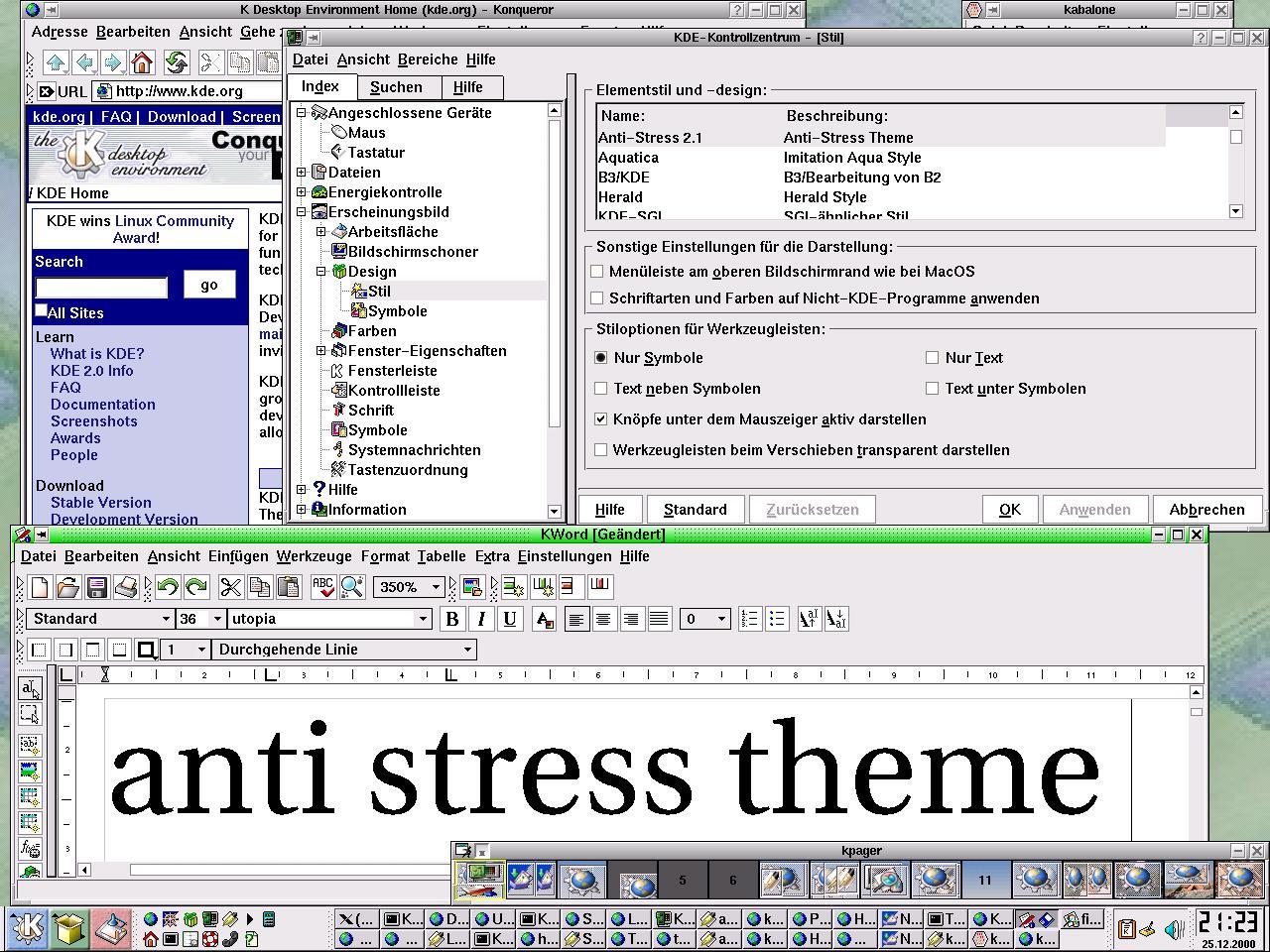
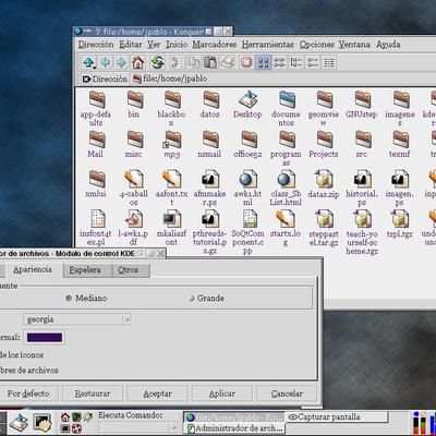
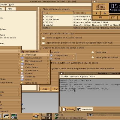
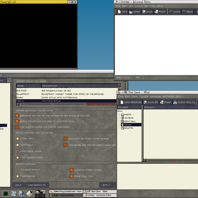
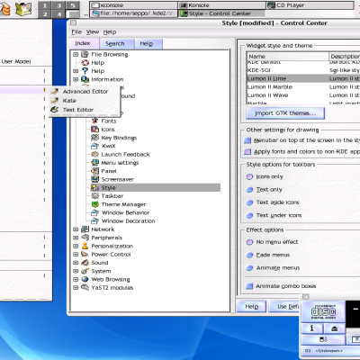
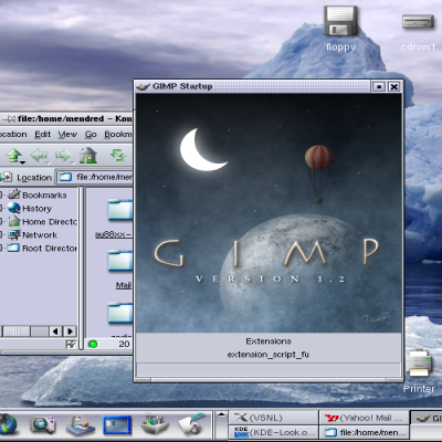
Description: I developed this theme to minimize eye strain and stress and to maximize readability and usability. It does not look cool and was never meant to. However it should be quite useful for day-to-day work, especially on old screens and high resolutions.
For most people black on white (dark on bright) is the most convinient way to read text. I designed all elements that way, also the selected parts, which are usually bright on dark in most themes.
Feel free to mail me comments and additions regarding this theme. Especially if you have suggestions regarding ergonomics.
INSTALLATION: Run "tar xvzf anti-stress-KDE2.?.tar.gz" in your home directory, that's it ;-)
If you really want to increase the contrast to reduce the stress, you're not doing it properly.
First, I've read or heard somewhere that the highest contrast difference that our eyes(or brain) differ is produced by the contrast between black & yellow (not white).
Second, so much brightness (white) on the screen saturates your eyes (or at least mine), getting a bit tired.
You probably noticed that some people get the eyes more relaxed working on black backgrounds, such as terminals on black with green/white colored letters.
So your anti-stress, does not more than get your eyes more stressed and therefore tired.
Sorry, but I think I'm right as seen by other comments before mine.
This theme was originally created by me.
Although I have nothing against posting it here, some credits section would be nice.
Roland Seuhs roland@wertkarten.net


Ratings & Comments
6 Comments
If you really want to increase the contrast to reduce the stress, you're not doing it properly. First, I've read or heard somewhere that the highest contrast difference that our eyes(or brain) differ is produced by the contrast between black & yellow (not white). Second, so much brightness (white) on the screen saturates your eyes (or at least mine), getting a bit tired. You probably noticed that some people get the eyes more relaxed working on black backgrounds, such as terminals on black with green/white colored letters. So your anti-stress, does not more than get your eyes more stressed and therefore tired. Sorry, but I think I'm right as seen by other comments before mine.
The simpleness of this theme stresses my brain ;)
Nothing to say about it. Too simple.
It is very simple, very relaxing ... perfect for me.
This theme was originally created by me. Although I have nothing against posting it here, some credits section would be nice. Roland Seuhs roland@wertkarten.net
I think it'd be more polite too.