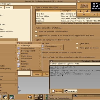
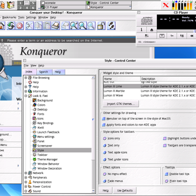
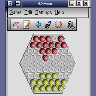
Description: This small patch just changes the colors of Mosfet Liquid buttons to make them more look like Mac OS: the default button is blue and the other ones white/gray. See the screenshot. (Window decoration is a self-modified Liquid, but it has got a problem because it displays a second one under the close button.)
The patch also includes the pablorg's change for scrollbars, so they don't get smaller than 15 pixels. Installation: unpack and run "patch widget-engine/liquid.cpp ml_btn.patch" in Liquid 0.7 source dir and recompile Liquid.
Comments and ideas how I can improve it are welcome.
I think what he is getting at is: why can't people put more effort into creating something original. We are not the artists (err.. maybe people that rip other OS looks aren't either).
The description says the buttons are blue by defalt, but in the screenshots the colors appear to be that of the default Liquid color scheme.
Just trying to understand. :o)
I think what the author meant to say is that the default buttons are blue whereas other buttons are white (more like Mac OS X). The original Liquid behaviour was to make all buttons blue (or whatever colour you assign to them).
Key theme here: "glow with a wet glare"
1. If it is possible, make the buttons have more of a "glowing wet" or "shiny" or "glass" look. The primary reason I used Aronax's Acqua style instead of Liquid is because Liquid's buttons look like sucked-on jelly beans. The correct look would be "wet jollyrancher" as someone once put it (whoever said that, I love that phrase! It captures the idea perfectly).
Make the top of the button have a white region, giving it a glare effect. Also fade from a darker blue at top to a lighte blue at the bottom, giving it a glowing effect.
This would go for all elements, really, including comobox controls, checkboxes, toolbar handles, scroll bars, etc.
The look I'm going for is already present in radio buttos - just enhance the "wet glare" effect a bit. A perfect example would be Aronnax's style and the buttons off kwinaqua and kwinaqua_ace.
2. Also, if possible, draw the "groves" of the scroll bars with a white background and shaded near the buttons and the let border (giving it a recessed, or grooved appearance). Right now, Mosfet has drawn the scroll bar backgorund with a greyed out image if the scroller itself, which is confusing and looks weird (doesn't look like a groove at all). It'd also be cool to have both scrollbuttons at bottom, but that may be asking too much.
3. Instead of drawing bubbles for toolbar grips, just draw some standard beveled lines. Or, as with the other elements, give them more of a wet "glare".
One reason Mosfet may not be doing this already is because of speed ("high performance"). However, I'd sacrifice a performance hit to have the desired effects - and I still think it would be faster than pixmap-based style, and I don't see a noticable hit when I do use pixmap based styles (PIII 500, old ATI Rage 128). Those concerned about speed can continue to use existing Liquid.
If one could do that, that would more than awesome. I wish I could do this myself, but I'm not a programmer.
Of course, if this involves major changes, then this may be something that Mosfet must do to the Liquid code himself, depending on the license he has on it.
Thanks,
Ty


Ratings & Comments
10 Comments
on every shot of the liquidtheme the buttons look fine and round but on my sys there're big and rectanglish. How can I fix that?
all those liquid themes are making me sick now... are there no NEW real themes for kde or is that all you can show and offer ?
Could you help all of us, putting here "any" of your excellent ideas?
I think what he is getting at is: why can't people put more effort into creating something original. We are not the artists (err.. maybe people that rip other OS looks aren't either).
The description says the buttons are blue by defalt, but in the screenshots the colors appear to be that of the default Liquid color scheme. Just trying to understand. :o)
I think what the author meant to say is that the default buttons are blue whereas other buttons are white (more like Mac OS X). The original Liquid behaviour was to make all buttons blue (or whatever colour you assign to them).
Thanks! I understand now. :o)
very very very nice candy ;-)
Key theme here: "glow with a wet glare" 1. If it is possible, make the buttons have more of a "glowing wet" or "shiny" or "glass" look. The primary reason I used Aronax's Acqua style instead of Liquid is because Liquid's buttons look like sucked-on jelly beans. The correct look would be "wet jollyrancher" as someone once put it (whoever said that, I love that phrase! It captures the idea perfectly). Make the top of the button have a white region, giving it a glare effect. Also fade from a darker blue at top to a lighte blue at the bottom, giving it a glowing effect. This would go for all elements, really, including comobox controls, checkboxes, toolbar handles, scroll bars, etc. The look I'm going for is already present in radio buttos - just enhance the "wet glare" effect a bit. A perfect example would be Aronnax's style and the buttons off kwinaqua and kwinaqua_ace. 2. Also, if possible, draw the "groves" of the scroll bars with a white background and shaded near the buttons and the let border (giving it a recessed, or grooved appearance). Right now, Mosfet has drawn the scroll bar backgorund with a greyed out image if the scroller itself, which is confusing and looks weird (doesn't look like a groove at all). It'd also be cool to have both scrollbuttons at bottom, but that may be asking too much. 3. Instead of drawing bubbles for toolbar grips, just draw some standard beveled lines. Or, as with the other elements, give them more of a wet "glare". One reason Mosfet may not be doing this already is because of speed ("high performance"). However, I'd sacrifice a performance hit to have the desired effects - and I still think it would be faster than pixmap-based style, and I don't see a noticable hit when I do use pixmap based styles (PIII 500, old ATI Rage 128). Those concerned about speed can continue to use existing Liquid. If one could do that, that would more than awesome. I wish I could do this myself, but I'm not a programmer. Of course, if this involves major changes, then this may be something that Mosfet must do to the Liquid code himself, depending on the license he has on it. Thanks, Ty
Version 0.8 will have higher contrast pushbuttons and different scrollbar grooves. mosfet@interaccess.com