


programers_microsoft
manolomx


Source (link to git-repo or to original if based on someone elses unmodified work):
v.0.12: 6-Sep-2003
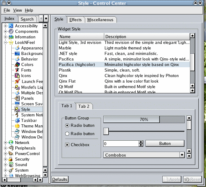
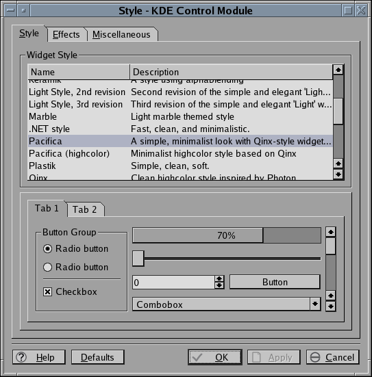
* New screenies!
* Fixed incorrect text color on combo boxes, unselected tabs, and menu bar.
* Replaced the gray "Pacifica Light" color scheme with a more Modern-looking color set.
* Added gradients to progress bars and hilighted tool buttons (hicolor mode).
* Added transparent menu support.
* Added compile-time option to use NeXT-style scroll bars instead of KDE style.
* Slight changes to flat-mode menus to reduce etch-stacking and improve visual consistency.
* Added compile option to display unselected tabs in normal color instead of button color.
* Added pacifica/style/styleoptions.h file to manage all these compile options.
v0.1: 4-Sep-2003
* Initial release


Other KDE 3.0-3.4 Themes:


Ratings & Comments
8 Comments
an "Geoworks XP" widget style :-9 I like that very much. But please find a better description!
I don't see much difference between this style and Qnix.
You're right; it is Qinx with a few nudges in key places to address the common complaints about Qinx. Mostly it's subtle stuff: consistent visual feedback from buttons, making all gradients on similar objects run the same way, unselected tabs no longer look disabled, the scrollbar buttons and slider gradients use the same light source now. Somewhat bigger, I added reverse-layout support to the asymmetrical elements like tabs, combos, spin widgets, and so on. Run an app with the --reverse parameter and compare to Qinx. I agree that this one's a bit too derivative; it would almost be a Qinx patch but I changed way too much code for that. Hopefully I've given the original author enough credit and complied with the etiquette for doing such minor forking. Now I'm working on a new 100%-original style, but it'll be a while before we see a 0.1 of it.
You seem to have found a VERY good balance . I would normally never use a monochrome theme (because it's monochrome) but this one has some depth, and the buttons are well done also. Congrats on your first theme =) ! Now, like all good programmers/ hackers/whatever, get busy on the next release, and woo us with your talents ;-) Once again--- Great Job =)
Yes, a very nice theme. It reminds me a lot of NeXT.
Thanks! Comparisons to NeXT are high praise! I was trying to get a 1980s CUA feel out of Qinx - looks like it worked.
Well, it certainly fulfills the requirements for being called "minimalist." All the grey makes me feel like I fell into Momo (you know, the grey men that steal people's time?). Not that a clean style like this wouldn't have its following, but I for one chose KDE because WindowMaker wasn't oppulent enough. Maybe people that are not such gluttons for eye candy as I am wouldn't have a problem with that ;)
Thanks for commenting. I appreciate what you're saying - this site is about eye-candy, and the Pacifica style is (intentionally) more like eye-tofu. Eye-tofu for your KDE desktop - I think that'll be the Pacifica project slogan! I should mention that there are no hard-coded colors in the style; everything is taken from the color settings in kcontrol. Just keep button text and normal text the same color until I fix a menu bar text-color bug. The contrast slider has a lot of power too. Just FYI, everyone.