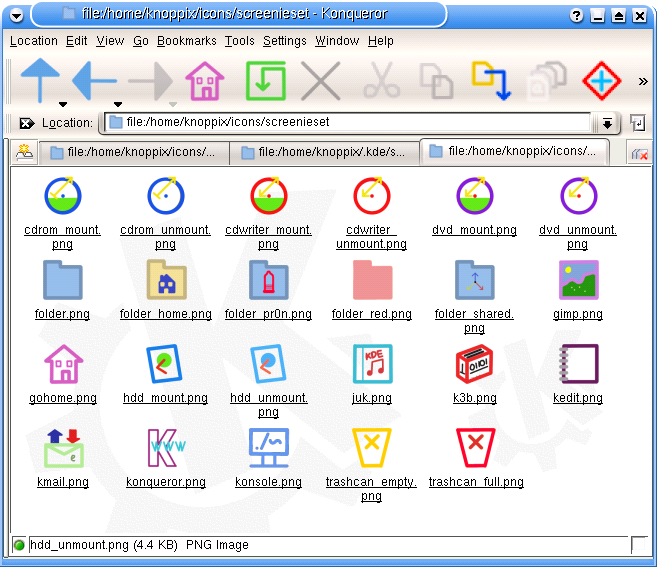
Description: These are some minimalist icons I made. I was sick of the over coloured icons and the glassy/cartoony look, so made some clean simple icons. Currently there's only a few icons, but there are some folder ones, ones for most of the KDE default panel icons, a k3b icon and an Apollon icon.
If you like it, please say and I'll make more Last changelog:
UPDATE 17/2/2004 Added some new icons, including apps and devices. Also changed folder icons.
Well frist of all i must say that it is a great idea and that you sey very well what you want in very litle lines and that is a good thing.
I agree with you about the trash icon.
it would be nicer if you would use all the time the same kind of lines and not so many colors. dicide on some basic colors not more than 4 or five diferent ones and go along as much as you can with them.
Last and this is only an idea if you do the outline of them i think they would be beter and more consistent.
sory for my english.... It is so bad.
but i must say that you truly have a good thing here and if you truly like the way it is you should do them as you like them and dont kere about some stupid guys that have nothing beter to do than flaming other guys work :).
one more thing keep them coming
but I must say, that you should improve/change some colors. The green from the cd-mount is too bright, try a darker, smoother looking green e.g.. And I would change the toaster-logo for k3b, because it is not so easy to understand (a logo should speak for itself and not being understood after a little meditating) and ...sorry... plain ugly. Just the opposite of the folders et all.
I like the folder with speaker icon :)
It's simple and clean.
But I think your arrow is too think, may be it look better when it bolder?
Sorry, my English is poor.
Just noticed you've got some more or less uhm... alternatively named icons in there ;) There are some good ideas there, and to be honest they are icons that we should probably include, because more people are interested in these subjects (not just the folder_pr0n icon, but also folder_shared... Other ideas for missing icons in this category? (I will include similarly named icons in the next version of the Reinhardt Icons, though the folder_pr0n icon might need a more 'official' sounding name, such as folder_erotic or somesuch?)).
Also, it might be a good idea to remove the cross in the trashcan_empty, as it to the novice user will seem too similar to the full icon (also, colourblind people will not know the difference easily), and the kmail icon might not be so good with the arrows (the icon itself is good, but might be better as mail_get in actions).
I sorta like the cross on the trashcan. If it wasn't there, it would look slightly *too* minimalistic. I think the two states are sufficiently different to keep them as they are.
As for the pr0n folder...considering the icon, I was thinking of calling it something like firewall or anti-virus... :D
on my opinion, if the colors were chosen more carefully the icon set would be quite better. Try a combination of colors more simple and eficient.. and discrete..
but that only my opinion. ;)
We have a minimalistic set already - reinhardt iconset. I think they are better then these ones.
But maybe you will change sth in the future that changes my point of view. ;)
I actually think you yourself described why this is worse/better than Reinhardt above :) Some people like the ultra-minimalist look of Reinhardt for the reason it is ultra-minimalist. Granted, it's a small minority of people, but it fills a niche :) But at the same time, one of the first comments on the Reinhardt Icons was that it was too minimalist, and your icon set is now beginning to fill that particular niche, which is probably around the same size. Thanks, it is rather nice work, and sufficiently different from my set too ;) If anything, we will only be borrowing tiny bits from eachother (though I suggest we might contact eachother when it comes to application icons... They are more colourful in Reinhardt than the rest of the set... Have a look and get in touch :) )
I would like to see you complete the set. These are really great! Simple, and colorful. I think they'd go great with a number of wallpapers I've found on this site.
I am liking your stuff there, it's very clean :) I would of course like to point out my own one, in case you have missed it (because from your description it sounds that way ;) ), though of course you may have simply decided it was too minimalist (others have, so that's not so weird ;) ).
If you haven't heard of it, it's Reinhardt (both Icon Set and Widget Style, along with a GDM theme and a background, and with more coming), and you can find it by clicking on my nick :)
I like these - keep working at them.
The folder icon could do with more definition - perhaps a thin black outline? At the moment it looks a bit like a background with no foreground.
Andy
In the next version, the folders are blue with dark blue outline. Sound crap, look great. The home folder is still beige though, but it too has a dark border.


Ratings & Comments
15 Comments
Well frist of all i must say that it is a great idea and that you sey very well what you want in very litle lines and that is a good thing. I agree with you about the trash icon. it would be nicer if you would use all the time the same kind of lines and not so many colors. dicide on some basic colors not more than 4 or five diferent ones and go along as much as you can with them. Last and this is only an idea if you do the outline of them i think they would be beter and more consistent. sory for my english.... It is so bad. but i must say that you truly have a good thing here and if you truly like the way it is you should do them as you like them and dont kere about some stupid guys that have nothing beter to do than flaming other guys work :). one more thing keep them coming
but I must say, that you should improve/change some colors. The green from the cd-mount is too bright, try a darker, smoother looking green e.g.. And I would change the toaster-logo for k3b, because it is not so easy to understand (a logo should speak for itself and not being understood after a little meditating) and ...sorry... plain ugly. Just the opposite of the folders et all.
I like the folder with speaker icon :) It's simple and clean. But I think your arrow is too think, may be it look better when it bolder? Sorry, my English is poor.
Just noticed you've got some more or less uhm... alternatively named icons in there ;) There are some good ideas there, and to be honest they are icons that we should probably include, because more people are interested in these subjects (not just the folder_pr0n icon, but also folder_shared... Other ideas for missing icons in this category? (I will include similarly named icons in the next version of the Reinhardt Icons, though the folder_pr0n icon might need a more 'official' sounding name, such as folder_erotic or somesuch?)). Also, it might be a good idea to remove the cross in the trashcan_empty, as it to the novice user will seem too similar to the full icon (also, colourblind people will not know the difference easily), and the kmail icon might not be so good with the arrows (the icon itself is good, but might be better as mail_get in actions).
I sorta like the cross on the trashcan. If it wasn't there, it would look slightly *too* minimalistic. I think the two states are sufficiently different to keep them as they are. As for the pr0n folder...considering the icon, I was thinking of calling it something like firewall or anti-virus... :D
on my opinion, if the colors were chosen more carefully the icon set would be quite better. Try a combination of colors more simple and eficient.. and discrete.. but that only my opinion. ;)
The alternative would look staid. This is meant to be colourful and lively, yet minimalistic.
We have a minimalistic set already - reinhardt iconset. I think they are better then these ones. But maybe you will change sth in the future that changes my point of view. ;)
Why are Reinhardt better? I'm trying to improve them, here :)
I actually think you yourself described why this is worse/better than Reinhardt above :) Some people like the ultra-minimalist look of Reinhardt for the reason it is ultra-minimalist. Granted, it's a small minority of people, but it fills a niche :) But at the same time, one of the first comments on the Reinhardt Icons was that it was too minimalist, and your icon set is now beginning to fill that particular niche, which is probably around the same size. Thanks, it is rather nice work, and sufficiently different from my set too ;) If anything, we will only be borrowing tiny bits from eachother (though I suggest we might contact eachother when it comes to application icons... They are more colourful in Reinhardt than the rest of the set... Have a look and get in touch :) )
I would like to see you complete the set. These are really great! Simple, and colorful. I think they'd go great with a number of wallpapers I've found on this site.
I am liking your stuff there, it's very clean :) I would of course like to point out my own one, in case you have missed it (because from your description it sounds that way ;) ), though of course you may have simply decided it was too minimalist (others have, so that's not so weird ;) ).
If you haven't heard of it, it's Reinhardt (both Icon Set and Widget Style, along with a GDM theme and a background, and with more coming), and you can find it by clicking on my nick :)
Yeah, I saw Reinhardt. Thought it was a bit too minimalist, a bit washed out to be honest. I'm trying to be quite colourful while still minimal.
I like these - keep working at them. The folder icon could do with more definition - perhaps a thin black outline? At the moment it looks a bit like a background with no foreground. Andy
In the next version, the folders are blue with dark blue outline. Sound crap, look great. The home folder is still beige though, but it too has a dark border.