


kppp dockicons
daniele


Source (link to git-repo or to original if based on someone elses unmodified work):
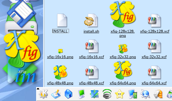
2002-10-24 (later) - (version 1.1) - Added the "fig" (the fruit!) to all the icons, made some restyling and uploaded a new screenshot
2002-10-24 - (version 1.0) - Initial release


More Icon Sub-Sets from daniele:
Other Icon Sub-Sets:


Ratings & Comments
11 Comments
Thats good looking...
XFig! Your King for schematic 'drawings'! *downloads* :)
The yellow leaf is really nice, but placed on the background becomes a little unrecognizable, especially at lower resolutions. Maybe darkening the color of the 'nerves' (si traduce cosi' nervature? ;-) Also the writing is a bit too large. ...opinions...
mmm raga ma in quanti italiani siamo qua su kde-look?? :PP
many italians, some south-americans, a couple of north-americans .. :) Daniele
This version 1.0, I just wanted to know if the idea had a sense. 32x32 and 48x48 need some work Daniele
Tss, must have... Xfig has some nice features, but I prefer the GIMP
You cannot compare xfig to the gimp. They both are fine apps. XFig is better for line/vector drawing. Gimp is, of course, for painting, etc. You wouldn't use Gimp for technical drawings, for example.
But unfortunately I have no use for it... Dim
Xfig is a MustHave-Killer App! :-) Daniele
I emerged xfig to see what it is, but well I'm a developer and not an artist. kde-look would not be very glad with my testpictures *gg*