


Gajim Ubuntu Iconset
draco


Source (link to git-repo or to original if based on someone elses unmodified work):
1.1
---------------------------------------
The icon tree in the tar archive wasn't right. I missed the "apps" folder.
Anyway, the file is now correct.
1.2
---------------------------------------
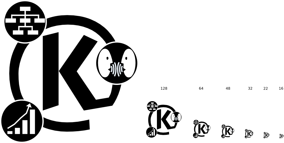
B&W version has now a white border in the "K" and "@", to make it visible on dark backgrounds.
1.3
---------------------------------------
Changes just in the color version. The shine on symbols has been reduced and also the "K@" gradient is more dark and simple. Much more readable in smaller sizes.


Other Icon Sub-Sets:


Ratings & Comments
5 Comments
Sure there is an email symbol...you just have to be creative... There is an envelope sideways in the 'K' - by nature of the shape of a 'K'. The vertical bar on the left of the 'K' is the bottom of the envelope. The two shorter angular bars on the 'K' are the flap, the envelope of course being closed... :-)
good piece of work, but I don't like it becaue there is no symbol for email and the symbols are hard to recognize in 48 size.
I understand what your saying but I think all that needs to be done is to remove the shine or reduce it. Other wise its not bad.
Yes, i was thinking about that myself. You're problably right, I'll try making one without it. Thanks, croky
"good piece of work, but I don't like it becaue there is no symbol for email and the symbols are hard to recognize in 48 size." The reason there is no email symbol it's because it wasn't asked for the contact mantainers. In fact they asked for "communication, organization and productivity". On the other hand, the "K" within the "@", does point to something related with emails, although kontact is not just an email program. Regarding the symbols not being recognized in 48 and smaller sizes, of course they are gone but that's not a problem to me. When scaling down a logo like this, with more that one element, the smaller elements may be gone but the overall consistency of the icon - the 3 smaller ballons - is not compromised, but reduzed for the sake of simplicity. Hope i could explain myself and thanks for the comment anyway. croky