besides usefulness for visually impaired folk and monochrome displays, I think these icons have a lot of neat factor, I could see myself theming my whole desktop this way if I can.
I hope more versions with more icons come out of this, and that it isn't just a one-time thing like so many are.
Hi,
this is IMHO very useful for people
with a 1bit X-Terminal. Not that
there are plenty, but for those
who use it, the icon set is a
major improvement.
Sven
I think it's kinda cool. Sometimes I get completely fed up with all the fancy colors, and then I'll welcome this brilliant retro style icon set. We should make a retro styleset also though...
Sorry, but if I wanted my desktop to look like Windoze 1.01 or dosshell then that is what I would use. There's no reason you can't make nice greyscale icons or use a limited pallette, but this is a bit much.
I've looked at your site, and I quite liked the other icon set (kiddo) you made. However I believe these icons could be clearer and cleaner if you want to make them easier for the sight-impaired.
*Simple* is fine though, and retro is all right too. :)
how can you have a pallete of more than 2 colours on a monochrome display? (hint: look up the meaning of monochrome in your dictionary)
for the visually impaired the more contrast and less noise there is the better.
From websters:
Monochrome \Mon"o*chrome\, n. [Gr. ? of one color; ? single + ?
color: cf. F. monochrome.]
A painting or drawing in a single color; a picture made with
a single color.
But.. from the free online Dictionary of computing:
Literally "one colour". Usually used for a black
and white (or sometimes green or orange) monitor as distinct
from a color monitor. Normally, each pixel on the display
will correspond to a single bit of display memory and will
therefore be one of two intensities. A grey-scale display
requires several bits per pixel but might still be called
monochrome.
I'm the proud owner of an XT, 10 mhz TURBO, with 640 k memory. I had a matrix printer with it and a "data display (mono-chrome)", as the manual calls it.
Actually, a friend stills e-mails with it. Another manual: "The basic components of the PC/XT Personal Computer consists of the System Unit, the keyboard and the
optional MONOCHROME DISPLAY." Same manual: "the IBM PC monochrome display".
Check your history first :-) The display is dark and paints with light, one color. That might explain the name.
"The icons can be used by
LCD/Monochrome-displays"
In no way does it 'explicitly say' that it is intended for *LCD/MONOCHROME* monitors, dick. Even if that's the authors intention, I believe the icons could be clearer and less "busy". Look at the whole icon set.


Ratings & Comments
17 Comments
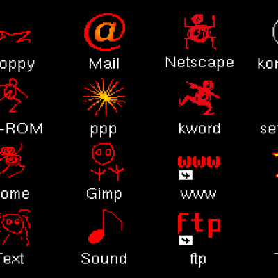
besides usefulness for visually impaired folk and monochrome displays, I think these icons have a lot of neat factor, I could see myself theming my whole desktop this way if I can. I hope more versions with more icons come out of this, and that it isn't just a one-time thing like so many are.
I like it, please, make more icons, it will be really good to have a complete B&W icon set.
KDE has about 1700 icons, so a complete set is a bit of a problem...
Hi, this is IMHO very useful for people with a 1bit X-Terminal. Not that there are plenty, but for those who use it, the icon set is a major improvement. Sven
I think it's kinda cool. Sometimes I get completely fed up with all the fancy colors, and then I'll welcome this brilliant retro style icon set. We should make a retro styleset also though...
Sorry, but if I wanted my desktop to look like Windoze 1.01 or dosshell then that is what I would use. There's no reason you can't make nice greyscale icons or use a limited pallette, but this is a bit much.
it looks kinda neat though
it looks kinda neat though
it looks kinda neat though
They are meant for visually impaired people too, so, no greyscales, etc!
I've looked at your site, and I quite liked the other icon set (kiddo) you made. However I believe these icons could be clearer and cleaner if you want to make them easier for the sight-impaired. *Simple* is fine though, and retro is all right too. :)
how can you have a pallete of more than 2 colours on a monochrome display? (hint: look up the meaning of monochrome in your dictionary) for the visually impaired the more contrast and less noise there is the better.
From websters: Monochrome \Mon"o*chrome\, n. [Gr. ? of one color; ? single + ? color: cf. F. monochrome.] A painting or drawing in a single color; a picture made with a single color. But.. from the free online Dictionary of computing: Literally "one colour". Usually used for a black and white (or sometimes green or orange) monitor as distinct from a color monitor. Normally, each pixel on the display will correspond to a single bit of display memory and will therefore be one of two intensities. A grey-scale display requires several bits per pixel but might still be called monochrome.
I'm the proud owner of an XT, 10 mhz TURBO, with 640 k memory. I had a matrix printer with it and a "data display (mono-chrome)", as the manual calls it. Actually, a friend stills e-mails with it. Another manual: "The basic components of the PC/XT Personal Computer consists of the System Unit, the keyboard and the optional MONOCHROME DISPLAY." Same manual: "the IBM PC monochrome display". Check your history first :-) The display is dark and paints with light, one color. That might explain the name.
It explicitly says that it is intended for *LCD/MONOCHROME* monitors. You don't look both ways before you cross the street, do you?
"The icons can be used by LCD/Monochrome-displays" In no way does it 'explicitly say' that it is intended for *LCD/MONOCHROME* monitors, dick. Even if that's the authors intention, I believe the icons could be clearer and less "busy". Look at the whole icon set.
Still, I find those icons very attractive and not at all boring. They are craftly made by someone who obviously knows what he is doing.