


Pandora Icon
SeanParsons


Source (link to git-repo or to original if based on someone elses unmodified work):
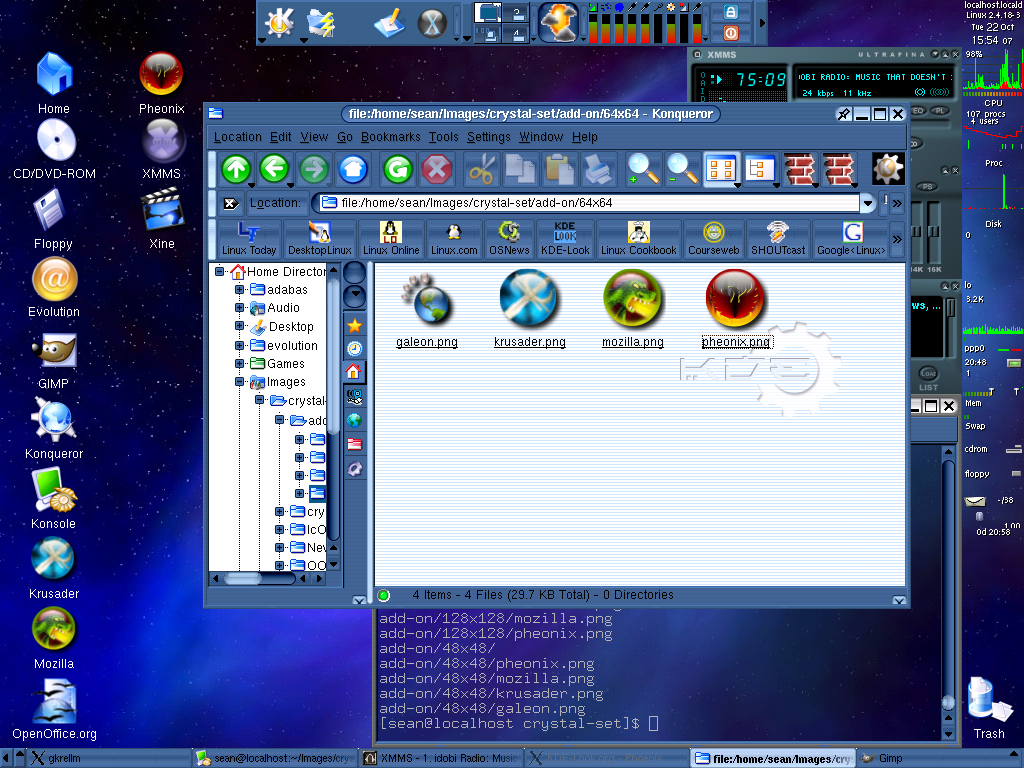
I changed the title to reflect the circular nature of my icons, and I decreased the lighting on the Phoenix icon. Bothe were done via requests.


More Icon Sub-Sets from SeanParsons:
Other Icon Sub-Sets:


Ratings & Comments
3 Comments
I like the Galeon one a lot. The others not so much though. Not because they're bad, because they're not. (I would recommend making the light on the Phoenix one a little darker though) The reason I don't like the other three is just a matter of your title - they'd fit a marble icon theme much better than Crystal. Otherwise, great work! :)
I agree with the original comment. The Galeon icon looks magnificent - it fits the Crystal theme nicely, and it maintains the theme of the Gnome foot. Very fitting. I will use this icon as soon as I build Galeon on my PC. :) IMO, far too many of the Crystal add-on icon makers have fallen into the "marble trap", whereby an icon becomes a "Crystal" icon solely taking a small version of an application's logo and stuffing it into the generic "marble" shape. I don't think that necessarily fits with the direction that Crystal is going. It'd be cool to see icon designers think outside the marble and design icons that fit with the theme but keep their own, proper shapes. How about a nice 3d-sculpted Crystal-style phoenix head and wing with a fade from black to dark burgundy? (I realize that I'm not a very good graphic artist at all, and my icon-design skills are limited, otherwise I'd be posting my own work.)
Nice icons. Not for me, but they're nice anyway. :) *brrrrr* this screenshot reminds me how ugly Liquid is. ;)