


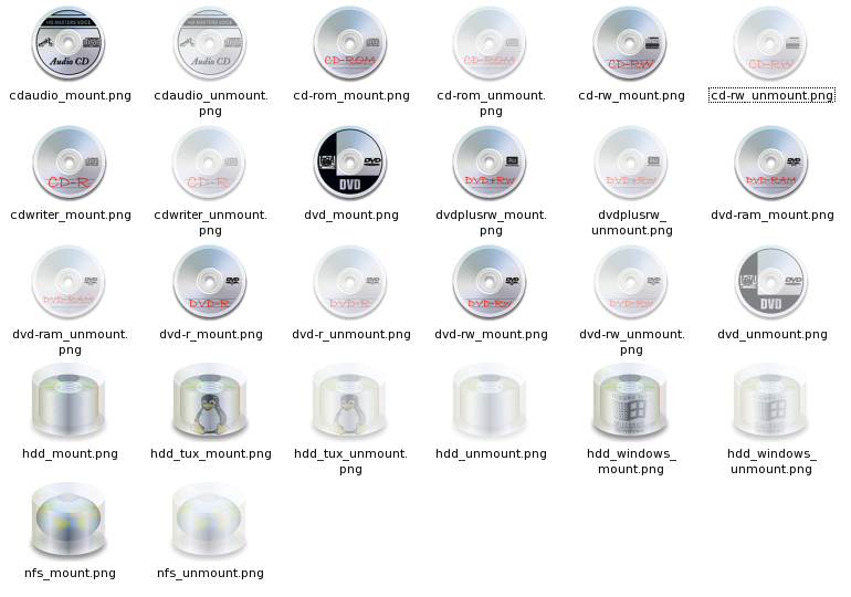
In this latest posting for the Cezanne icon theme are a collection of device icons for CD/DVD drives and hard disks.
The hard disk icon particularly is a 'beta' version (I never thought it would be so difficult to think of a vaguely original look for a hard drive icon!!
 ). If you like it, or if you think its total c**p, please comment with recommendations.
later.
Chris


Ratings & Comments
9 Comments
Great work guy. I'm looking forward for the first release. I'd suggest more contrast between mounted and unmounted icons (as already said) and, why not a samba icon? Congratulations.
Chris impressive icon set. Looking forward to the final complete set. Thanks.
It's difficult to see wether the devices is mounted or not (more contrast please :)
I second that. But the icon set overall is very good, and at this rate it could soon become part of KDE.
But why do you publish different packages for mimetypes etc. and not one big packet "Cezanne Icon Theme"?
...good point. the reasons are as follows: 1. the set is not currently complete and I tend to work on one 'type' of icon, creating them in a batch...this helps to ensure consistency and is just mentally more simple. Until the set is complete, releasing them as 'mimetype' etc enables you to simply extract them into the appropriate folder in your current theme. 2. (the main reason) until the icon set is complete, I'd rather release small packages because I have to distribute anything over 500k from my own web space, whereas kde-look will host anything under this size....this helps to ensure that I don't exceed my bandwidth limit and get charged!! ...so the reason is entirely selfish, for which I apologize. Needless, to say, as soon as I have a set which I think is full enough to constitute an entire 'theme' I will release them as a proper package ready for install. Hope that explains it.
...of course, if anyone out there wants to put together a package of the Cezanne icons that have already been released and distribute them on this website, please feel free to do so.
I like the idea you have employed, however it looks very much to me like a cakebox spindle of CDs. If perhaps you added some hd reading heads in there or didn't make the case round it would look more HD like? Also many of your icons go for photographical likeness which I think is lovely. Your HDs are an exception. Perhaps you could use your previous style for them as well. You could have a standard photographic rectangular HD with a window on top, showing a tux, winflag, globe etc... on the top platter through the window. I haven't seen anyone use that concept before for icons so you would still be original. Cheers, TightCode
yeah - the hd looking like a cd spindle was pretty much my reservation about it. I tried doing it square and it just wouldn't come out right. ...I like your 'window' idea - I think I might have a crack at that and see how it looks....in my sillier moments what I really want is a tux with his face against the window trying to get out!! hee hee.