


Quanta+ Replacement Icons
jLisec


Source (link to git-repo or to original if based on someone elses unmodified work):
26.12.2005 (beta 0.9 edition):
Finally after long time new omicrOn icons are here! And not in 0.7 or 0.8 edition, it's 0.9 edition!
From this edition omicrOn icons will be installable trugh KDE Control Center, so that you can faster enjoy in your new omicrOn icons.
*New actions
*New mimetypes
*NEW WEBSITE!
23.10.2005 (beta 0.6 edition):
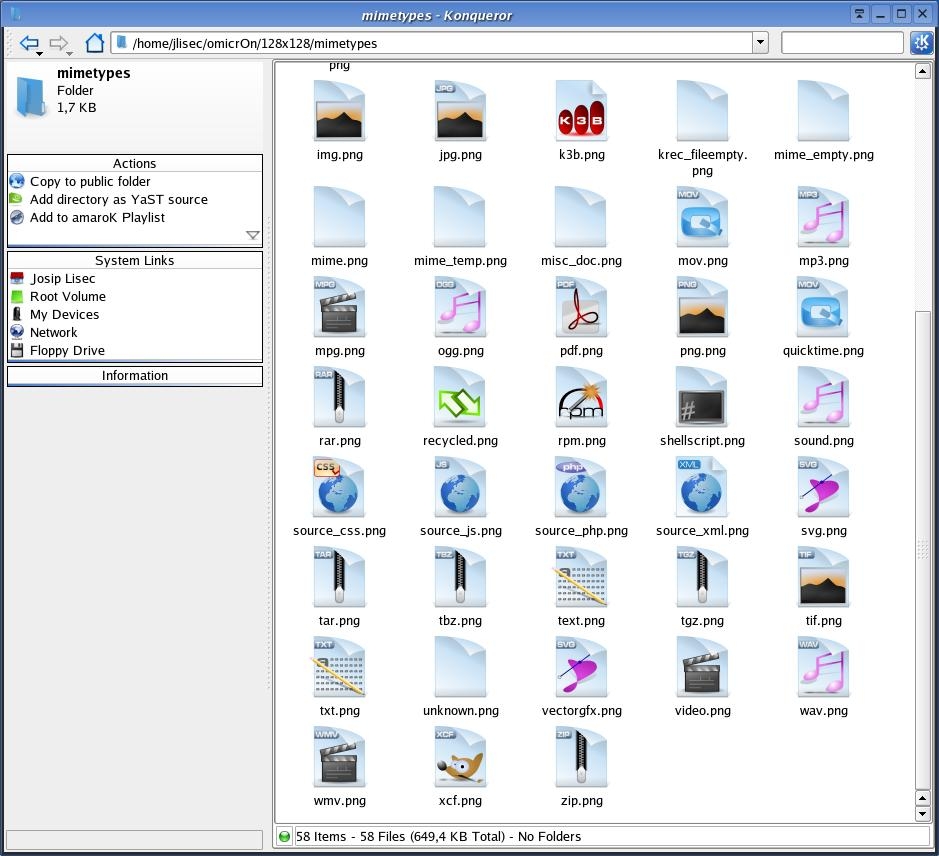
New design of Mime-type icons!
Few new folders and apps.
Some SVG's are avaliable for download.
09.10.05 (beta 0.5 edition):
First beta edition, what this means:
There are again only 128x128 icons, but soon there will be published "beta 1" with all sizes and allot of new icons.
All (95%), of icons from beta 0.5 will be in all other realizes "same"!
Icon changes:
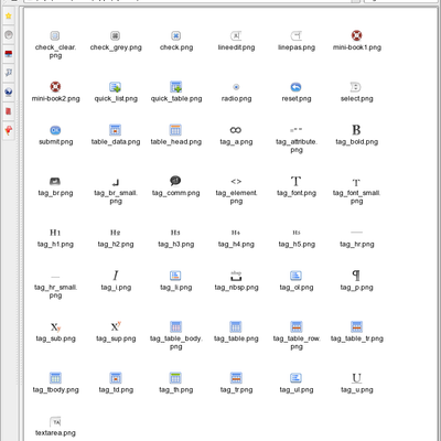
Allot of new icons(Actions, Apps, Folders)
New folder design (look screenshot 2)
New globe (based on Eriols globe)
Better quality
...
NEW ICONS, NEW DESIGN, NEW SITE 
---
The first screenshot looks like the old but its NEW.(again, for beta0.9)


More Icon Sub-Sets from jLisec:
Other Icon Sub-Sets:


Ratings & Comments
10 Comments
Omicron is not so good name too, i think. I think Omiron better name.
It's good to see the new icons, keep up the good work. Regarding my earlier comment about the 'encrypted' mimetype I was thinking to have it on the same background as the others, like the box on the .tgz icon, replacing the box with the safe and saying 'Encrypted' rather than 'Archive". Anyway, I dont' mind it either way.
I like them thy're a little rugged still but still quite nice. I Like the Green effect with the mounted Icons. Keep up the good work!
Thank you for your critics, but could you be more "detailed", wich icons are (by your opinion) roughed (some/all-wich?), could you tell me.
I also like them - they look different to the popular icon sets, they are colourful, not too complicated and fun. Few suggestions/questions/observations: - Why is the "encrypted" mimetype icon so different to the others? I think it would look better if it followed the same pattern? - It would be nice to have one of the preview pictures on here showing a number of different icons (more people would look at a preview than would download) - Some of the mimetypes icons (eg txt) have a shadow others (eg svg) don't - I guess you probably know this already and just haven't got round to it yet - I think the ones with a shadow look good - The OpenOffice icon is really nice, going to start using that now More of the same will be great.
Thak you wery much for your comment. As you prepose there is new screenshoot. About that shadow, It's my mistake that icon of txt file (its an older icon I have accidently upload it, there is new package alreday awaiable :) with few new icons), so that icon had an "shadow" but new (all other) icons(mimetypes) have a tiny shadows at bottom. Your next question was about "encrypted" icon, I suppose that you gessed that is an safe (I'm not sure that I spelled it OK), and it represents an encrypted file, that means that you dont want that anyone besides you knows whats in, so its ony a box :) Thank you very much for your comment :)
My mother tounge is not english so I think that I get what you think, and I'm working on icons as fast and as good I can, but besides makin icons I go to school (im 14) so it's a bit slow :)
I fail to see any real icons... only somekind of ad... however the ad looks great... ;) -gime some..... OBS! Pardon my spelling, eng. isn't my native language...
is there any problem with the package or is something else, because I downloaded package and icons are there. BIG THANKS FOR YOUR COMMENT BECAUSE I KNOW HOW HARD AND BORING IS TO WRITE. :)
I think he is talking about the previews. I would like to see the icons and not just some add images as previews, too.