


Office icons
osrogon


Source (link to git-repo or to original if based on someone elses unmodified work):
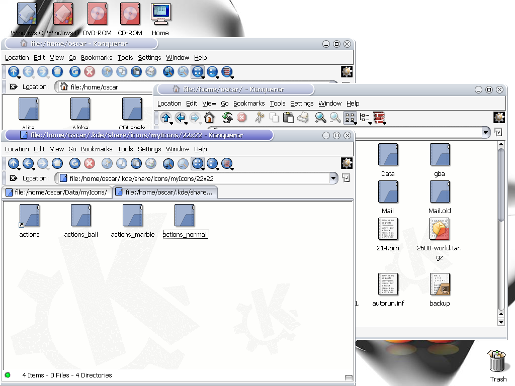
-Added first try of device icons (see screenshot)
-Three different versions of toolbar icons: normal, marble and ball (or xp  ). See also the screenshot. BTW, I'm having problems when creating the tgz file. My 22x22/actions dir is linked with one of the toolbar versions, but when I compress the set, the link is missing, any ideas?
-I'll make a release next week. It will not be finished, but I'm going to be without computer for at least two months (moving to another country) so I decided to release it anyway (most of it it's done).


Other Icon Sub-Sets:


Ratings & Comments
26 Comments
go there : http://www.kde-look.org/content/show.php?content=2740&PHPSESSID=3569e504d6652d5f86601470d9437416
Where are the icons? :P
the link still doesn't work
link is missing.. ah, good work..
The file_xml.png icon says xlm.
I'll fix it.
Good work. But the toolbar looks like mix with XP and Aqua.
Yes. Just like crystal toolbar icons - totally totally XPish.
Well, as usual, you can do whatever you want with the toolbar once the set is released ;). BTW, I have no idea how XP toolbar looks like. Last version of windows I installed in my computer was w2000, and I don't know anybody with XP running in their computers (win98,Me,NT and 2000, yes but no XP or eXPensive :) ). Any resemblance with XP it's just coincidence and was not my idea to make icons that look like XP
I really like the blue/marbles toolbar icons. Are you also planning to create a "complete" set of these? Also, when are you planning to have a download available?
When you do release this iconset, PLEEEEEEASE include the old toolbar icons as well. Some of us out there can't stand the 3d, shiny, crystal-type aqua look
Don't worry. The old toolbar icons will be also available. I'll make de release as soon as I have some device icons I like.
Really nice toolbar icons! I've always planned to create something like that for a future Marbles release (see comments to the appropriate postings) but was lacking time to put much effort in it yet. (And maybe never will have time to realize it). I'm really impressed how awesome this looks. Great work! :-)
Download link don
There is no download yet.
Looks great. I'd suggest something like "Mimecons" would be a more appropriate title (PNG images aren't neccessarily associated with office suites for instance). Just a suggestion.
Already, I'm a huge fan. I've always been partial to the "flat" look... too much 3d makes things a little too difficult to read (just my opinion). However, please post at least a handful of icons... too many previews just ruins the fun! We like. We want. Can't wait to see the full download!
wery well done! It's nice to have a classic, "flat" set of icons, amonng all these 3D icons. And I love the toolbar buttons! a bit like the ones in the "new" crystal, but better. keep up the good work! fred BTW i don't think that just because Crystal is all the rage now, the other icons sets are "dead". An iconset doesn't have to evolve perpetually. Ikons is older than Crystal and was pretty finished when everaldo came along ...
I was talking about iKons the project, not the icon set. I know some people still use it, but last update was made 6 months ago, so I think we'll never have iKons finished.
...except the toolbar icons, which remind me on winXP (I hate winXP). This icons go well with iKons, which are dead now, I suppose. You should join this two projects...
Hmmm, there aren't much usable icons for KDE, but these are Great! Still a bit immature is think that they could easily be in one line with connectiva icons...
I think it's the best I've seen in a long while.
used? Simple great!
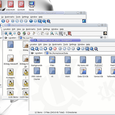
being used on kde 3.1 --notice the tabbed browsing.
The window decoration is the default keramik with new buttons. I didn't like keramik buttons, so I changed them. The style it's plain liquid.