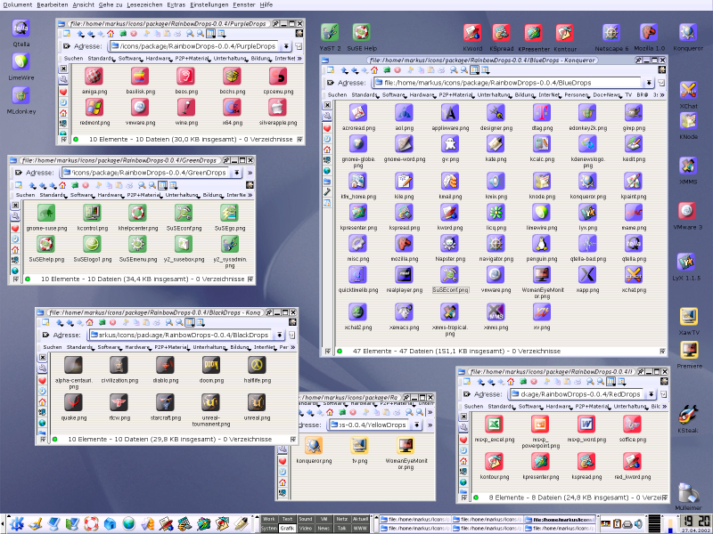
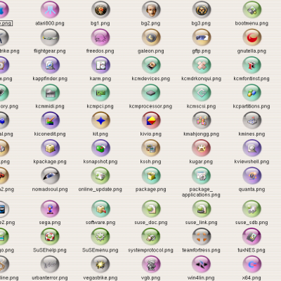
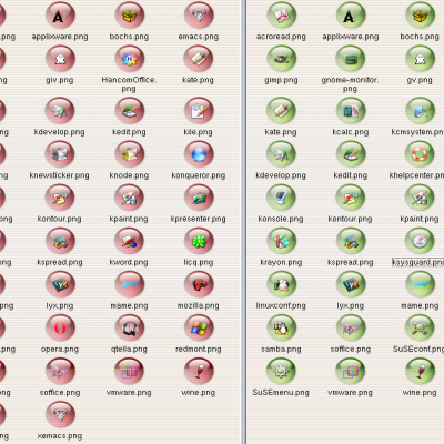
Description: This time I created 21 new items and framed another 7 ones resulting in a total of 88 icons. I hope you like the black buttons. The XCF templates are added as promised. They are accompanied by a short HOWTO. The icons are now grouped by colour in several seperate directories.
There won't be any future releases of the Rainbow Drop icon theme unless someone asks for more icons or sends me his/her own creations. I consider this icon set superseded by my Marbles theme. Anyway, somebody might find it nevertheless useful.
SMALL PRINT:
These icons are meant as a temporary replacement for standard icons in a Crystal theme enviroment.
Every idea and all elements are taken from other artists. The "drop" (liquid/crystal) button design is adopted from caldroun's mozilla.xcf. Most icons originate from different, already existing themes. All praise and credits go to the concerning artists; all errors and uglinesses are my fault.
! You can't install this packages as described in [how to install] !Last changelog:
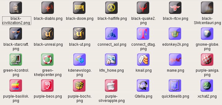
* Added another set of 28 icons
* Added new background colour: black buttons (games)
* Directory structure has changed. Icons are grouped by colour.
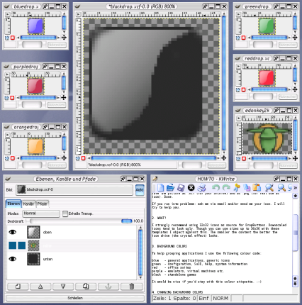
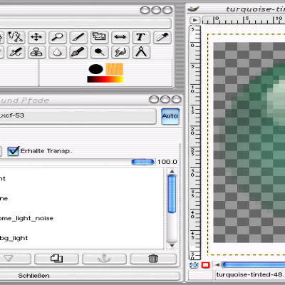
* Provided XCF templates and a mini HOWTO
* Added section "other" for newly created icons that may be of public interest
Download works fine... either the kde-look ftp server was down/busy for a few minutes or your local network has a problem.
If you still can't get the package, drop me a line - I'll send it to you via email.
maybe you'll get a bit sick of all-square icons. i'm not knocking your work as it's very nice, but your desktop is gonna start looking like a mahjong tile set :p
That was my first try to make some icons, so please forgive me ;-).
They shouldn't be used for all'n'everything, but only as a replacement for some icons or maybe solely in kicker.
There were already a lot of square icons completed - I just thought I publish them in case anyone has a useful application for those buttons.
I totally disagree, there are so many round icons about, it's really nice to have some variation here, and square icons look so much nicer on the panel :)
Could you include an XCF of the blue icon without any particular application's icon in the middle? That way others could create similar icons for their own apps and add them to your collection if you liked them. I'm certainly gagging to try converting my whole panel to these icons, and trying to extract / redraw the icons in the gimp myself always seems to give rubbish results :-/
The XCF templates for all colours will be included in 0.0.4 (because I have packaged .3 already). Additional icons made with them that are sent to me will be proper credited and included in future versions of this icon set.
Until I release .4 you can nonetheless send me a wishlist of icons if you like.
These are nice icons, worth having. I was just looking for a good Kate icon when I logged on just now.
Does anyone know if there is a mini-howto on making Crystal-like icons with Gimp? I'm not smart enough to do it on my own!
You probably wont find any worth while tutorials an anything artistic on the internet.
Ive been a Photoshop/3D Studio artist for nigh on 4 years now, and I have to say despite searching many times and buying two expensive books I believe 12 seconds of peering at objects in your garden is more usefull than 200 hours of reading tutorials. Just chew some gum and study the light on it...
your icons are good! the x-chat one is VERY good!
But what i like about your icons (i don't know whether that was intentional) is the fact that all the icon have the same shape. With the new trend towards 3D, colourful, icons, is much more difficult to get consistency between the different icons. To "frame" the icons in a cristal looking button could be a solution to get consistency and let the artists be creative at the same time.
nice! Yey, they're not Crystal, but those are real hard to beat. I like them. If you would provide a complete iconset for all the apps I use, then I promise I'll give it a try.
grz
Tom


Ratings & Comments
15 Comments
I get all but the last 1KB and then it stops forever? They look so nice too :s
Download works fine... either the kde-look ftp server was down/busy for a few minutes or your local network has a problem. If you still can't get the package, drop me a line - I'll send it to you via email.
maybe you'll get a bit sick of all-square icons. i'm not knocking your work as it's very nice, but your desktop is gonna start looking like a mahjong tile set :p
That was my first try to make some icons, so please forgive me ;-). They shouldn't be used for all'n'everything, but only as a replacement for some icons or maybe solely in kicker. There were already a lot of square icons completed - I just thought I publish them in case anyone has a useful application for those buttons.
I totally disagree, there are so many round icons about, it's really nice to have some variation here, and square icons look so much nicer on the panel :)
Could you include an XCF of the blue icon without any particular application's icon in the middle? That way others could create similar icons for their own apps and add them to your collection if you liked them. I'm certainly gagging to try converting my whole panel to these icons, and trying to extract / redraw the icons in the gimp myself always seems to give rubbish results :-/
The XCF templates for all colours will be included in 0.0.4 (because I have packaged .3 already). Additional icons made with them that are sent to me will be proper credited and included in future versions of this icon set. Until I release .4 you can nonetheless send me a wishlist of icons if you like.
The XCF will be plenty for me, as the icons I'd like to port to your design are all handmodified by myself :) Thanks...
That was a quick response... more icons. Good work too. Keep it up :)
These are nice icons, worth having. I was just looking for a good Kate icon when I logged on just now. Does anyone know if there is a mini-howto on making Crystal-like icons with Gimp? I'm not smart enough to do it on my own!
You probably wont find any worth while tutorials an anything artistic on the internet. Ive been a Photoshop/3D Studio artist for nigh on 4 years now, and I have to say despite searching many times and buying two expensive books I believe 12 seconds of peering at objects in your garden is more usefull than 200 hours of reading tutorials. Just chew some gum and study the light on it...
your icons are good! the x-chat one is VERY good! But what i like about your icons (i don't know whether that was intentional) is the fact that all the icon have the same shape. With the new trend towards 3D, colourful, icons, is much more difficult to get consistency between the different icons. To "frame" the icons in a cristal looking button could be a solution to get consistency and let the artists be creative at the same time.
Very smart thoughts. Yes, maybe is framing a good way of unifying different icon styles. Proof of concept follows. ;-) Thank you for your input.
my pleasure!
nice! Yey, they're not Crystal, but those are real hard to beat. I like them. If you would provide a complete iconset for all the apps I use, then I promise I'll give it a try. grz Tom