The intricate detail is what makes your icons stand out. The creamy beautiful look is what glued my eyes to them. Crystal isa lso cool, but it looks like galss, and is not very detailed. I think your icons look great. The only problem I found is that some have odd symbols.
Carlitus.
Your graphics are wonderfull.. the only problem i have with them is that they have to many details and are too complex - they are no longer icons. Another problem is that you violate conventrions on how icons should look. For instance the kate/kedit icon is a disaster since most people never used that type of pen.. and on black paper?
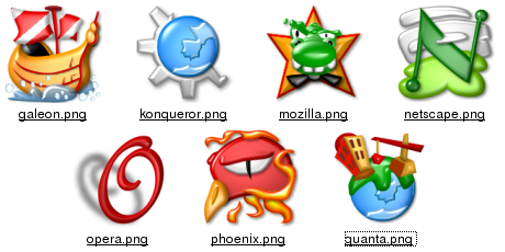
The Mozilla icons in the menu .. whats that green suppose to be? - its probably 10x10 pixels.
Apart from the few things i find annoying i actually used this theme since i find it original alnd great.. but i took me some time to get used to the icons.. a newbie will have real problems.
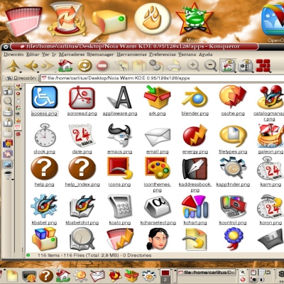
My icons are intended to be right viewed at high icon sizes. KDE uses too many times small icon sizes. This is a problem for icons (not only mines, the OSX original icons have the same problem). I have two solutions: show only one part of the icon (observe the Control Center icon 16x16 and the other sizes) or make the icon with outlines and very highcontrasted (i choosed this last option for small sizes).
I can't make it more. The Noia icons have lots of curves, and it's very hard to make god designs for small sizes. In adition, the apps icons only have one size (128x128), and it depends of the GUI engine for correct showing of graphics (i mean good shrinking, and a small sharpening). Of course, if the design is complex (as this icons have), the GUI engine can't make miracles.
These icons have better funcion as application launchers, not as system menu entries.
ABout some designs: hou have reason about some icons, they are bad designed, but not out conventions. When i have a dude, i tried to use the same designs as KDE. Maybe i can refine some designs (making a correct ink pen, chanching the polygon -this mean 'paper'? I guess this is a simple design to hisghlight the pen-, and any other change needed).
I observed the KDE users don't like the changes. The Noia icons are a alternative, with diferent designs as usual. I not intended to make a definitive iconset. Anyway, i done lots of changes, but the Noia icons for KDE is very near to their '1.00' (and final) version, as is. Maybe i will make a Noia 'generic' iconset, more adapted to daily use, without 'K' logos (to match with other desktop managers), and... freedesktop compatible.
Anyway, the Noia apps icons don't will change
You are one of the most talented individuals I've ever seen. Keep up the great work. We all appreciate your efforts. Thank you for the time you put into this icon set.
Merging with Noia Icon Set is a better idea :)
And Carlitus would you interested in making some user icons for kdm? Goes under ~/.kde/share/apps/kdm/pics I think.
Yes, i will make pictures for KDM!
I have not a lot of time, and the Noia for KDE iconset is the preferent.
Really, i changed my own picture with the gimp (Noia) png :)
The realease of this www iconset is just for make another version of the phoenix icon. If this new version is wellcome, i will change the phoenix icon included on the Noia for KDE iconset.
ok! What a pyti! I like the name 'phoenix'.
Which will be the new name?
Anyway, i like the new icon i create for Phoenix, if it will not match with new name, i will use for any other app or generic icon
No one has announced what the new name will be as it was just earlier this week that Phoenix Technology chose to get upset about the Phoenix Browser name. I understand the frustration as I just recently posted a Phoenix icon here:
http://kde-look.org/content/show.php?content=3980
The new name will be announced when the 0.5 version is released next week.
Pheonix icon makes me feel sad though.
However, I think you shouldn't be released separately. It should be listed in the NOIA KDE entry with a link to the download section. Thisway people wouldn't have to search through KDE-LOOK.org to find the apps and could download all of the NOIA icons they want from one place.


Ratings & Comments
19 Comments
Cannot install this icon set, coming up with the error message 'Not a Valid Icon Archive file' - any suggestions??? Ray
very prettyand funny, nice colors, and sharp.........good work
Great set of icons. I
The intricate detail is what makes your icons stand out. The creamy beautiful look is what glued my eyes to them. Crystal isa lso cool, but it looks like galss, and is not very detailed. I think your icons look great. The only problem I found is that some have odd symbols.
i love this iconset....all i needt now is a evolution iconset to go with it....any change that might happen, carlitus? deech
Carlitus. Your graphics are wonderfull.. the only problem i have with them is that they have to many details and are too complex - they are no longer icons. Another problem is that you violate conventrions on how icons should look. For instance the kate/kedit icon is a disaster since most people never used that type of pen.. and on black paper? The Mozilla icons in the menu .. whats that green suppose to be? - its probably 10x10 pixels. Apart from the few things i find annoying i actually used this theme since i find it original alnd great.. but i took me some time to get used to the icons.. a newbie will have real problems.
My icons are intended to be right viewed at high icon sizes. KDE uses too many times small icon sizes. This is a problem for icons (not only mines, the OSX original icons have the same problem). I have two solutions: show only one part of the icon (observe the Control Center icon 16x16 and the other sizes) or make the icon with outlines and very highcontrasted (i choosed this last option for small sizes). I can't make it more. The Noia icons have lots of curves, and it's very hard to make god designs for small sizes. In adition, the apps icons only have one size (128x128), and it depends of the GUI engine for correct showing of graphics (i mean good shrinking, and a small sharpening). Of course, if the design is complex (as this icons have), the GUI engine can't make miracles. These icons have better funcion as application launchers, not as system menu entries. ABout some designs: hou have reason about some icons, they are bad designed, but not out conventions. When i have a dude, i tried to use the same designs as KDE. Maybe i can refine some designs (making a correct ink pen, chanching the polygon -this mean 'paper'? I guess this is a simple design to hisghlight the pen-, and any other change needed). I observed the KDE users don't like the changes. The Noia icons are a alternative, with diferent designs as usual. I not intended to make a definitive iconset. Anyway, i done lots of changes, but the Noia icons for KDE is very near to their '1.00' (and final) version, as is. Maybe i will make a Noia 'generic' iconset, more adapted to daily use, without 'K' logos (to match with other desktop managers), and... freedesktop compatible. Anyway, the Noia apps icons don't will change
You are one of the most talented individuals I've ever seen. Keep up the great work. We all appreciate your efforts. Thank you for the time you put into this icon set.
veeery veeeery nice man :) keep on...
Merging with Noia Icon Set is a better idea :) And Carlitus would you interested in making some user icons for kdm? Goes under ~/.kde/share/apps/kdm/pics I think.
Yes, i will make pictures for KDM! I have not a lot of time, and the Noia for KDE iconset is the preferent. Really, i changed my own picture with the gimp (Noia) png :) The realease of this www iconset is just for make another version of the phoenix icon. If this new version is wellcome, i will change the phoenix icon included on the Noia for KDE iconset.
Nice we will Noiafy KDM too :) . Btw Phoenix will change its name in 0.5 version so better wait for name change :D
ok! What a pyti! I like the name 'phoenix'. Which will be the new name? Anyway, i like the new icon i create for Phoenix, if it will not match with new name, i will use for any other app or generic icon
No one has announced what the new name will be as it was just earlier this week that Phoenix Technology chose to get upset about the Phoenix Browser name. I understand the frustration as I just recently posted a Phoenix icon here: http://kde-look.org/content/show.php?content=3980 The new name will be announced when the 0.5 version is released next week.
Nice icon, your design match better on the 'Phoenix bird' sense as mine!
and it seems the most popular name is 'Firebird' It will be excellent, and matching with the icon i created :)
Pheonix icon makes me feel sad though. However, I think you shouldn't be released separately. It should be listed in the NOIA KDE entry with a link to the download section. Thisway people wouldn't have to search through KDE-LOOK.org to find the apps and could download all of the NOIA icons they want from one place.
But Phoenix is getting renamed, so you might need to change that icon. Anyway, they look great!
I like the name phoenix