Description: So aftersome ppl thought i have stopped this set i begann to work on it again in the last days. Im a perfectionist chaot so i begann to overwork the existing icons to finalise style which can be used further in the dev. phase.
So this is a new touch as you see. More details, less borders, more color.
I hope you like the direction and wont give up on this, cause i am planning to finish this set.
-- This is a the new set of Icons im designing in my limited free time. Sparkling were quite a succes, though i did never finish them. I hope you like them and i myself hope that they will turn out as a complete set.
hi!
im currently working in my first theme (just to improve skills with inkscape =)
can i get your svg source?
can i help or working with U?
really good. keep working
Hi man,
i would like together with you if you feel able to to the style i created the icons in.
If you mail me to flowing.creativity@gmail.com we can talk a bit about it and the sources.
Hope you write me because help is needed.
Florian
Since youre still just starting off, it might be a good time to consider following the Oxygen guidelines so that these icons are "KDE4 ready". basically, just making them high res png's or possibly svgs.
Anyway, they are very nice.
hi, they actualy are all svgs, but i added shadows and enhanced the small icons afterwards.
I actualy think svg is not so "superb" because the small icons are important too and detailed icons can look super in big sizes but like a mess in 16x16.
So: i dont this should be svg.. but yes it should be kde4 ready.
What sizes are used in kde4 also bigger then 128 x 128 ?
thx for the suggestion by the way and glad you like them.
i will try to google the info..
well, heres a link to the oxygen site http://www.oxygen-icons.org/ the most important part is the "about" section, as well as the previews
Basically, toolbar icons are going to now be 32px, so 16px will be out. there is no reason not to include 16px with your theme, but 32px should be available as well.
If i remember correctly, menu icons will be removed completely.
as for 256px, it really wont matter much if you decide to distribute the set as svg's, and it would make the size of the set huge, however in kde 4, the default desktop/file manager icon size will be 128px, so 256px will become the new "Huge" size.
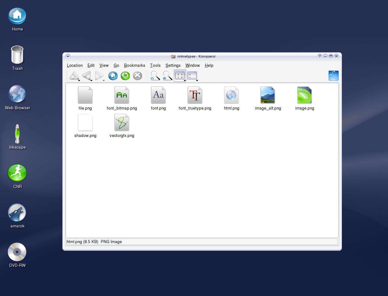
The image file icon is really nice - though I first thought of it as a slice of lime cropped like this :) But no need to change it, I like it that way! A pity I cannot download those icons.
Please go on! It will be a more and more bueautiful theme than your EXCELLENT sparkling one (which is currently on my desktop and will never leave...)!
These look nice, but you need to do some more work on the small ones.
Small icons need to be tweaked by hand, otherwise they turn into low contrast blobs.


Ratings & Comments
62 Comments
Not Found The requested URL /~guppetto/downloads/Alternate_Konsole.zip was not found on this server. Apache/1.3.20 Server at myspeedworks.com Port 80
hi! im currently working in my first theme (just to improve skills with inkscape =) can i get your svg source? can i help or working with U? really good. keep working
Hi man, i would like together with you if you feel able to to the style i created the icons in. If you mail me to flowing.creativity@gmail.com we can talk a bit about it and the sources. Hope you write me because help is needed. Florian
Since youre still just starting off, it might be a good time to consider following the Oxygen guidelines so that these icons are "KDE4 ready". basically, just making them high res png's or possibly svgs. Anyway, they are very nice.
hi, they actualy are all svgs, but i added shadows and enhanced the small icons afterwards. I actualy think svg is not so "superb" because the small icons are important too and detailed icons can look super in big sizes but like a mess in 16x16. So: i dont this should be svg.. but yes it should be kde4 ready. What sizes are used in kde4 also bigger then 128 x 128 ? thx for the suggestion by the way and glad you like them. i will try to google the info..
well, heres a link to the oxygen site http://www.oxygen-icons.org/ the most important part is the "about" section, as well as the previews Basically, toolbar icons are going to now be 32px, so 16px will be out. there is no reason not to include 16px with your theme, but 32px should be available as well. If i remember correctly, menu icons will be removed completely. as for 256px, it really wont matter much if you decide to distribute the set as svg's, and it would make the size of the set huge, however in kde 4, the default desktop/file manager icon size will be 128px, so 256px will become the new "Huge" size.
These icons are unbelievable! Don't sleep until they're done! :-)
Something to install!! :-) :-)
Keep up the good work. I like the icons very much.
Well, I like continuum as a name. It is hard to finish something when you're a perfectionist...I'm the same. Good Luck.
i will finish this set .. as promised just give me the time it needs ;)
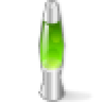
man, i have to say that i like the idea with the lava-lamp very much - for what will it be the icon ?
it will be either an "extra" icon u can use for whatever you like or i will find a nice task for it :)
SUPER! GET IT FINISHED, SO THAT I CAN USE IT!
the leaf image is so realistic how did u do that?
Your icon theme is beautiful, If you finish them, I'me sure to use it !
If I click on download it open a screenshot and no tar.gz or something! Thx TOD
it was a preview back then, now you can download the first release
these look awesome, definitely looking forward to the finished set!
The image file icon is really nice - though I first thought of it as a slice of lime cropped like this :) But no need to change it, I like it that way! A pity I cannot download those icons.
Please go on! It will be a more and more bueautiful theme than your EXCELLENT sparkling one (which is currently on my desktop and will never leave...)!
These look nice, but you need to do some more work on the small ones. Small icons need to be tweaked by hand, otherwise they turn into low contrast blobs.
Excellent set. I'd like to see more.
I really like the style. Please complete the icon set and show us your talent :-)
Those icons are the best I've seen thus far! Please keep up your work.