... a theme for now. Just a mockup.
Maybe someday it will become real.
But I think Nuno knows exactly what to do. And with some artworks we all help him & KDE. That's why I decided to connect this icon into my mockup. Thank you all guys/girls for pleasant words about this style and for criticism :)
Yes the gears are too rounded and they don't look good at a small size(looks wonky).
I think you should keep everything sharp looking, sort like a razor edge but the theme itself looks pretty good.
Well, what about bearing rack?
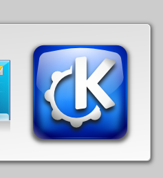
This icon was designed to replace the official KDE icon in Splash Screen.
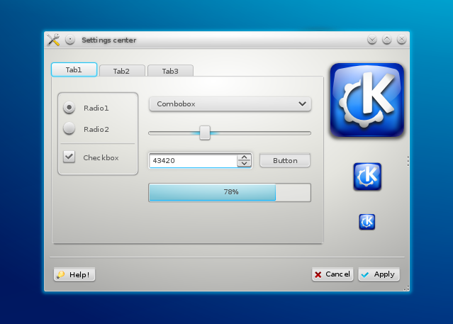
As you can see - I've revealed an idea in 1st screenshot :)
Next version is in my mind and is waiting in queue in Inkscape :)
I know I'm being picky, but gear teeth cant be rounded like that. I understand artistic license and all, but if I noticed really quick and I'd bet others would too.
although the kde icon is too gradient to me, but the screenshot looks really awesome. playful but still taken seriously. i would use your theme immediately.
greetz


Ratings & Comments
10 Comments
is this a mockup or a real widget theme/style? and if its real > where can i find it? *_*
Ist nur ein Icon. Also ganz ruhig.
This looks so good, I hope this becomes the new logo :)
... a theme for now. Just a mockup. Maybe someday it will become real. But I think Nuno knows exactly what to do. And with some artworks we all help him & KDE. That's why I decided to connect this icon into my mockup. Thank you all guys/girls for pleasant words about this style and for criticism :)
What theme/Style use ? very nice ....
Yes the gears are too rounded and they don't look good at a small size(looks wonky). I think you should keep everything sharp looking, sort like a razor edge but the theme itself looks pretty good.
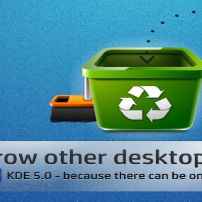
Well, what about bearing rack? This icon was designed to replace the official KDE icon in Splash Screen. As you can see - I've revealed an idea in 1st screenshot :) Next version is in my mind and is waiting in queue in Inkscape :)
2nd screenshot of course :D
I know I'm being picky, but gear teeth cant be rounded like that. I understand artistic license and all, but if I noticed really quick and I'd bet others would too.
although the kde icon is too gradient to me, but the screenshot looks really awesome. playful but still taken seriously. i would use your theme immediately. greetz