


I've just fixed the download and install problems people were having with this iconset!
*****
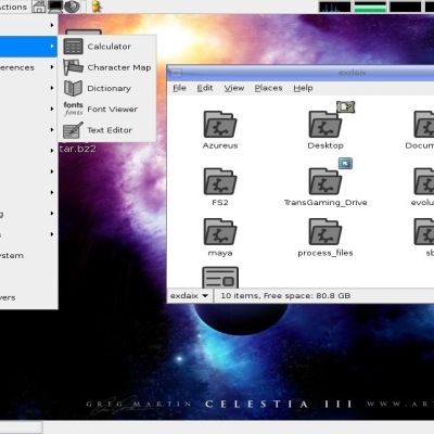
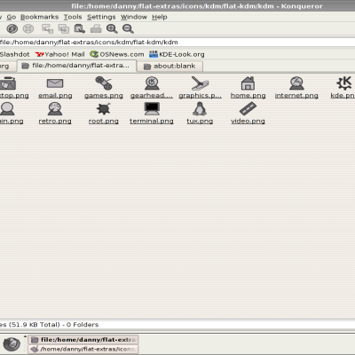
(This is the SVG version of my Flat iconset, and so can only be used on KDE 3.3 or greater.)
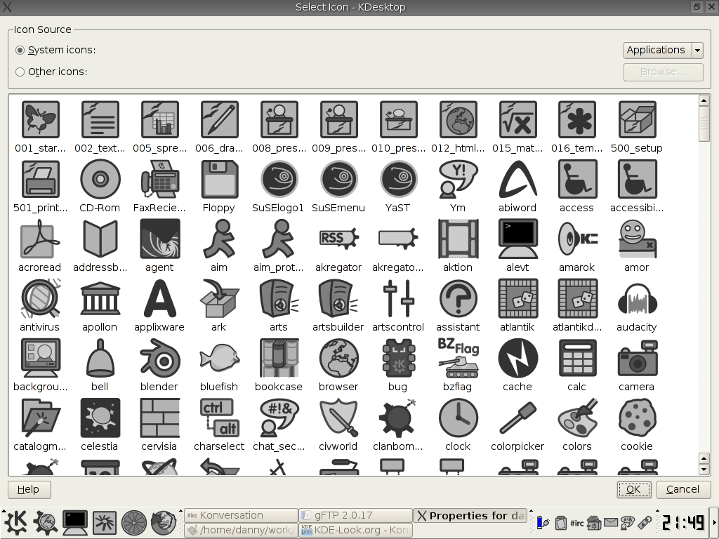
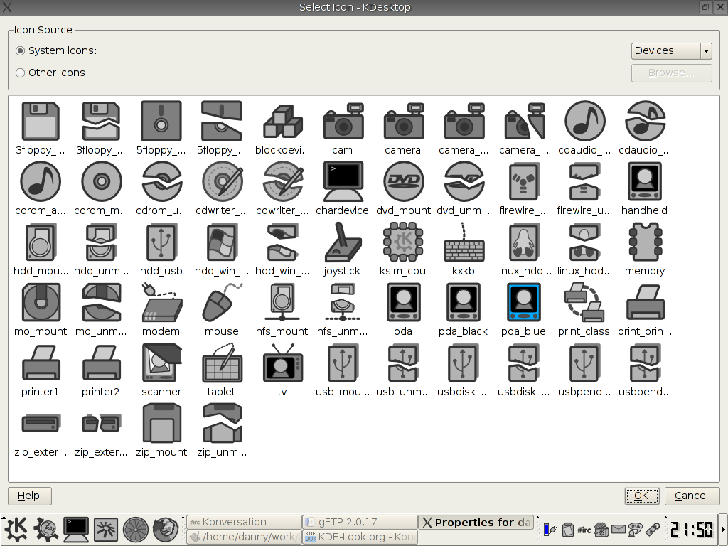
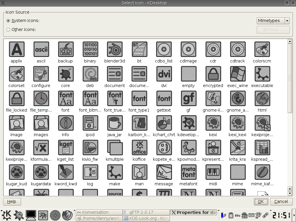
Yes, they are grey.
It has been a while, but I finally motivated myself to work on the set again.
I now feel happy to call this set "Version 1.0".
With 1776 pieces of SVG goodness, I believe that my iconset is the most comprehensive of any in KDE - tell me if it is also the best

The response to this iconset has been amazing, especially the few emails I have received - thanks everyone!
(Created as SVG in Inkscape).
----
I also strongly recommend my Flat extras pack: http://kde-look.org/content/show.php?content=12592
This package contains loads of extras that cannot be easily installed - Flat splash screens for apps, colour schemes, misc images, etc. - for a consistent Flat desktop.
-----


Ratings & Comments
13 Comments
6 This is fantastic grey look, sadly abandoned, I just tried it on KDE plasma 5 and only the file explorer had "generic" icons, eveything else (eg settings) were empty. Hope the dev will update it one day.....
The online and offline icons in the status bar look identical. Normally the offline one would be "grayed out", but with the icon being gray itself that doesn't change anything. Is there anything you can do, or is this just a kopete issue?
I'm using kde 3.5 with superkaramba 3.7. Its Icon does not appear flat. Could you please add a superkaramba icon? Thanks.
Hi dannya, thank you for your really great work. I've been googling web for years searching alternative icons known from Solaris CDE which I like. I tried your icons with KDE+CDE-themes and I must say this combination is superb! Once more thanks!
The theme is really great, although in a few places you use symbols that are not universally recognizable. One such symbol is the use of thumb for image thumbnails; it is a coincidence that in English these words are related, but this coincidence is not really transferrable to other languages, and as such this symbol is totaly inunderstandable for non-English speakers.
Hi. Thanks a lot for this valuable feedback - though I have not been spending time on this icon set recently, I have been working on the black-and-white version of the set: http://www.kde-look.org/content/show.php?content=18317 I have changed the thumbnail icon in this set - if you could download it and tell me about any other "uncertain" icons, that would be great! Danny
Thank you for making Flat icon style. Very nice. I've created a Gentoo ebuild for the svg version. What do you think of using flat in conjunction with comix? The comix colour scheme doesn't exactly match, but the look fits perfectly to flat.
Sorry, forgot to add a link: http://bugs.gentoo.org/show_bug.cgi?id=72045
Yep, that is great (though I don't use gentoo :) I have noticed Comix myself, especially how well it would go with my iconset. Thanks, Danny
about the sim/licq icon: it looks funny. every part of the flower should be over one part, and below another. look at it and you'll notice.
Ok, fixed this (I think :) for the next time I release... Anything else? :) Thanks, Danny
it really should become standard part of KDE
I totally agree. I just downloaded FlatSVG for my newly-installed KDE 3.3.1. Just perfect. I also downloaded the "flat-extras" package for wallpapers, splash screens and what not. They are just as great... except that it would be even nicer to include the splash screen for KDE 3.3. :) Keep up the great work!!!