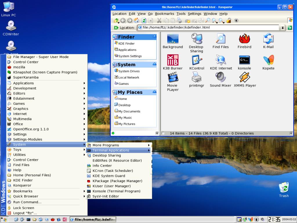
KDE Finder with XP2 theme installed There is also a version of the KDE finder that impliments the Crystal Outline icons. So it's not just for this XP2 theme. I have made a few versions of KDE Finder, This is just the newest one. I'll have the Crystal one updated in a few days. If you want to test the install, Send me an e-mail and I'll send a link to use. I can't post due to bandwidth issues.
NO I AM NOT THE CREATOR OF ALL THE THEME STUFF... The IceVM theme and icons are from http://speleoalex.altervista.org/
Hi.
Your look is great.
You can send me what you do this on your system? Icons, Wallpapers, Styles, Themes, All with you can.
And if can too show me how you do this setp-by-step...
Thank's.
i think this skin is not bad, and it is exactly the type of thing that is needed to get hardcore m$ people like me to give kde/linux a try. but to make that happen, it really does need to be a fairly exact match (although the infringing windows logos are not really necessary).
i've noticed a few minor differences here, some which are intended and some which maybe are not. for those which are intended, maybe that's ok - they could be improvements - but maybe you want to create a version that really doesn't intend to deviate at all, for the reasons i described above. the one sort of glaring problem i see is that the rounded window edges seem to have white square edges behind them. i have seen some other kde skins that have correctly rounded edges, so i am guessing this is not a kde problem. is it possible to fix this?
the other issue i see is that the left panel with the finder, system, and my places subpanels, does not actually look like the one in xp - it looks more like the one in win2k. but this is not as glaring as the 3d vertical separator bar - this bar certainly does not have the xp look/feel to me. i would recommend changing that to a flatter design if possible.
it is not going to take an exact xp replica to entice me to try kde/linux, but i know that it would certainly make it easier (by eliminating a variable from the equation) to explain to my colleagues what the advantages are.
keep up the good work.
Thank you for your input. I will look into the round corner issue. I'm not sure I can fix i or not. I'll be working on this project more soon.
I have a recording session, so all my time has been taken up with work and writing music. I'll post updates soon.
I have no problem with your making an XP-like theme. I dislike it myself, but that's no reason for you not to make it.
But should you really be putting copyrighted and trademarked material like the Windows XP logo in there?
Look, I like a good imitation as much as the next guy, but the colors on XP are so faux-Bauhaus without the style or the thought. I mean it looks like someone shoved a kiddy pool into your computer. Plus I just can't take a computer seriously if it looks like that game where you match the triangle with the triangular hole. More than that, if you want to do this don't defile Slackware....go for Redhat or something.
So you hate the XP look? I mean in general or do you just think this paticular theme is poorly done?
If you answer with "I hate the XP Look"
refer back to my "Like it or LUMP it" post and read it again.
If you think this theme is just poorly put together, I'm still working on it
Take a deep breath and realize that XP is a terrible design. It's bulky, childish and forces users to be stupid; come on people: the medium is the message. If you're computer looks like an injection molded plastic appliance then that's what you'll treat it like. I don't think this is poorly executed but you should really put your talents to something else. I will grant you that this is OK as a study: XP *is* well thought out -- the interface is very integrated, but the thought behind it is bad. I can understand the urge to imitate it: but please, use this as a study; figure out why it is you like XP, how it is put together to make it seamless. Then use that knowledge to create something better. Exempli gratia, come up with ways to get the KDE community to move in their own direction, not simply imitating Mac or Win. And for fck's sake: help us come up with an alternative to PINSTRIPES!!!
Yours,
Thanks for the post. Sorry if I sounded rude on my last reply. I was thinking you were just basicly bashing without allot of thought. I do see your point and agree. I think this theme would help a newbie user so I have to say I will still work on it. However, I will be moving on and making another version that will install the same but will use a different theme. I am still learning allot about linux and KDE. This project has helped me find allot of info on the KDE structure and will help in further Finder theme projects.
Thank you for your opinion.
I appreciate the kind words.
I don't need feedback from people that hate the XP look(Hit the back arrow and STFU).
UPDATE!!!!
If you've ever used the OSX Finder you will like the KDE Finder that I put together.I've made many other tweaks to KDE for this theme and will have it ready for download soon.
I've added:
Of course the KDE Finder
Ksidebar image that says KDE Windows
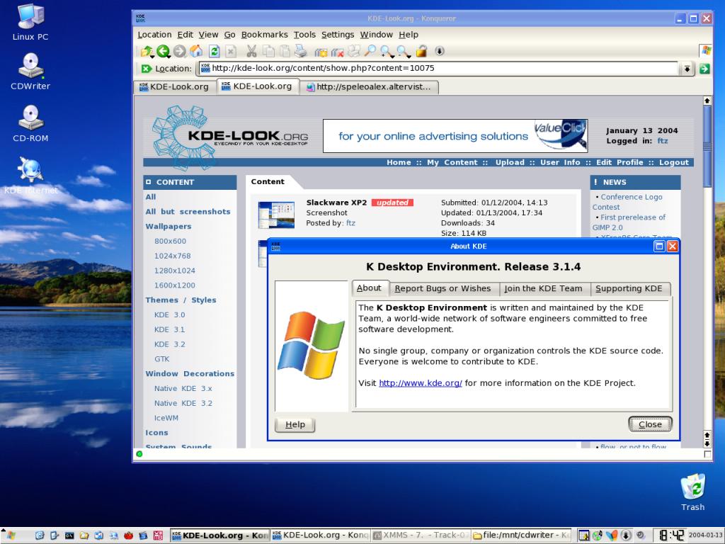
A flag logo for logout dialog and "About KDE"
kde_XP Icon theme
(I did ditch the e icon for Konqueror internet )
XPish Window Decoration (IceVM)
So, where is this KDE Finder you speak of. I did a search and it's not listed in kde-look.org. Is this the konqui sidebar thing or something else?
-p0z3r


Ratings & Comments
18 Comments
Hi. Your look is great. You can send me what you do this on your system? Icons, Wallpapers, Styles, Themes, All with you can. And if can too show me how you do this setp-by-step... Thank's.
Where can I get the finder? And does it work with KDE 3.4?
i think this skin is not bad, and it is exactly the type of thing that is needed to get hardcore m$ people like me to give kde/linux a try. but to make that happen, it really does need to be a fairly exact match (although the infringing windows logos are not really necessary). i've noticed a few minor differences here, some which are intended and some which maybe are not. for those which are intended, maybe that's ok - they could be improvements - but maybe you want to create a version that really doesn't intend to deviate at all, for the reasons i described above. the one sort of glaring problem i see is that the rounded window edges seem to have white square edges behind them. i have seen some other kde skins that have correctly rounded edges, so i am guessing this is not a kde problem. is it possible to fix this? the other issue i see is that the left panel with the finder, system, and my places subpanels, does not actually look like the one in xp - it looks more like the one in win2k. but this is not as glaring as the 3d vertical separator bar - this bar certainly does not have the xp look/feel to me. i would recommend changing that to a flatter design if possible. it is not going to take an exact xp replica to entice me to try kde/linux, but i know that it would certainly make it easier (by eliminating a variable from the equation) to explain to my colleagues what the advantages are. keep up the good work.
Thank you for your input. I will look into the round corner issue. I'm not sure I can fix i or not. I'll be working on this project more soon. I have a recording session, so all my time has been taken up with work and writing music. I'll post updates soon.
I have no problem with your making an XP-like theme. I dislike it myself, but that's no reason for you not to make it. But should you really be putting copyrighted and trademarked material like the Windows XP logo in there?
Look, I like a good imitation as much as the next guy, but the colors on XP are so faux-Bauhaus without the style or the thought. I mean it looks like someone shoved a kiddy pool into your computer. Plus I just can't take a computer seriously if it looks like that game where you match the triangle with the triangular hole. More than that, if you want to do this don't defile Slackware....go for Redhat or something.
So you hate the XP look? I mean in general or do you just think this paticular theme is poorly done? If you answer with "I hate the XP Look" refer back to my "Like it or LUMP it" post and read it again. If you think this theme is just poorly put together, I'm still working on it
Take a deep breath and realize that XP is a terrible design. It's bulky, childish and forces users to be stupid; come on people: the medium is the message. If you're computer looks like an injection molded plastic appliance then that's what you'll treat it like. I don't think this is poorly executed but you should really put your talents to something else. I will grant you that this is OK as a study: XP *is* well thought out -- the interface is very integrated, but the thought behind it is bad. I can understand the urge to imitate it: but please, use this as a study; figure out why it is you like XP, how it is put together to make it seamless. Then use that knowledge to create something better. Exempli gratia, come up with ways to get the KDE community to move in their own direction, not simply imitating Mac or Win. And for fck's sake: help us come up with an alternative to PINSTRIPES!!! Yours,
Thanks for the post. Sorry if I sounded rude on my last reply. I was thinking you were just basicly bashing without allot of thought. I do see your point and agree. I think this theme would help a newbie user so I have to say I will still work on it. However, I will be moving on and making another version that will install the same but will use a different theme. I am still learning allot about linux and KDE. This project has helped me find allot of info on the KDE structure and will help in further Finder theme projects. Thank you for your opinion.
That's it, it's a cool work, yo got it! I hate XP-theme, but Win-users would like this shot for sure.
I appreciate the kind words. I don't need feedback from people that hate the XP look(Hit the back arrow and STFU). UPDATE!!!! If you've ever used the OSX Finder you will like the KDE Finder that I put together.I've made many other tweaks to KDE for this theme and will have it ready for download soon. I've added: Of course the KDE Finder Ksidebar image that says KDE Windows A flag logo for logout dialog and "About KDE" kde_XP Icon theme (I did ditch the e icon for Konqueror internet ) XPish Window Decoration (IceVM)
So, where is this KDE Finder you speak of. I did a search and it's not listed in kde-look.org. Is this the konqui sidebar thing or something else? -p0z3r
http://kde-look.org/content/show.php?content=8046 http://kde-look.org/content/show.php?content=8046 These are some older versions I had posted. The sidebar was originally built by someone else. I asked permision to modify it. I have not posted the latest version other then this screenshot. The version I have rite now works on Slackware. I have not tested it on any other distro. If your distro uses /opt/kde it should work. ================================== Thanks to dcpark , axeljaeger and scream! This is based off of the Sidebar posted here http://www.kde-look.org/content/show.php?content=8027
http://kde-look.org/content/show.php?content=8070
http://kde-look.org/content/show.php?content=8070
...why not? It's a (technical) good conversion and you deserve my respect -
no matter if I like Window$(tm) or not.
dude, you deserve to be b****slapped out of the linux community. what kind of an idiot makes linux look like xp.
Sorry, but it's horrible ... if you wanted to make it appear like XP, you got it, but XP themes and colors are so much annoying for me ...