


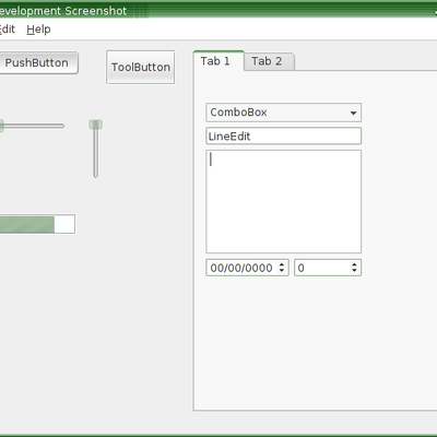
I'm basing the style on the idea of customizing anything you want with the style. And along those lines, I'd like some comments/suggestions on the name. And the following:
1: Working well with light desktops versus dark desktops
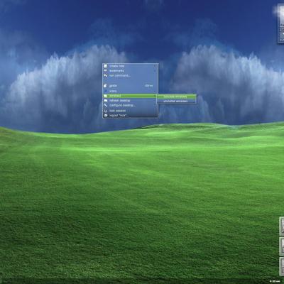
2: Removing disabled menu entries (looking at the dark screenshot, the menu should have an "undo" option but its disabled so I didn't draw it.
3: Use lower case text when you want to (menus, tabs, toolbars, buttons, etc.) Upper case too?
4: Defines custom button sizes - go from as small as possible to as big as possible.
5: A name? I was thinking Chameleon but my wife shot it down.

6: Oh yeah, and removing icons from menus. Styles are much speedier when icons are removed.
Comments, suggestions?


Ratings & Comments
3 Comments
I don't understand what you ask for. E.g. for the first item, "Working well with light desktops versus dark desktops", do you want suggestions about how to make it look good on both kinds of desktops? Or maybe you want to know whether people would need it? For now, I have name suggestions - "Kreep" and "Kasper" (in case you aren't annoyed by übergeeKy/sucKy/Kretin/Kool Knaming Konventionz :P ). Overall, you seem to be reading my mind. I have dreamed about all 5 things, but never found time to implement or even ask for them... One more thing - the sixth item. It would be great if icons could be completely disabled. I find them unnecessary and distracting. However, that probably doesn't apply to the systray - at least until a way to show/hide it with a button/shortcut is available (think "List Windows" equivalent for systray icons, with columns (oh, my)). Perhaps best would be to stay consistent with your third item, i.e. let the user say where he wants icons and where he doesn't. BTW, probably would be great if you integrated these ideas into Tiblit... yeah, I know, you don't have infinite resources, but you asked for suggestions ;) . About "I'm basing the style on the idea of customizing anything you want with the style.", makes you think... decgen/deKorator for widget styles, sounds pretty exciting, only an enormous job.
Not bad but the some of the colors aren't very attrative.
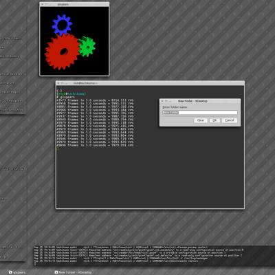
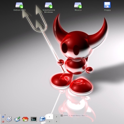
The second darker screenshot is designed for use on lcds. I can't vouch for that one on crts.