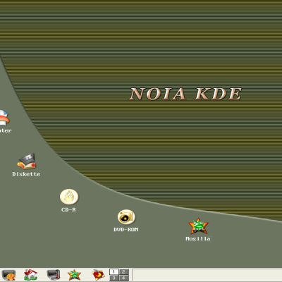
Description: Here is the second attempt to join different stuff from kde-look.org. In my opinion Thin Keramik looks to much bloated. The first time i have seen the NOIA icon theme i thought: Cool this is a realy new idea no XP or OS x , but whis his agressive colors and rounded style it doesnt fit with the availible KDE 2.x Styles and Wallpapers.
But isn't it amazing how wonderfull these two (bloated) pieces work together, if we add the right colors and wallpapers.
so let me poin out, if you use thin keramik check out the noia icon set, they are really made for each other ;-).


Ratings & Comments
1 Comment
And windows' dropdown shadow is done by?