


Kopete -> Cygwin style
synthetik


Source (link to git-repo or to original if based on someone elses unmodified work):
Version 4.2.1:
- The non-compact Legend variant was still having an old draft avatar-bar image. This is corrected.
Version 4.2:
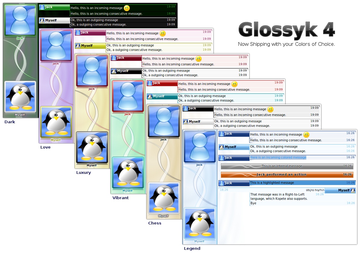
- Added a new color scheme: Legend (Light & Dark Blue)
- Long unbreakable urls now have their own scrollbar, instead of putting one horizontal scrollbar for the whole conversation.
Version 4.0:
- Six new well-balanced color schemes
- Always use one line of text in headings (in case of a very long names)
- Fixed problems with unwanted scrollbars with previous KDE versions
- Renamed the theme from "Glossyk" to "Glossyk 4" because variant names have changed (without the rename, you would have both old and new variant names). Make sure to select "Glossyk 4" in Kopete, and you can remove "Glossyk" since it is duplicated now
Version 3.0:
- Includes a "Compact" variant, as well as a "Compact, No Avatar Bar" one, for people wanting to save precious pixels like me :-)
- Keep aspect-ratio in mini-icons too
Version 2.0.1:
- Includes SVG sources of every elements
- Includes the source of the background image of avatars
Version 2.0:
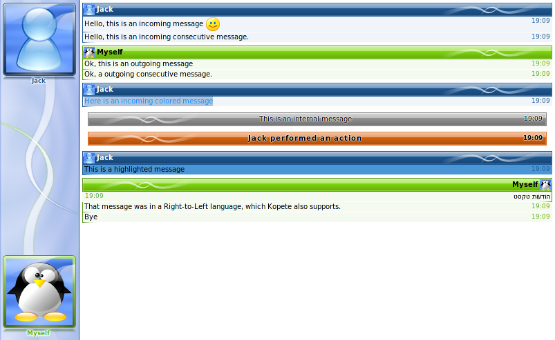
- More modern and more elaborate graphics, featuring Oxygen-like light reflextion, glass-like avatar squares and message headings, pastel-like avatar-bar background, more visible message separations
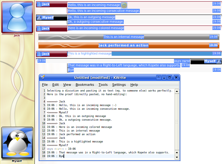
- Perfect "copy discussion as text"
- Do not distorse non-square buddy icons
- Perfect "Right to Left" language support
- Show date and seconds in the tooltip of the time
- A little bit more compact
- Cleaner HTML & CSS sources (allowing easier future new variants)
Version 1.0:
- Initial version


Other Kopete Styles:

Ratings & Comments
26 Comments
Hey! This is great, but can you add the little commmunication check thing that kopete has now. It tells you if a message was sent or not. I have a horrible internet connection as do many people and it is very useful. I doesn't show up with this theme
great theme. is it possible a version with avatar section on the right? thank you :)
I don't see how I can open this theme in kopete ... Leave an answear plz :o
Your theme is really great. This is the only one I use since I discover it. It's amasing. Thank you very much for doing and sharing it.
This theme should be default, no kidding. It should _at least_ be included in the default themeset of Kopete. Awesome theme!
Very nice... Thank you...
-Copy discussions as text without any glitch- This is an excellent feature. I'll do some reversing to your theme to provide the same functionallity to kONE. Really apreciated work. Keep it up! Thanks. :D
Nice to be helpful. The tricks are at the end of main.css. Basically: - Use <span/> instead of <div/> so that Konqueror does not put new lines between blocks - Make span{display:block} to emulate <div/> but still keeping the Konqueror property of not adding new lines at the end of the tags - Comment spaces and new lines at the end of <span/> so that Konqueror does not interpret them as one extra ending-space - Add an extra <span/> between the time and the message, displaying ": " and use a visibility:hidden (but still display:block, so the content gets copied) of a very small size - Use <img alt=""/> property to make headings to visually stand out in their text form ("=====>" and "<=====")
this is the best Kopete theme EVER :D
Nice! I would like to try this on KDE4 with Oxygen-icons. (Whoo! KDE4 have to be killer! xD )
looks great with oxygen :P
omg, i sooo love this :) would be great to have a darker theme in the next version ;) (the black & white one is great, but a little too white for me ;) )
Yes, looks good and most importantly displays all information I want in a good way. A bit to much bling bling for me. This theme with the looks of the Clear theme - that'd be my dream :) Nevertheless: I have a new kopete theme - thank you.
This Theme looks Nice Thanks Good Job Thanks, Mena
I really love this style too just the aspect ratio of the avatars should be fixed somehow. I think Sebien already did that with "Kone". I am switching between Glossyk and Kone on a daily base now :D
Now, Glossyk 2.0 centers the avatar and keep the aspect-ratio!
It looks great, a bit like msn but better (the avatar on the left for example, you've got a point that it's better located there), the only thing is, it doesn't really fit with the rest of kopete :) but still it's a big improvement.
I like this theme. It's the best Kopete theme I think,. But there is one thing I don't like. Using this theme buddy icons are deformed if they are not square. Most of ICQ users has rectangular :-( I have tried to change the thema to to keep aspect ratio but withou any success :-( Do you plan to change this behavior?
Yes, I tryed to play with CSS to be able to keep image ratio. I somewhat succeeded but the image is not centered anymore. I should have more tests to be able to release a solution that is good enought...
Now, Glossyk 2.0 centers the avatar images and keep the aspect-ratio!
Do you think a version without the display picture on the bar. I don't think the avatars need to be shown again when they're shown so big on the left. Also, they're too small anyway.
The reason to show them here is triple: - When chatting with several prople at once, like in a multi-person MSN chat, to be able to see the avatar; - Even if they are not really indentifiable at such small size, they are one more help to quickly attach a message to a person. The other ways are the color of the bar and the displayed name. Images are quicker identifiable than text, and it help people with difficulties associating colors with persons; - For people who disabled the left avatar-bar.
this is really the best kopete style that i have ever seen :) it would be a good idea if you make a variant with the avatar bar on the right side
Thanks. I don't think being able to configure the avatar bar position is so interesting. I already plan to do a lot of variants. With every combinations it's arround 50 variants to make :-/ I should try to keep the number of variants below 100 ;-) Moreover, having the avatar bar on the right make the whole theme to feel un-natural. Why? Because the scrollbar is always on the right, and when scrolling, only the left part will move (the conversation) while everybody learned for years that a scrollbar always scroll the area just aside it. Having the avatar bar on the left is much more natural, the scrollbar acts as expected and the avatar bar is more recognized as an independant component of the window;
I like your "patchwork". Specially the abatars bar and the effects on the buddy icons. You're encouraged me to still working on kONE. A lot of ideas has not been implemented yet and yes, HTML/CSS needs a rewrite now! Again, nice job! Thanks