Why isn't this unique? I searched almoast a day and didn't find something similar so I made one... I find it quite unique and easy to read... maybe this one is just not for you it's just a matter of taste....
Well, I feel free and quote you:
"I'm more happy if I got a comment to it than a good or bad vote..."
So I added a comment.
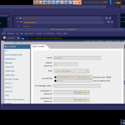
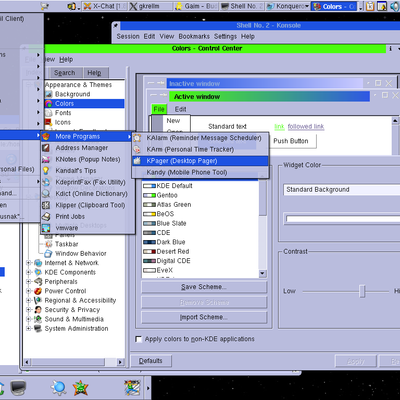
There is no standardised font color.
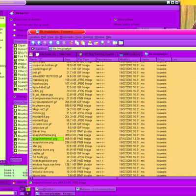
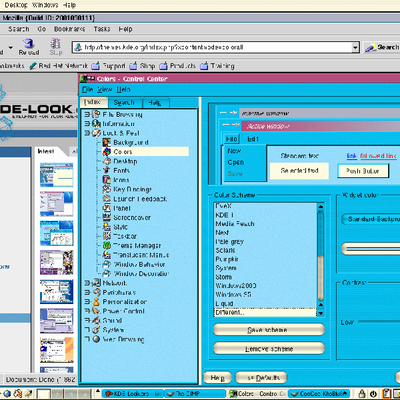
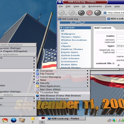
The background of the Konqueror panels look... not good.
Dark blue font on dark green background? :{
Flashy, aggressive green colors...
There are many reasons I don't like it. Do you want to forbid me to say that? Critic should make the criticised people refine their work. I am no foe of this idea.


Ratings & Comments
4 Comments
The color's are clashing. No unique design, just parts that dont match.
Don't like it don't use it.....
Why isn't this unique? I searched almoast a day and didn't find something similar so I made one... I find it quite unique and easy to read... maybe this one is just not for you it's just a matter of taste....
Well, I feel free and quote you: "I'm more happy if I got a comment to it than a good or bad vote..." So I added a comment. There is no standardised font color. The background of the Konqueror panels look... not good. Dark blue font on dark green background? :{ Flashy, aggressive green colors... There are many reasons I don't like it. Do you want to forbid me to say that? Critic should make the criticised people refine their work. I am no foe of this idea.