


 I tried to keep the colors somewhat subdued, as I'm trying to avoid the "Angry Fruit Salad" effect.
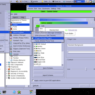
The menus, of course are off-white text on a dark blue background. Instead of black-on-white text, I've chosen dark blue on light gray to keep enough contrast for text to be readable, without being too harsh. I'm also thinking white on dark blue for standard text and background, but too many programs make assumptions that depend on battleship gray / black-on-white color schemes, so this is a compromise. For highlights such as selected text, I chose white on blue-cyan.
Let me know how this works for you. I'm still fighting with programs that demand battleship gray menus and black-on-white text, and suggestions would be helpful as for making this scheme look as good as possible.


Ratings & Comments
1 Comment
but i won't be using it :) I voted ---> [Good]