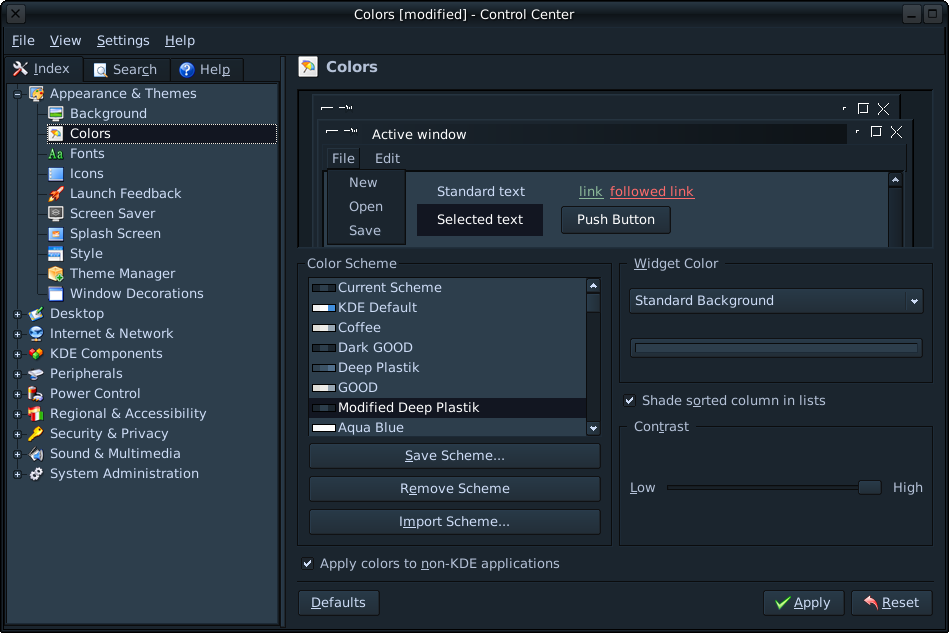
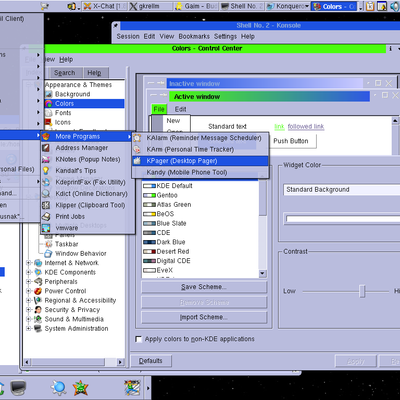
Description: This is my modified version of Deep Plastik. In my opinion, the background wasn't dark enough and the text wasn't bright enough; the contrast was just a bit off.
I'm using the SUSE2 kwin decor, Nuvola icons, and QtCurve theme - although it looks good with just about any other style.
I have accompanying configs for kfm, konsole, and kvirc if anybody wants them to be posted too.
It's meant to be like this. For the most part, I know exactly what is in the titlebar of anything I'm using: I (personally) don't need Kopete stating that it is kopete. If I'm really puzzled as to what something is, I move the mouse over it and voila. There's also the taskbar.. It's just a personal preference; I've found it easier to use like this. It can be easily changed by yourself if you like.


Ratings & Comments
3 Comments
the text of the inactive titlebar is invisible.
It's meant to be like this. For the most part, I know exactly what is in the titlebar of anything I'm using: I (personally) don't need Kopete stating that it is kopete. If I'm really puzzled as to what something is, I move the mouse over it and voila. There's also the taskbar.. It's just a personal preference; I've found it easier to use like this. It can be easily changed by yourself if you like.
Just installed and used this - what a fantastic colour scheme! Just what I have been looking for - thank you! :-)