


Right-click on the download link, and choose "save as" and save it as "FutureTech BlackBlue.kcsrc"


Source (link to git-repo or to original if based on someone elses unmodified work):


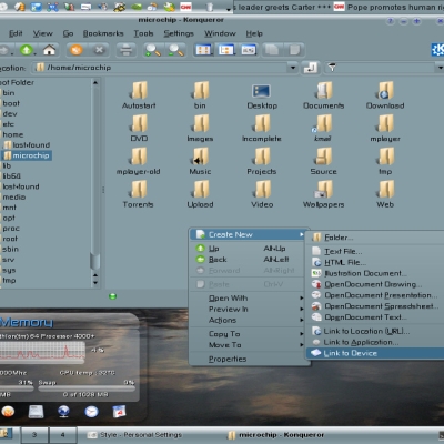
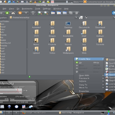
More KDE 3 Color Schemes from microchip:
Other KDE 3 Color Schemes:


Ratings & Comments
14 Comments
This is the best color combination i have ever seen. Thanks for sharing!
nice theme, i like it. but may i ask what icon theme that is? if possible have you got a link to it? thanks.
looks very nice. using it right now, but how did you get the glass menu's like that? I would like to know how to do that.
great theme, i was wondering tho what karamba theme yr using on the lrft there
I love the scheme. For some reason my computer doesn't show the text on the menu bar (black on black). if I move my mouse over it, the menu buttons get highlighted in light blue. If I change the background color to blue, the text changes right with it. But if I change the background to white, the text changes to black so it legible. Does anyone know how to fix that? Otherwise, great scheme. I always wanted something that could change the window areas to white-on-black (easier on the eyes imo and cooler of course). The problem is that there is always one application or website that decides to do white-on-white or black-on-black (bad web design?) Real annoying.
Very nice color scheme, using it currently and loving it! Just wondering what style you're using and how you achieve the transparency in your context menus? I'm a bit of a newbie at this, any help would be great! Thanks!
nice wallpaper, where from? theme is nice, but a bit to cold for me (like more red and less blue) :)
wallpaper is from Adni18 http://www.adni18.com/gallery/details.php?image_id=269&sessionid=0631e84d9536a15f980c9c4f94e07d1c You can modify the scheme if you like more red :)
Wow - you´re right: with this background it looks really good! I like it, good work :)
it fits mostly perfect with MurrinaMire v2 for Gnome theme :) Perfect for us mortals that use KMail and amaroK :) http://www.gnome-look.org/content/show.php?content=51023
glad you like it :) seems like this guy made a similar scheme for GNOME as well :)
This just might make me leave "default land". Good job on this, I really enjoy the contrasts, though they aren't much, the colors look great together.
Glad you like it, I always use a black color scheme 'cause I found out that, after hours in front of the monitor, it doesn't stress my eyes that much :)
I alwas tried to go with such dark color schemes, but I always end up frustrated due to bad color shades. But your color scheme seems to be better than others - I really like this shade of blue and black, a good combination.