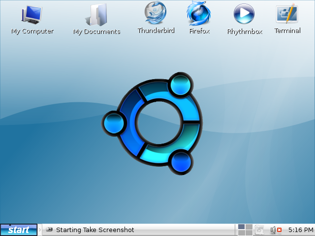
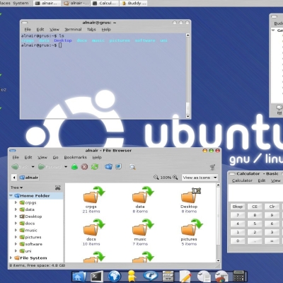
love the icons they integrate really well, the wallpaper needs a bit of work though i think (the black outline looks to thick and jagged) the start button looks alrite i would only suggest that you make the black outline either non-existant or thinner
I see you've used that blue start button. I think it integrates well with the rest of your blue theme.
I'm not to keen on the massive ubuntu logo, but there you have it: each to his own.
What's your screen resolution? It looks quite small.


Ratings & Comments
5 Comments
the start button resembles Window too much. It has an OSX and Windows, combination look.
true...i wish i could make the background logo transparent but i cant see to figure it out
love the icons they integrate really well, the wallpaper needs a bit of work though i think (the black outline looks to thick and jagged) the start button looks alrite i would only suggest that you make the black outline either non-existant or thinner
im not completely sure..but it wont let me change it anyway so...
I see you've used that blue start button. I think it integrates well with the rest of your blue theme. I'm not to keen on the massive ubuntu logo, but there you have it: each to his own. What's your screen resolution? It looks quite small.