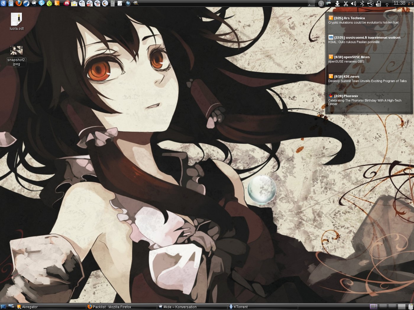
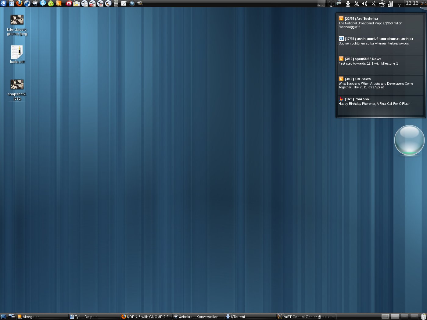
Description: RATIONALE: GNOME is heading towards strange new directions and I'm disappointed with both GNOME Unity and GNOME 3. I decided to discard both and make KDE look like the classic GNOME. Thanks to KDE's flexibility, it doesn't take long to modify it to look like this.
Many GNOME users like me would find this kind of continuity in interface pleasant.
VISION: Have distros adopt this kind of layout as the default look.
TODO: - need a menu for KDE that replicates the GNOME triple-menu layout [Applications, Places, System] with zero menu depth for increased usability.
Comments wanted! What would you think if this were how KDE looked like this by default?
Lancelot doesn't have the simplicity or clarity of GNOME tri-menu. In fact, it's one of the two plasmoids that makes me wonder what were they thinking or were they thinking. The second one is Kickoff.


Ratings & Comments
3 Comments
If you want to feel even more at home (visually), you can use this Plasma theme: http://kde-look.org/content/show.php?content=136981
You can set Lancelot to have separate panel buttons for each menu. You can also add custom submenus directy too panel.
Lancelot doesn't have the simplicity or clarity of GNOME tri-menu. In fact, it's one of the two plasmoids that makes me wonder what were they thinking or were they thinking. The second one is Kickoff.