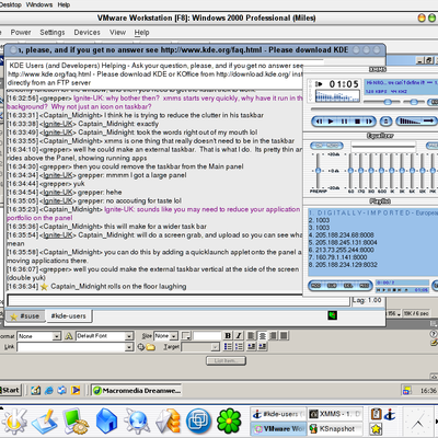
Description: My Thin Keramik'ed KDE 3.1.3 with the UI Enhancements patch to do the lovely drop shadows on the desktop icon text, and the KWin patch to do drop shadows.
Too bad that download link sends you to a screenshot...I really miss ThinKeramik, too. I'm running Debian 5.0.3 "Lenny", and it doesn't come with it (the Debian download link is broken, btw)-so I'll just have to copy the files I need from my OpenSuse Distro.
I've seen people license their screenshots, GPL Artistic or "who cares", but what's really the difference between Artistic and GPL? And, can a screenshot even be licensed ?
:D
I think we can safely ignore any licenece on screenshots don't you think hehe.
Anyway... I'm please you like it so much!
It's thanks to the great work of all the developers that we all can enjoy such wonderfull desktops. styles , decos etc....
There is a few things im going to add to this to tart it up a bit... and if it's major mods, then I will upload as Brushed Thin Keramik II
I think so too.
But, will you make the changes I mentioned. I would do it myself, but I don't have the shadow patch and a few more things I would need.
Thanks for improving your screenshots, they are now the best on looky! I almost running out of suggestions!
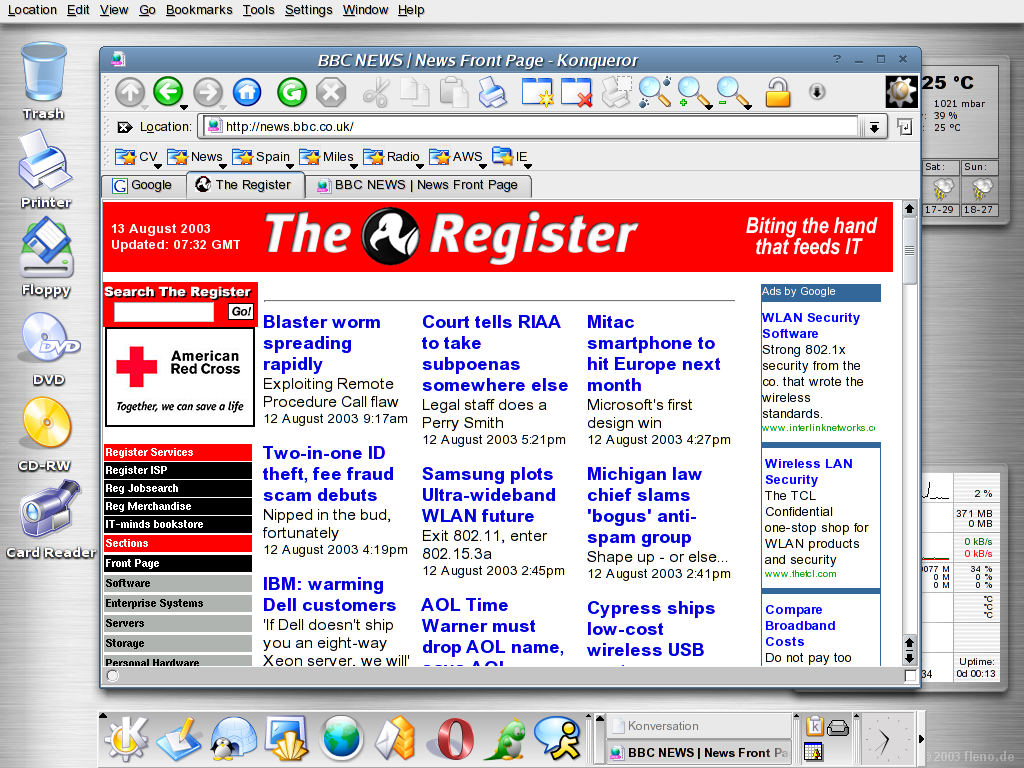
I think that the second screenshot would look even better with a top/bottom split screen. (CTRL SHIFT T). The top half could be locked in position and linked to the bottom half so that any link clicked on the top half would open in the bottom half.
The top half could contain what theregister.co.uk and the bottom half could have one fo the articles open.
And also a bookmark on the toolbar like OSNEWS.com, since it has an icon could be next to the folders.
If you don't know how to do what I said please ask, I would be happy to tell you.
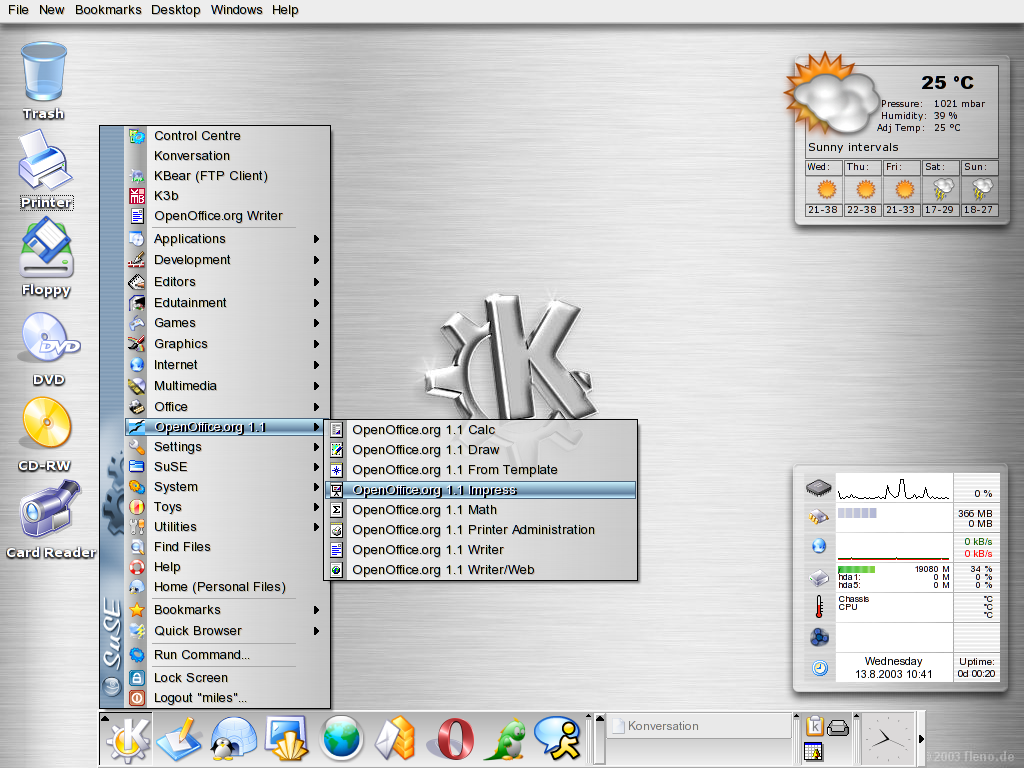
My other suggestiosn are for the download screenshot. First of all I think you should make a note somewhere that the download screenshot is not the same as the other screenshots, people might not click it thinking its the same thing.
now about the screenshot itself, I think it would look even better if kbounce (since the way it looks fits in great with your theme and no games have been shown) was overlapping the dark part of the shell. (to the left of the K.)
Finally, the mouse could be hovering over an icon on the kicker since that hasn't been shown yet. (of course with the icon zoom option enabled).
Otherwise I am completely clueless on how else it can be improved and believe me that's a first.
BTW: Please don't change the title color decoration in these screenshots or anything else related to color or style. The blue titlebar matches well with th menu select color and it just looks really good with silver.
Please, if you want to upload screenshots with different styles or colorschemes make another submission, but leave the Brushed Thin Keramik the way it is. I want to show these screenshots to my friends and anyone who doesen't like the way KDE looks or has never seen Linux. (after you take my last suggestions :)
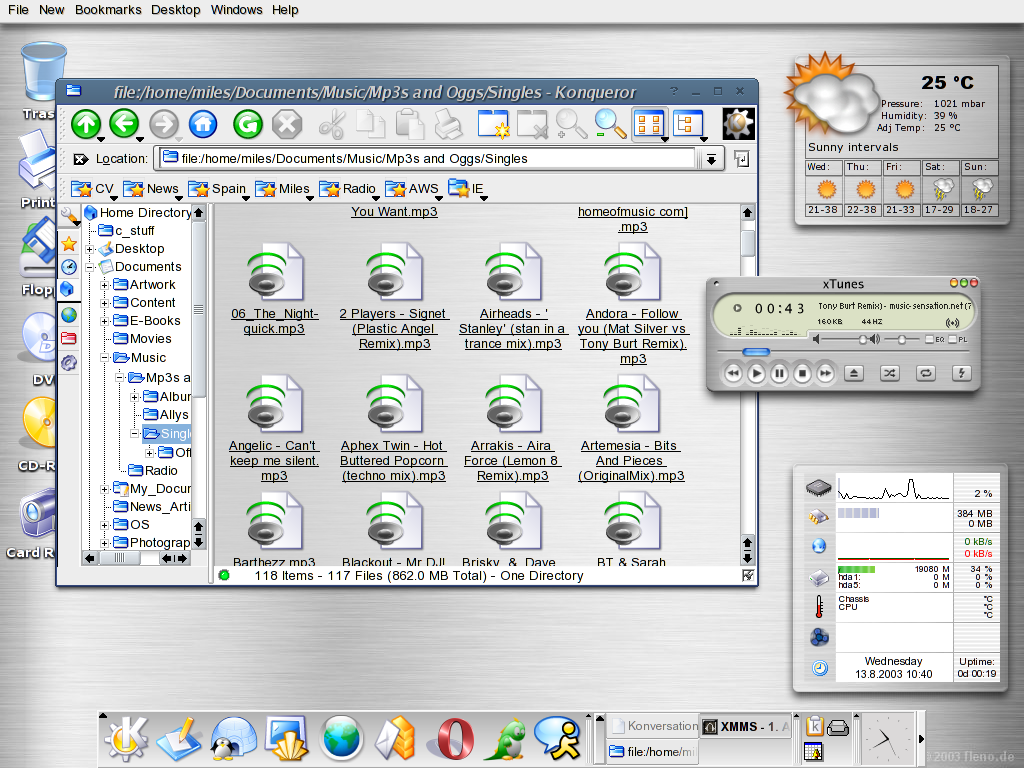
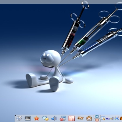
I forgot my last suggestions for the 3nd screenshot. I promise these are the very last suggestions, ever. i know I am being very picky for a couple of screenshots, but I want to show them to everyoen who doesen't know how linux looks like or says GNOME looks better ;p
Okay, please go to Konkqueror's setting->Appearance-> and uncheck word-wrap icon text so that all the icons's names will be just as long.
Next, show some more varied files, not just mp3's, show a folder with html in it (to show off the abiltiy of folders to reflect contents) one with an image, one with a text file. Than some pictures, and a text file (to show off Konqueror's preview abilities of images and text files.)
Okay, please go to Konkqueror's setting->Appearance-> and uncheck word-wrap icon text so that all the icons's names will be just as long.
Sorry, I can't agree with this. When I was using Windows, I got very sick of not being able to see complete filenames in the icon view, especially when looking at a folder full of music with long filenames. Can you imagine trying to pick a specific song out of 50 that all have an identical unselected caption of "Sakura Taisen - ..."?
But you also want to show those screenshots to your non-Linux and KDE using friends. Annoying misfeatures should be kept down to a minimum to keep it attractive both visually and functionally.
In the left corner, in the red shorts we have "Deciare".
In the right corner, in the blue shorts we have "WinterWolf"
Now boys, I want a nice clean fight.... no punching beneath the belt...
You know the rules..
This is by far the nicest looking silver-ish setup I've seen. The titlebar's shade of blue doesn't quite fit with the rest of the theme, though... It's too dull.
Thanks for your comments....
I'm going to try and come up with a colour for the window deco to blend in... however.. I thought the blue "lifted" the window off the desktop slightly, and drew emphisis to it... but I'll see if I can find other colours that can be used..
Regards
Miles.
That is an option in Thin Keramik.
The "stripe" option
I ask the developer to add it, and it's basically copied the idea from dotNET style.... but it looks nice.
Please just close the star tray program (what program is it anyway) while taking the screenshot and have Konqueror with 2-3 tabs open and Tmon 1.3 is out =)
Anyway, i really like the screenshot, but the trash can also doesen't seem centered correctly with the text.
the 1st 2 screenshots in which the trash icon appears to be centered incorrectly and the star icon is in the tray.
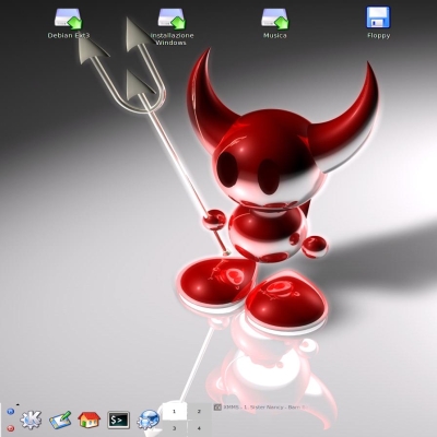
But, i even have a suggestion for the 3rd screenshot, add some shadow at the top of the wallpaper so the mac os style menu would look better
Yes, but not all of it...
All I did was look at the files that the patch effected... and recompiled them..
Took about 10 mins to patch/compile/install...
Great patch tho... give it a go, well worth it mate!


Ratings & Comments
27 Comments
Too bad that download link sends you to a screenshot...I really miss ThinKeramik, too. I'm running Debian 5.0.3 "Lenny", and it doesn't come with it (the Debian download link is broken, btw)-so I'll just have to copy the files I need from my OpenSuse Distro.
Is xTunes really XMMS??? If so, where did you get that skin? Also, if it isn't XMMS, what is it and where can I get it? Thanks!
sir,how can download the software,the download link was a picture,not a software,please give us a right link,thank you!!
Its a screen shot, not software!
I've seen people license their screenshots, GPL Artistic or "who cares", but what's really the difference between Artistic and GPL? And, can a screenshot even be licensed ?
:D I think we can safely ignore any licenece on screenshots don't you think hehe. Anyway... I'm please you like it so much! It's thanks to the great work of all the developers that we all can enjoy such wonderfull desktops. styles , decos etc.... There is a few things im going to add to this to tart it up a bit... and if it's major mods, then I will upload as Brushed Thin Keramik II
I think so too. But, will you make the changes I mentioned. I would do it myself, but I don't have the shadow patch and a few more things I would need.
Thanks for improving your screenshots, they are now the best on looky! I almost running out of suggestions! I think that the second screenshot would look even better with a top/bottom split screen. (CTRL SHIFT T). The top half could be locked in position and linked to the bottom half so that any link clicked on the top half would open in the bottom half. The top half could contain what theregister.co.uk and the bottom half could have one fo the articles open. And also a bookmark on the toolbar like OSNEWS.com, since it has an icon could be next to the folders. If you don't know how to do what I said please ask, I would be happy to tell you. My other suggestiosn are for the download screenshot. First of all I think you should make a note somewhere that the download screenshot is not the same as the other screenshots, people might not click it thinking its the same thing. now about the screenshot itself, I think it would look even better if kbounce (since the way it looks fits in great with your theme and no games have been shown) was overlapping the dark part of the shell. (to the left of the K.) Finally, the mouse could be hovering over an icon on the kicker since that hasn't been shown yet. (of course with the icon zoom option enabled). Otherwise I am completely clueless on how else it can be improved and believe me that's a first. BTW: Please don't change the title color decoration in these screenshots or anything else related to color or style. The blue titlebar matches well with th menu select color and it just looks really good with silver. Please, if you want to upload screenshots with different styles or colorschemes make another submission, but leave the Brushed Thin Keramik the way it is. I want to show these screenshots to my friends and anyone who doesen't like the way KDE looks or has never seen Linux. (after you take my last suggestions :)
I forgot my last suggestions for the 3nd screenshot. I promise these are the very last suggestions, ever. i know I am being very picky for a couple of screenshots, but I want to show them to everyoen who doesen't know how linux looks like or says GNOME looks better ;p Okay, please go to Konkqueror's setting->Appearance-> and uncheck word-wrap icon text so that all the icons's names will be just as long. Next, show some more varied files, not just mp3's, show a folder with html in it (to show off the abiltiy of folders to reflect contents) one with an image, one with a text file. Than some pictures, and a text file (to show off Konqueror's preview abilities of images and text files.)
Okay, please go to Konkqueror's setting->Appearance-> and uncheck word-wrap icon text so that all the icons's names will be just as long. Sorry, I can't agree with this. When I was using Windows, I got very sick of not being able to see complete filenames in the icon view, especially when looking at a folder full of music with long filenames. Can you imagine trying to pick a specific song out of 50 that all have an identical unselected caption of "Sakura Taisen - ..."?
I only want him to do that stuff for the screenshots. It looks better when everything is evenly spaced.
But you also want to show those screenshots to your non-Linux and KDE using friends. Annoying misfeatures should be kept down to a minimum to keep it attractive both visually and functionally.
In the left corner, in the red shorts we have "Deciare". In the right corner, in the blue shorts we have "WinterWolf" Now boys, I want a nice clean fight.... no punching beneath the belt... You know the rules..
lol
This is by far the nicest looking silver-ish setup I've seen. The titlebar's shade of blue doesn't quite fit with the rest of the theme, though... It's too dull.
Thanks for your comments.... I'm going to try and come up with a colour for the window deco to blend in... however.. I thought the blue "lifted" the window off the desktop slightly, and drew emphisis to it... but I'll see if I can find other colours that can be used.. Regards Miles.
Hey. Nice. How do you get the different background behind the small menu icons? I've seen this before but never got around to asking. Thanks ..eskay
That is an option in Thin Keramik. The "stripe" option I ask the developer to add it, and it's basically copied the idea from dotNET style.... but it looks nice.
Please just close the star tray program (what program is it anyway) while taking the screenshot and have Konqueror with 2-3 tabs open and Tmon 1.3 is out =) Anyway, i really like the screenshot, but the trash can also doesen't seem centered correctly with the text.
the 1st 2 screenshots in which the trash icon appears to be centered incorrectly and the star icon is in the tray. But, i even have a suggestion for the 3rd screenshot, add some shadow at the top of the wallpaper so the mac os style menu would look better
The thin Keramik window decoration is sooooo much better than the default... someone might recommend changing the default to this. :)
Erm... It's Knifty...not default!
Erm.... sorry miss read! :D
How did you get the UI Enhancements patch to work on 3.1.3? did you recompile kde?
Yes, but not all of it... All I did was look at the files that the patch effected... and recompiled them.. Took about 10 mins to patch/compile/install... Great patch tho... give it a go, well worth it mate!