


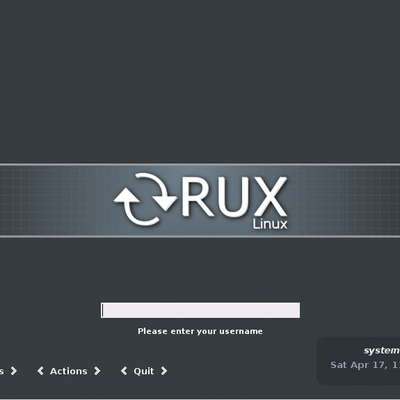
I. Requirement
This theme requires KDE (I'm sure you have it
 )
)II. Installation
1. Open kcontrol
2. "Appearance & Themes" -> "Theme Manager" and select the .kth file
3. Just apply then and enjoy
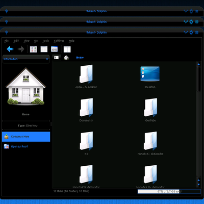
and then tell me if everything's like in the screenshot


Ratings & Comments
7 Comments
"I. Requirement This theme requires KDE (I\'m sure you have it ;) )" kde 3 or kde 4??
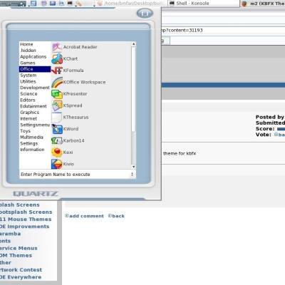
...I like it a lot! "Just apply then and enjoy ;) and then tell me if everything\'s like in the screenshot" No, not quite. I had to download a separate deKorator theme and I didn't get the wallpaper as shown. Where'd you get that wallpaper? I also don't have the Crystal-project icons installed, but the Dark-Glass iconset goes with this theme beautifully. http://www.kde-look.org/content/show.php/Dark-Glass+Icons+Project?content=67902 Nice job and thanks! LocoMojo
In fact I don't quite know what is in the theme package as I can't open it :( I just set the fonts like I want, the icons, color schemes and then I create the package. The wallpaper in the screenshot, is from the Leopard Preview, you can find it on google, it's called Aurora :) I used it because it was giving some light to my desktop, but I'm sure you can find some other good ones on this site ;) For the dekorator windeco, I posted it as another file, you can find it here http://kde-look.org/content/show.php/NanoTekReloaded-Dekorator?content=68813 There's also the domino configs here http://kde-look.org/content/show.php/NanoTekReloaded-Domino?content=68814 I'm currently working on an update of my dekorator theme for Nanotek at first, and then on Nanotek Reloaded
Sorry, but I don't like this white/black font on light grey~brown background. It doesn't fit the windecos nor the Domino buttons well. Why such a radical change?
Why such a radical change ? You're true it's really different, but I'm sorry to say there's no changes as this is the first version of this theme. This is not an updated version of the other NanoTeK theme I made. You can consider it as a fork ;) The main line of this theme, is to have a semi-dark base without being hard on eyes :) That's why the fonts are bold and have a good contrast...
Looks good, I like it, only draw back I had was a few missing icons after applying and also it made iceweasle look like a typical IE explorer window but hey nothing I couldn't fix
Thanx :) That's a pleasure ;)