Description: If for some reason the changelog hasn't updated to reflect the latest version (it hasn't been working since 1.3.1) you can see the changelog at https://github.com/godlyranchdressing/Minwaita/releases
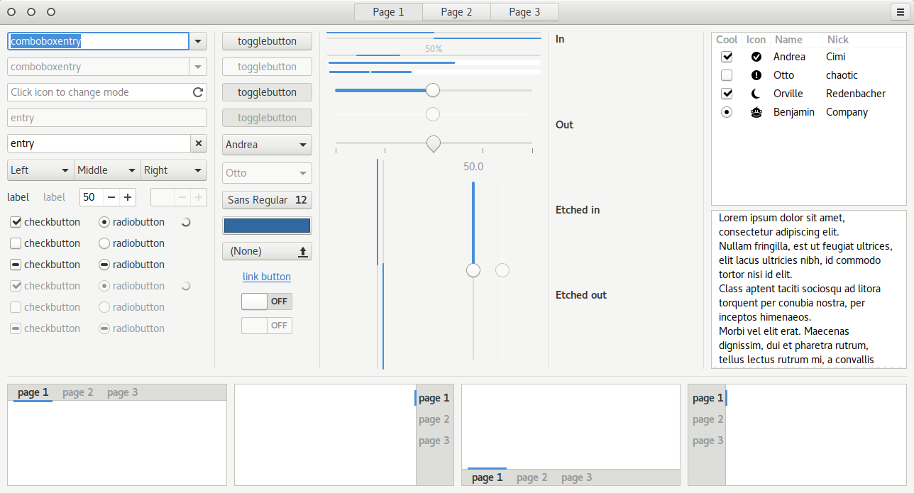
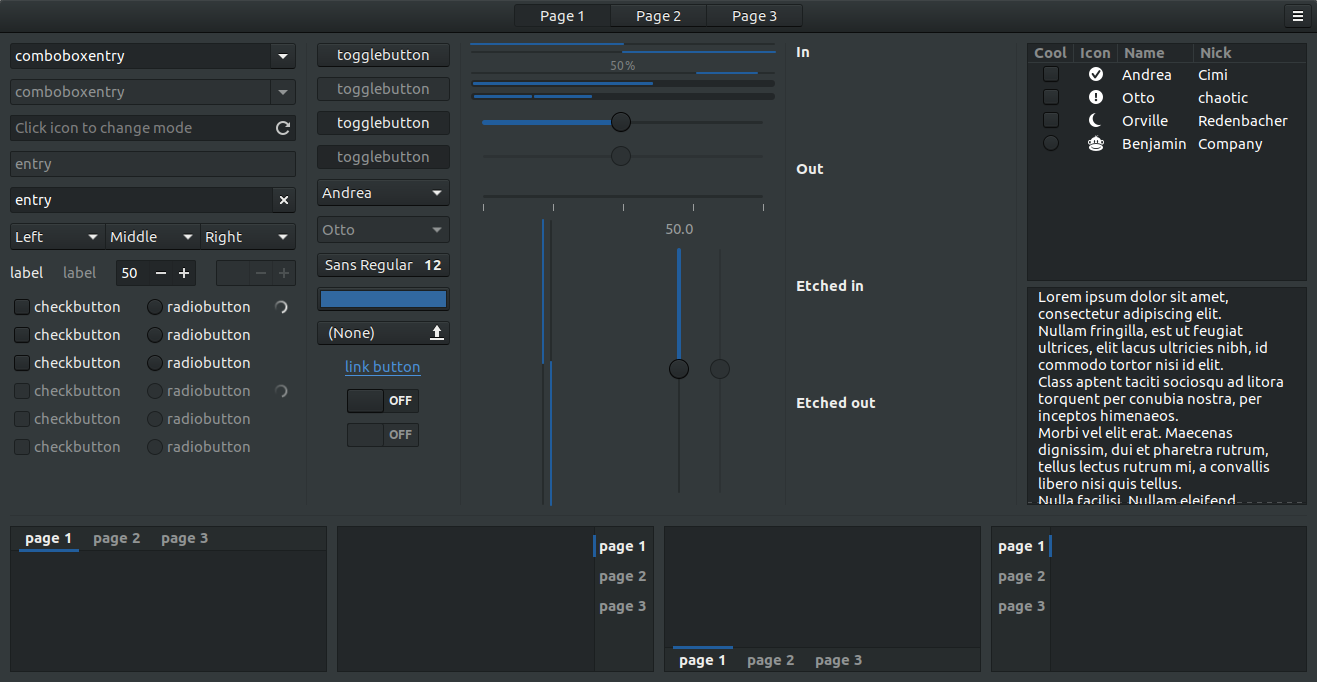
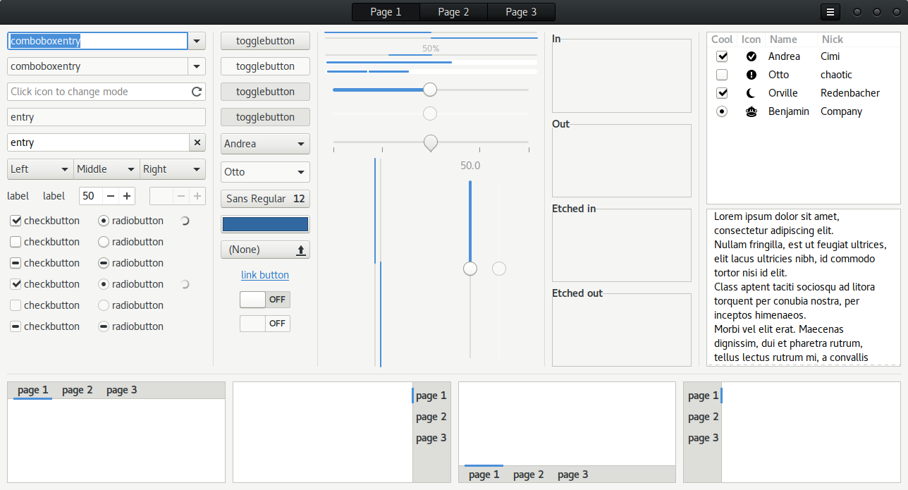
# Description Reduces excessive padding from the default GNOME, Adwaita to make it more compact. Some of the additional tweaks include:
Window shadow being reduced to get rid of the "dirty" look Adwaita has. New window buttons. Vertex, OSX and vanilla style. The appmenu icon in the topbar has been removed (with spacing accounted for) as well as the dropdown arrows There is now a light variant of the shell theme The spacing in third-party indicators and the aggregate menu have been tweaked to make it all appear uniform Additional Dash to Dock styling to make the dock feel more "complete" A couple more tasteful design tweaks such as removing the progressbar borders all for a cleaner look The end goal is to provide a sleaker, more streamlined GNOME experience without the need for too many extensions and additional tools.
# Installation Copy the folders to [username]/.themes or /usr/share/themes for a global installation.
# Recommend extensions Dash to Dock, Dynamic Panel Transparency (don't hide corners) + Top Icons Plus.
# Move window buttons: Just in case you're curious and don't know how. In terminal: gsettings set org.gnome.desktop.wm.preferences button-layout 'close,minimize,maximize:'Last changelog:
V1.6.1
Fixes for 3.26. Fix the issue where Chrome would show a generic icon when a window is maximized. Remove white line on desktop when desktop icons are enabled and the top panel is semi-transparent.
Nice theme! I always loved Adwaita Dark, but the spacing was too big for my taste.
One small issue, the colors of this theme don't match with the vanilla ones (neither in light or dark variant). Could you please change that?
Please could you fix the issue with the huge window buttons which appeared after the last update of Chrome? thanks! I see other themese, like High Sierra are fixing this too. Thanks for maintaining this theme!
This is a very functional theme, while remaining pleasing on the eye. I like it because it retains the GNOME 3 default identity while optimizing space. GNOME people should make this theme a default option (since many people don't like the huge padding used by default Adwaita). I like both Vertex and Vanilla versions.
Thank you! and keep up with the good job.
To me it's - clearly - the best theme for Gnome Shell / GTK I've ever used. I personally use light option and it's just aesthetically pleasing and really cool. Thank you so much for creating this!
Very nice theme. Just one suggestion: in Nautilus, the floating bar at the bottom (the one that shows the size of the selected file) should be opaque, otherwise it gets unreadable when it is above some text.
I made some changes to dash to dock in Droid Shell gnome theme. You should check it out. I think you might like the idea. You could make it blue. But I don't have an assets folder so watch that if you decide to look.
For the GTK3 theme there's three window button variants (no custom buttons, OSX and the original Vertex icons). For the Shell, the borders around the system menu actions in the aggregate menu (power, lock, etc.) have been removed.
The changelog didn't (and continues to) not go through. Sorry about that. In the future you can check the releases page on Github for it.
Wow. I really the result. It lends a really elegant look to the titlebar but I think that's the problem. Too much flair. I'll probably fork Minwaita without self imposed constraints so maybe I could use it for that.
I love the compact nature of this theme but now gnome shell is light grey rather than the original black and I an't see a way to switch back. Do I have to roll back to 1.2.1 or is there another way around this? Thank you
No, that was my mistake. The light shell css file was being used by the dark (normal) version by accident. I've corrected that and you can redownload the archive. Sorry about that.


 0.56 MB


Ratings & Comments
41 Comments
Nice theme! I always loved Adwaita Dark, but the spacing was too big for my taste. One small issue, the colors of this theme don't match with the vanilla ones (neither in light or dark variant). Could you please change that?
9 Just what I was looking for
Please could you fix the issue with the huge window buttons which appeared after the last update of Chrome? thanks! I see other themese, like High Sierra are fixing this too. Thanks for maintaining this theme!
Nice theme.
Good job but isn't compatible with GTK 3.18 :( any plans to make a 3.18 version ? thks
This is a very functional theme, while remaining pleasing on the eye. I like it because it retains the GNOME 3 default identity while optimizing space. GNOME people should make this theme a default option (since many people don't like the huge padding used by default Adwaita). I like both Vertex and Vanilla versions. Thank you! and keep up with the good job.
To me it's - clearly - the best theme for Gnome Shell / GTK I've ever used. I personally use light option and it's just aesthetically pleasing and really cool. Thank you so much for creating this!
Very nice theme. Just one suggestion: in Nautilus, the floating bar at the bottom (the one that shows the size of the selected file) should be opaque, otherwise it gets unreadable when it is above some text.
I copied the folders to /usr/share/themes but this theme didnt work. All my other themes works perfectly fine. It is not showing in the gnome tweak.
I made some changes to dash to dock in Droid Shell gnome theme. You should check it out. I think you might like the idea. You could make it blue. But I don't have an assets folder so watch that if you decide to look.
The "ordinary" archive which should have the Vertex style seems to contain the Vanilla style.
I'm so dumb. It's been fixed.
What's the changelog for v1.3.1 please? Thanks!
For the GTK3 theme there's three window button variants (no custom buttons, OSX and the original Vertex icons). For the Shell, the borders around the system menu actions in the aggregate menu (power, lock, etc.) have been removed. The changelog didn't (and continues to) not go through. Sorry about that. In the future you can check the releases page on Github for it.
i would love to see this theme with the original Adwaita color palette! http://imgur.com/eognOmV
I wanted to share something with you and see what you think? .titlebar:not(headerbar), headerbar { padding: 2 5px; min-height: 34px; border-width: 0 0 0.5px; border-style: solid; border-color: rgba(0, 0, 0, 0.3); border-radius: 0; background: #f5f5f4 linear-gradient(to top, #d1d1cc, #f0f0ef); box-shadow: inset 0 0px 0px rgba(0, 0, 0, 0.1), 0 2px 4px rgba(0, 0, 0, 0.17); }
Not the padding
It looks a little different on different apps. not sure why yet.
Wow. I really the result. It lends a really elegant look to the titlebar but I think that's the problem. Too much flair. I'll probably fork Minwaita without self imposed constraints so maybe I could use it for that.
I would like to see that!
I love the compact nature of this theme but now gnome shell is light grey rather than the original black and I an't see a way to switch back. Do I have to roll back to 1.2.1 or is there another way around this? Thank you
No, that was my mistake. The light shell css file was being used by the dark (normal) version by accident. I've corrected that and you can redownload the archive. Sorry about that.
Thanks for the speedy fix. :D
Really gorgeous
I think -gtk-icon-filter is gtk4 only and hasn't been back-ported to gtk3.