License ------- This is distributed under the terms of the GNU General Public License, version 3 or later.
Extensions ---------- Dash to dock. Enable panel mode and position it on the left. Dynamic Panel Transparency. The non-dark variant comes with a semi-transparent panel. In an ideal world, the top panel would become completely black when a window is maximized but we don't live in that world yet. I highly recommend this extension.
Credits ------- - The original creator of Flat-Plat: https://github.com/nana-4/Flat-Plat/ - The original creator of Arc: https://github.com/horst3180/arc-theme - The original concept by Jovan Petrovic: https://dribbble.com/shots/3429458-Ubuntu-Gnome-Concept - The included symbolic icons are based on [Material Design icons](https://github.com/google/material-design-icons) by Google.Last changelog:
V2.3
Fixes a couple of issues. Some small changes for 3.26 like removing the gradient effect in Ubuntu 17.10 (thanks to kfstudio).
I second satigik's proposal, and remove the gray window shading over the whole of the unfocused windows. It's very difficult to read text or displayed content when the entire window is shaded like that. Please remove it.
I really like this theme, but It has one thing that doesn't let me use it. It is that (extreme) shading on the background windows. I work with two monitors, and while I'm writing on the text editor in one monitor, I'm reading on the other, and that shading is not very helpful in such cases... How can I disable that feature? There is a workaround in the code for that? I'm not very familiar with CSS, but with the right directions, I can do it.
Still the best theme ever, always getting better. Two minor quibbles - would it be possible to better articulate the division between two left-and-right snapped windows? Also, any chance of fixing this bug with curved corners trying to render in the split headerbars that appear in some apps?
https://i.imgur.com/LZFjLBX.png
The window screenshot makes it look transparent since it only renders toolkit elements I thnk, but normally it's a black triangle on one side of the division and a little distracting.
9An almost perfect theme, if you ask me! Very stylish and clean. I especially like the wide, but fitting use of transparency. BUT: Why on earth gray fonts on the desktop (I enabled files on desktop in Tweak Tool)? I can (barely) tolerate them in the Nautilus sidebar, but gray fonts on the desktop hurt my eyes. The default white would be great here.
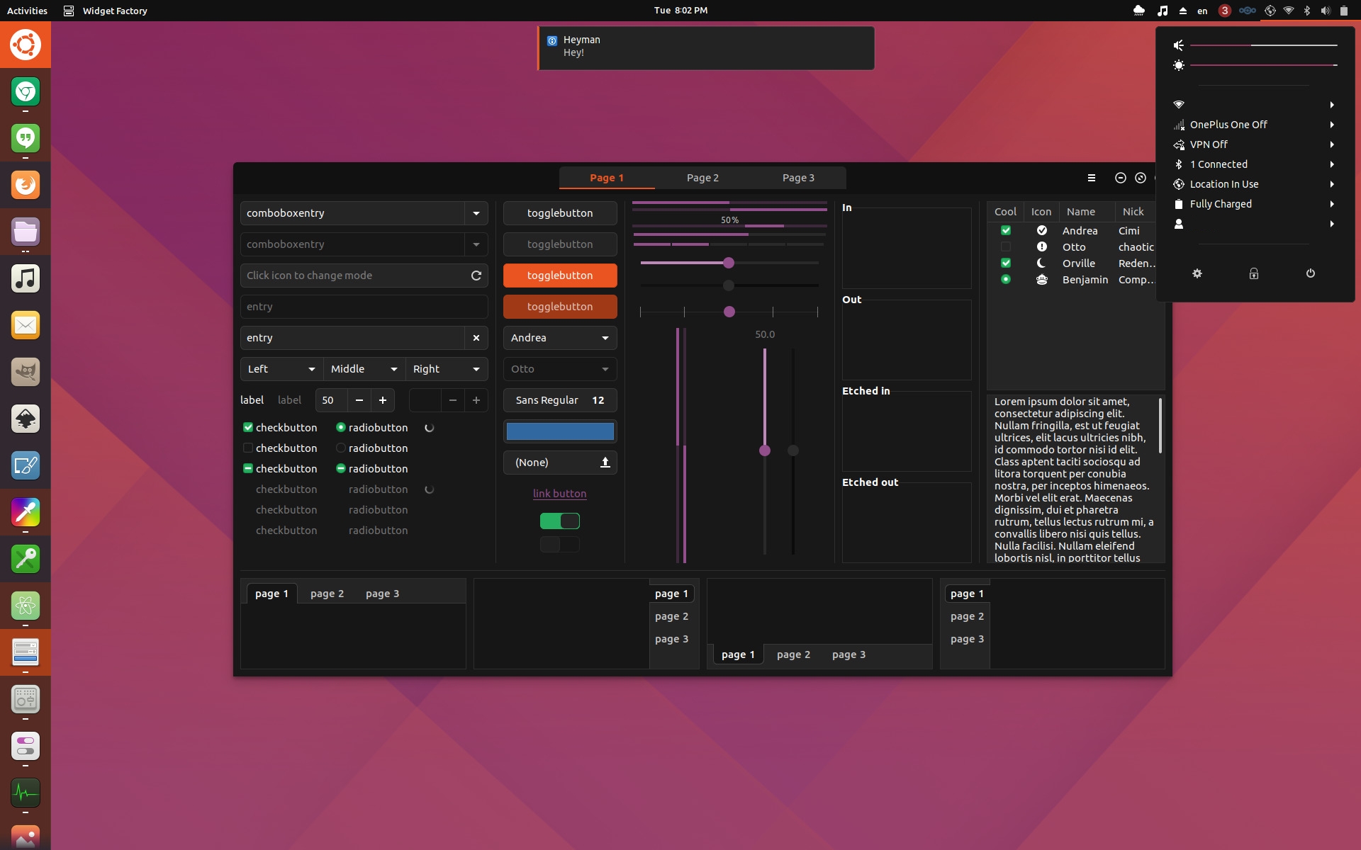
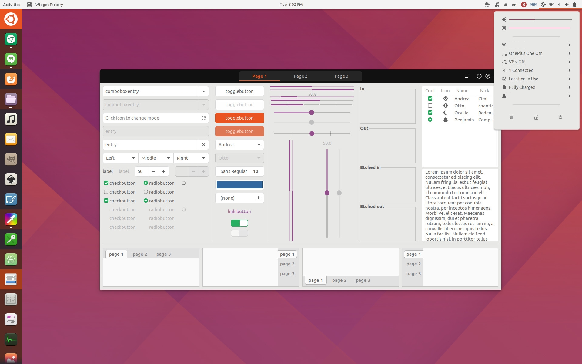
I really like the gtk theme but i have a question for the shell theme. Someone know how can I remove the logo from the dock and have the simple 9 dot button?


Ratings & Comments
180 Comments
10 10 the best
10 10 the best
I second satigik's proposal, and remove the gray window shading over the whole of the unfocused windows. It's very difficult to read text or displayed content when the entire window is shaded like that. Please remove it.
3 -
I really like this theme, but It has one thing that doesn't let me use it. It is that (extreme) shading on the background windows. I work with two monitors, and while I'm writing on the text editor in one monitor, I'm reading on the other, and that shading is not very helpful in such cases... How can I disable that feature? There is a workaround in the code for that? I'm not very familiar with CSS, but with the right directions, I can do it.
How can I config UI like this? http://www.omgubuntu.co.uk/2017/05/united-gnome-theme-updated
Love the theme! May I ask, which icons are used in the screenshots? Thanks.
Still the best theme ever, always getting better. Two minor quibbles - would it be possible to better articulate the division between two left-and-right snapped windows? Also, any chance of fixing this bug with curved corners trying to render in the split headerbars that appear in some apps? https://i.imgur.com/LZFjLBX.png The window screenshot makes it look transparent since it only renders toolkit elements I thnk, but normally it's a black triangle on one side of the division and a little distracting.
Better screenshot: https://i.imgur.com/z07ILqk.png
Hands down my favorite potential new default theme for Ubuntu 18.04 LTS, if you ask me!
9 ..
Thanks so much for the Debian variant (^▽^) Upvoted! Keep up the good work.
9 An almost perfect theme, if you ask me! Very stylish and clean. I especially like the wide, but fitting use of transparency. BUT: Why on earth gray fonts on the desktop (I enabled files on desktop in Tweak Tool)? I can (barely) tolerate them in the Nautilus sidebar, but gray fonts on the desktop hurt my eyes. The default white would be great here.
I really like the gtk theme but i have a question for the shell theme. Someone know how can I remove the logo from the dock and have the simple 9 dot button?
I just removed it using dash to dock
9 Excellent work! Love this theme.
9 it is awesome
Tanks, look great on Ubuntu Gnome.
Doesn't worl with ubuntu 15.04!
The best.
My new Favourite Gnome Shell and Theme, Good Job! :D
look nice
9 nice the stack looks a bit strange(no borders)
Wonderful
Great theme, thanks