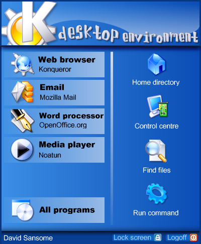
Description: This is another idea for the KDE menu. The user will be able to select his/her preferred applications for each of the tasks on the left. All the icons and positions will be customisable.
The download link only takes you to the XCF file - there is no code yet.
I personally love it...i've been using kde on and off for about 2 years and i think the menus ugly as crap.
course, i love cute stuff, this may be because im a girl, but still, i think its awesome :)
All the apps in the menu are the kind you're likely to keep on your kicker for easy access.
I typically put apps I'm likely to use alot on my kicker. I use the K-menu to retrieve lesser used apps or create a quickbrowser (eg. I have a seperate menu for my games).
It works like a charm.
The idea of changing the current KDE menu is simply good. I hate the way menus of most desktop environments/window managers work.
Looks should be customizable. MANY people want eye candy. But, because of customizability, the eye candy can be left out and the menu can be just plain functional.
The XP menu (as far as I've seen it) would be a good basis. Easy access to recent applications is already integrated in KDE, but it's half way up the screen. If things like that can be improved, and customization or even theming of the menu is achieved, I think it can provide a great thing for anyone, from the "plain" desktoppers to the eye candy freaks.
Having to deal with XP and newbie users daily i find that menu style
horrible. I find that style annoying and confusing.
I dont understand why most things presented here are
ripoffs of other stuff.. but ripping off the really bad
stuff from Windows is sad.
Use your creativity and do something completely new...
and thin about usability!! and not looks
why not make a round menu which appears, where your mouse pointer is? almost every keyboard has a windows keyboard. use that to pop up the menu. and for the menu entries use self-explaining icons, and put them in "slices". i personally don't like moving the mouse up and down to access menu entries. going in several directions to access them should be quite a bit faster.
Actually, that screenshot looks to me a childish toy OS, this is nice to look at but don't seem very usable (and would probably be very consuming in system ressources, but that is normal for a future windows).
I really prefer the actual KDE look.
Well, before expressing my opinion, I want to say just a thing.
Yhe idea of omproving the K-menu started with the uga's post "innovative". But is there really something innovative here?
Actually I don't like too much huge menus, but that's not the point. The point is that making these menus is, IMHO, just remarking the kde way of doing things.
Ok, MacOSX and WinXP may be beautiful OSs, and we have to learn a lot from them. But we can't just stay and make carbon copies of their ideas!!! Better, we could teke the best of their ideas and improve it. So, if someone likes the huge xp-menu, he could suggest different looks of these menus, if someone just want to put the "Change user" menu in the K (That I think is one of the best thing xp have introduced: user changing without logoff) so take this idea and improve it.
But, please, do not put a copy of xp menu and call it "Innovative".
Now waiting for critics!
I think this is a good idea.
Maybe it could be custumizable through Kcontrol so everyone is happy. Have it so you can turn on that portion of the menu. Kinda like the option to use the side kde logo on the menu
although this cuts down information for newbies quite well it cuts it down too much for people who want to work with the system...
i prefere the ideas where the menu is used for additional information as well (eMails, ToDo-Lists, Time, Schedule, Weather;-), ...)
For gods sake, im not critising your for having an idea, but please, it just looks like XP to me! Ok, I like OS X look yeah, but this is KDE, cant something more original be developed! Fine taking the basis of an idea, and vastly improving on it, but not just making it totally identical.....


Ratings & Comments
14 Comments
I personally love it...i've been using kde on and off for about 2 years and i think the menus ugly as crap. course, i love cute stuff, this may be because im a girl, but still, i think its awesome :)
But Just copying a bad Idea microsoft had doesn't make it a good idea.
All the apps in the menu are the kind you're likely to keep on your kicker for easy access. I typically put apps I'm likely to use alot on my kicker. I use the K-menu to retrieve lesser used apps or create a quickbrowser (eg. I have a seperate menu for my games). It works like a charm.
The idea of changing the current KDE menu is simply good. I hate the way menus of most desktop environments/window managers work. Looks should be customizable. MANY people want eye candy. But, because of customizability, the eye candy can be left out and the menu can be just plain functional. The XP menu (as far as I've seen it) would be a good basis. Easy access to recent applications is already integrated in KDE, but it's half way up the screen. If things like that can be improved, and customization or even theming of the menu is achieved, I think it can provide a great thing for anyone, from the "plain" desktoppers to the eye candy freaks.
Having to deal with XP and newbie users daily i find that menu style horrible. I find that style annoying and confusing. I dont understand why most things presented here are ripoffs of other stuff.. but ripping off the really bad stuff from Windows is sad. Use your creativity and do something completely new... and thin about usability!! and not looks
why not make a round menu which appears, where your mouse pointer is? almost every keyboard has a windows keyboard. use that to pop up the menu. and for the menu entries use self-explaining icons, and put them in "slices". i personally don't like moving the mouse up and down to access menu entries. going in several directions to access them should be quite a bit faster.
Maybe this is innovative: http://www.winsupersite.com/images/showcase/longhorn_fake_7.gif If kde would make something similar, we'd be ahead of xp and osx and they'd start copying from us!
Actually, that screenshot looks to me a childish toy OS, this is nice to look at but don't seem very usable (and would probably be very consuming in system ressources, but that is normal for a future windows). I really prefer the actual KDE look.
The idea is not too bad, but actually it's true, I think that things like this may not be too usable...
Well, before expressing my opinion, I want to say just a thing. Yhe idea of omproving the K-menu started with the uga's post "innovative". But is there really something innovative here? Actually I don't like too much huge menus, but that's not the point. The point is that making these menus is, IMHO, just remarking the kde way of doing things. Ok, MacOSX and WinXP may be beautiful OSs, and we have to learn a lot from them. But we can't just stay and make carbon copies of their ideas!!! Better, we could teke the best of their ideas and improve it. So, if someone likes the huge xp-menu, he could suggest different looks of these menus, if someone just want to put the "Change user" menu in the K (That I think is one of the best thing xp have introduced: user changing without logoff) so take this idea and improve it. But, please, do not put a copy of xp menu and call it "Innovative". Now waiting for critics!
I think this is a good idea. Maybe it could be custumizable through Kcontrol so everyone is happy. Have it so you can turn on that portion of the menu. Kinda like the option to use the side kde logo on the menu
although this cuts down information for newbies quite well it cuts it down too much for people who want to work with the system... i prefere the ideas where the menu is used for additional information as well (eMails, ToDo-Lists, Time, Schedule, Weather;-), ...)
For gods sake, im not critising your for having an idea, but please, it just looks like XP to me! Ok, I like OS X look yeah, but this is KDE, cant something more original be developed! Fine taking the basis of an idea, and vastly improving on it, but not just making it totally identical.....
And XP menu usability is really bad bad bad. this doesn't look good.