


meteo-qt
dglent


Source (link to git-repo or to original if based on someone elses unmodified work):
Added Full Screen Site Preview
---------------------------
Initial Release


Other Various Stuff:

Score 7.2
Score 5.0

Score 5.0


Score 5.0

Score 5.0

Score 5.0
Ratings & Comments
8 Comments
Duno how this happened, but its fixed now.
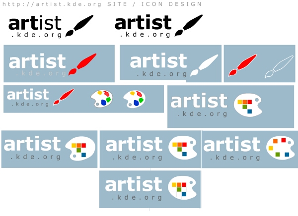
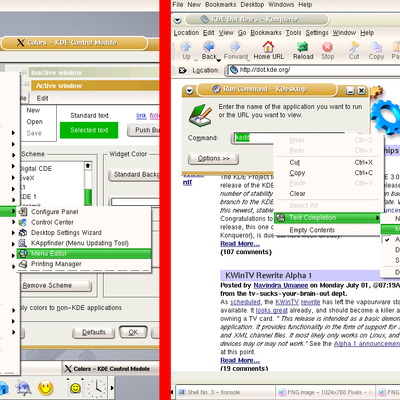
looks more finished now... :) still don't like the font in logo (imho worse choice than the previous verdana) and these "pixels" really don't fit to the palette, don't you feel it so?
...is not available! I always get the old one!
I think that artist.kde.org should have been wiped and reloaded a long time ago. What is the time frame and what is the goal of the new site? ( I belive that I alread know the answer to the second part)... BTW I like the red paint brush.
The time Frame? thats a good idea, we should make one. Off course there is no Time Frame a the moment, all should go as fast as possible. Nice to hear that you like it, i'll use it in the next versions of the Logo. I also think about using another font as Luci said.
Sure you could use my Paintbrush shape for the site design. I don't think so. The Idea of a Logo is the main part not a 'original' Font. The Font must only fit to the rest of the page, so that all together gives one whole thing. Okay yes too expected, whats bad with that? I think you better have a Logo that is expected how you'd say, a Logo that is understandable for the user, then having no Logo. Where is a Logo in Your Design? And if it really exists, is it really (well) founded? These colouredshapes are pixels, that show that kdeartists are bit different from normal artists, because they work only with pixels ( and vectors :P). You have two different navigation Bars in you design, and that is what you call a logical structure? I have one section for New Things News Featured artist and new tools, and i have the other things in another section. The other section is the Kde-Family Section. I think at the Moment it is very hard to compare the two designs because i only included a screenshot of the left part of the Page. When you see the whole screen you'd realize, that this is a consitent design, and is useable and doesn't play with different Layers of photos with low opacity. That is very difficult to do in html and it needs much bandwidth for the user. But thats just my Opinion
thanks >I don't think so. The Idea of a >Logo is the main part not a >'original' Font. The Font must >only fit to the rest of the page, >so that all together gives one >whole thing. good logo doesn't need the textual information at all or it mustn't be so big in size as yours. smaller "artist.kde.org" made with good loooking font would be better... >Okay yes too expected, whats >bad with that? I think you >better have a Logo that is >expected how you'd say, a >Logo that is understandable >for the user, then having no >Logo. again, good logotype should be original, match the idea of "business" and be rememberable at first sight ;) >Where is a Logo in Your >Design? it's the "K" made of connected dots concept with pencil on it. these dots resembles together a "star constellation". still thinking about the final look and feel. i was thinking about filling each/some dot of the logo with a color (palette-like) or made one more line connecting dots to add "A" for Artist anyway i think each theme can have different logotype as seen on various skinning sites... kde artist is no trade mark (it's the KDE logo or KDE mascot for this here) so we don't worry about it... ;) >And if it really exists, is it >really (well) founded? maybe yes, maybe not, but nobody asked about this except you... :o) >These colouredshapes are >pixels, that show that kdeartists >are bit different from normal >artists, because they work only >with pixels ( and vectors :P). i don't think so. kde artist can work today with whatever he/she wants... >You have two different >navigation Bars in you design, >and that is what you call a >logical structure? i think yes, my concept is different. the top bar is to reach quick and easy the main section you want (maybe i forgot some). the left menu is a submenu of the main section you choosed. the whole layout is optimized for size and for any browser and still good looking... there should be no barriers for anyone at kde sites, anyone can be "KDE artist" even he/she is blind. >I have one section for New >Things News Featured artist >and new tools, and i have the >other things in another section. yes, you have got another concept of menus which i respect :) >different Layers of photos with >low opacity. That is very >difficult to do in html and it >needs much bandwidth for the >user. it's just a subject of layout u choose to prefer. of course i will optimize the graphics (e.g. cca 3KB for the background is acceptable) as much as possible and i know how to do it in html too, don't worry ;) if it'll be so high for bandwidth i can simply switch it off in css and the layout can live without it on... no problem :p cheers, luci
hi, here's my opinion... what i like: - the paintbrush shape (can i use it for something at artist.kde.org?) - the colours what i don't like: - the textual logo "artist" (verdana is too common to be an original logotype) - palette or paintbrush is so common/expected for an artist site logo - the cubical coloured shapes really don't fit the oval palette shape (these "drawed by hand" are better) - the webpage layout is just "glued by eye", no logical structure, elements don't fit together