


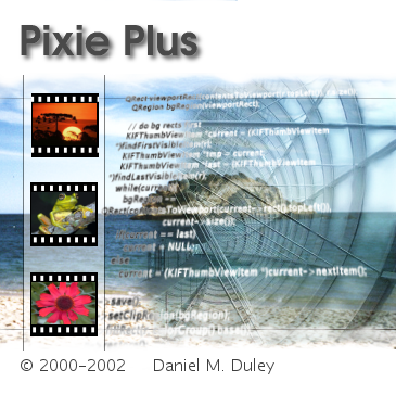
It's a screenshot of a logo suggestion i made for Mosfet's mega cool upcoming new "Pixie Plus"

I hope you like it more then the first one and
if not feel free to post comments. It's the only chance for me to improve it !
Notice ! There is nothing useful to download here. !


Ratings & Comments
3 Comments
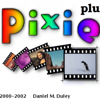
...I think it's too messy.
I'd like to see something more interesting done with the copyright/credit line. Compared to the rest (which I really like) it's just too plain, and feels like an afterthought. Matt
I will change that soon. Yesterday i had a bad crash that killed my perfectly running system. Now gimp provides only a few ugly fonts and no truetype fonts. I installed all my truetype fonts with kde fontinstaller. Every kde app and OpenOffice has all available fonts. Only the gimp makes problems. I have xfs running. No clue. If someone knows what to do ... But nevertheless i will change the copyright line to give Mosfet's name the shine he deserves :)