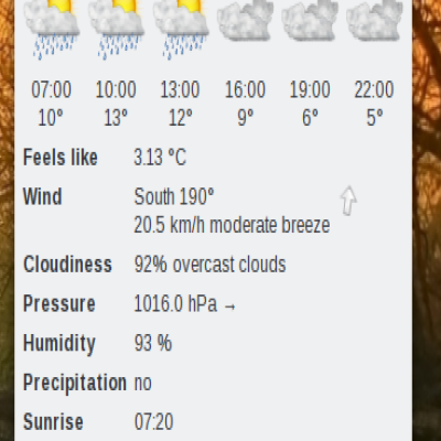
Description: New version of the KDE Lineart Logo. While the old version consisted of circles and lines the new one makes more use of curves. Therefore the new one looks more dynamic.
The kdelogo_lineart_variation.* files contain: * the old version on the left * the new version in the middle * a variation of the new logo on the right which was inspired by the Bright Logo by Chris Luetchford
Feel free to use it to promote KDE on business cards, to decorate your wallpapers, etc. (You might even want to use it as a tattoo ;-).


Ratings & Comments
0 Comments