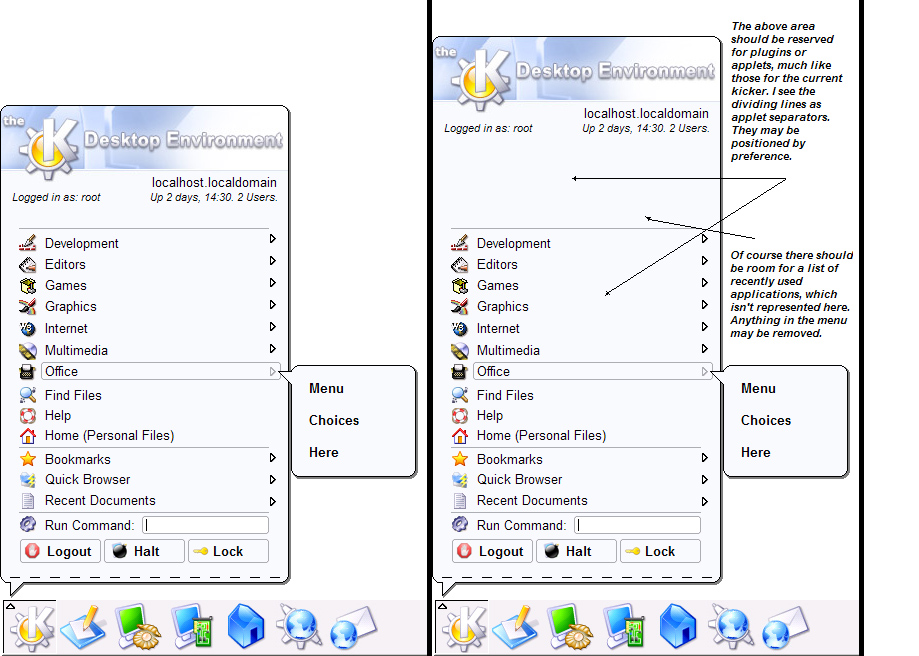
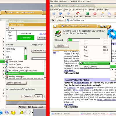
Description: This is my proposal for a new KMenu. I find the previous ones excellent and you can see how I copied some of the elements in each (I hope no one is offended). However, I find that the Windows XP start menu is a little too busy and the current KMenu is falling behind in the eyecandy business. My proposal calls for a menu with one column of options. It also allows for theme designers to theme the KMenu the same as their window decorations and styles. I feel it should all be integrated. Isn't this what KDE is about? Allowing for themes and not a standard look that is best for all. I feel that this is the easiest proposal to implement based on current KDE GUI practices.
I added a second screenshot which kind of shows a translucent effect. I haven't had time to make it look perfect, but hopefully you get the idea.
Due to complaints, I have updated it to hug the screen edge. Also, I have eliminated the large buttons at the bottom. Those who said they were too large are right.
Let me know what you think about the integrated run command. I for one would find such a feature useful.
People talk about "innovation." How would making the menu like XP make it innovative? Also, what about Kroupware? I think that a second menu should be built to support the mail and scheduling. In the future, I will provide a screenshot of what I am describing. Also, what purpose does the time in the KMenu serve? Of course it should be an option under an applet system (as seen in the most recent screenshots). However, I see no purpose for items that are currently in the kicker.
It looks great, out of all the ones I've seen on kde-look.org recently this is by far the most effective.
One question, can we get some code down so that it can be used. I really like the run feature builtin to the menu. I would like very much to see this be distributed.
XinMan
How did you get those AA fonts on KDE? The ones that KDE has now look ugly. GNOME2's were like that as well, but apparently RH has patched their GNOME, so you can optimize AA for laptop displays, etc...
If you did integrate the "run command", it would have to be optional. I really like such things as the icon that reflects what you type in, and the advanced options in minicli (the current run command box.)
And I'd like to see a strong optional drop-shadow for the start menu. Yes I know that KDE 3.1 will have drop shadows for the menu, but what about a stronger drop shadow for the start menu? What do people think?
A change of layout and style of the existent kde menu is welcome :). and imho this one is cute and more usable tan the default. However ... (ahem)
However, i think a menu should be built based on "less clicks and mouse movement for common applications/groups". As Eugenia mentioned in her reviews, most menus look cluttered and some have multiple entries for the same thing. Therefore, i dont think it's worth just adding plugins in the menu and a nice frame. Probly a redesign... any volunteers.. :) ?
The screenshots look really nice. But I'm not sure about the baloon style in a menu. It gives the feeling of a (really big) tooltip :) That;s why i'd go for a "Dynamic menu" style. The frame circleing the parent entry and the submenu looks cool and is probably quite easy to implement. although i'd be curious to see a concept on small fonts (let's say 11pt) and left-right nested cascades..
in conclusion: new menu for kde? definately, but not just for the sake of eyecandy.
Please start a project for the next KDE Menu! Register your project at sourceforge.net and upload there a forum or I can create a forum at kde-forum.org but PLEASE START DEVEL NOW!!!
zenok
http://urbanlizard.com/~aseigo
there is a link to some work that i started during 3.1 and will finish for 3.2 ... i put it aside for 3.2 to take care of more pressing issues for 3.1 ...
the source and screenshot are a bit old. i've got some slightly newer work on my HD at home.
the design is not meant to create a new popup menu widget (how will it look consistent with the given style, otherwise) but there is quite a bit of graphic design to be done on it. the focus is REAL usability and functionality.
I'm glad that there are people who want a new start menu, however, I think it needs more innovation. I mean this is the same menu with more/different graphics.
What I want is more functionality. The menu is very messy, it would be helpful if it could be grouped better, maybe a couple of main categories, and I like the two-column part of the XP menu. ^_^
rendering common elements of the desktop really needs to be kept in the widget style IMHO. this will keep things looking and working consistently. this means largely sticking to already existing widgets.
you are correct that many of the pseudoscreenshots so far mostly consist of new graphic treatments of the menu. such a graphical facelift should be handled by the widget theme.
would be cool to se a launcher in the menu
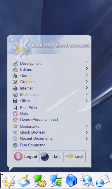
(first screenshot)
to be innovative, i think icons, which are most used should be bigger, than others!
i don't no if one should change their order but size is ok.
i like it a lot.
however, i would definitely remove the big KDE banner at the top. i like the
graphic itself, but i'd rather make the
menu more 'to the point'.
good work.
Of all tghe "innovative" K-Menus I've seen here - this is the only one I would probably use. The so called innovative ones here are often big and clunky. Plus they look a lot like the WinXP Start menu...and I *hate* the WinXP Start menu. The second screenshot of this menu is probably, IMHO, the closest combination of "innovation" and usability. You're right, we DON'T need hughe shutdown/logoff buttons. We also DON'T need a huge menu with only a few giant options. A new e-mail button is very nice, so is user info and the date, and a scedule, but why do we need to have giant icons with this making a huge XP-like menu??? Maybe ad it as an option, but I prefer to stick to the basics. In fact, I use K-Menu so little it never even occurred to me that it needed fixing.


Ratings & Comments
31 Comments
Great. It HAS to implement in kde 4.0!
this is the best start menu I ever have seen in my life, really! Please build this thing.
I like yours the best of all the kicker mockups.
It's perfect.
It looks great, out of all the ones I've seen on kde-look.org recently this is by far the most effective. One question, can we get some code down so that it can be used. I really like the run feature builtin to the menu. I would like very much to see this be distributed. XinMan
How did you get those AA fonts on KDE? The ones that KDE has now look ugly. GNOME2's were like that as well, but apparently RH has patched their GNOME, so you can optimize AA for laptop displays, etc...
If you did integrate the "run command", it would have to be optional. I really like such things as the icon that reflects what you type in, and the advanced options in minicli (the current run command box.)
And I'd like to see a strong optional drop-shadow for the start menu. Yes I know that KDE 3.1 will have drop shadows for the menu, but what about a stronger drop shadow for the start menu? What do people think?
It looks beautiful!!!!!!!!! Perfect!!!
A change of layout and style of the existent kde menu is welcome :). and imho this one is cute and more usable tan the default. However ... (ahem) However, i think a menu should be built based on "less clicks and mouse movement for common applications/groups". As Eugenia mentioned in her reviews, most menus look cluttered and some have multiple entries for the same thing. Therefore, i dont think it's worth just adding plugins in the menu and a nice frame. Probly a redesign... any volunteers.. :) ? The screenshots look really nice. But I'm not sure about the baloon style in a menu. It gives the feeling of a (really big) tooltip :) That;s why i'd go for a "Dynamic menu" style. The frame circleing the parent entry and the submenu looks cool and is probably quite easy to implement. although i'd be curious to see a concept on small fonts (let's say 11pt) and left-right nested cascades.. in conclusion: new menu for kde? definately, but not just for the sake of eyecandy.
Please start a project for the next KDE Menu! Register your project at sourceforge.net and upload there a forum or I can create a forum at kde-forum.org but PLEASE START DEVEL NOW!!! zenok
http://urbanlizard.com/~aseigo there is a link to some work that i started during 3.1 and will finish for 3.2 ... i put it aside for 3.2 to take care of more pressing issues for 3.1 ... the source and screenshot are a bit old. i've got some slightly newer work on my HD at home. the design is not meant to create a new popup menu widget (how will it look consistent with the given style, otherwise) but there is quite a bit of graphic design to be done on it. the focus is REAL usability and functionality.
I'm glad that there are people who want a new start menu, however, I think it needs more innovation. I mean this is the same menu with more/different graphics. What I want is more functionality. The menu is very messy, it would be helpful if it could be grouped better, maybe a couple of main categories, and I like the two-column part of the XP menu. ^_^
rendering common elements of the desktop really needs to be kept in the widget style IMHO. this will keep things looking and working consistently. this means largely sticking to already existing widgets. you are correct that many of the pseudoscreenshots so far mostly consist of new graphic treatments of the menu. such a graphical facelift should be handled by the widget theme.
would be cool to se a launcher in the menu (first screenshot) to be innovative, i think icons, which are most used should be bigger, than others! i don't no if one should change their order but size is ok.
What about the litte line at the end of every menu, where you can make a normal window out of a menu?
I liked the look of this one better (the color of the selected item and the way the submenu comes of out it, great !): http://www.kde-look.org/content/preview.php?file=3577-1.png Can't you mix both of them ?
I think new users would love it. Alt + F2 isn't really intuitive.
I love the design
Excellent idea, it looks really good and I would definitely use it.
I like this menu idea the best of all and I would definately love to use this....
It offers more new options than this menu. This proposal really only makes for a nice design...
Sorry, I meant dynamic, not Innovate.
i like it a lot. however, i would definitely remove the big KDE banner at the top. i like the graphic itself, but i'd rather make the menu more 'to the point'. good work.
Of all tghe "innovative" K-Menus I've seen here - this is the only one I would probably use. The so called innovative ones here are often big and clunky. Plus they look a lot like the WinXP Start menu...and I *hate* the WinXP Start menu. The second screenshot of this menu is probably, IMHO, the closest combination of "innovation" and usability. You're right, we DON'T need hughe shutdown/logoff buttons. We also DON'T need a huge menu with only a few giant options. A new e-mail button is very nice, so is user info and the date, and a scedule, but why do we need to have giant icons with this making a huge XP-like menu??? Maybe ad it as an option, but I prefer to stick to the basics. In fact, I use K-Menu so little it never even occurred to me that it needed fixing.