


meteo-qt
dglent


Source (link to git-repo or to original if based on someone elses unmodified work):
It looks like i wasn't making myself clear
enough about what i'm trying to suggest here. so i made yet another drawing,
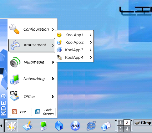
this one shows how a menu could look like
but with all special items DISABLED.
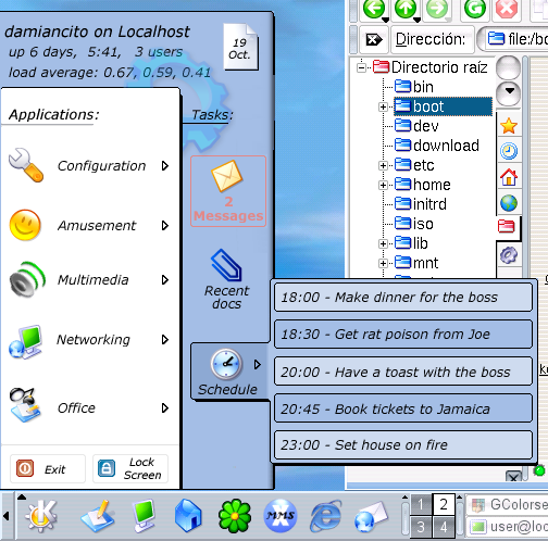
now the first screenshot shows the full
menu with the mail notification and such,
and the second one shows how it would
look like without them.
(The way the submenu opens up remains
part of my personal wishlist ;o))
Damian


Other Various Stuff:

Ratings & Comments
86 Comments
I want a new menu that is possible to configure to look however you want it to, the more configurable, the better. But this design rules, so I want this as default.
plan for KDE 3.2 which title reads something like "add task-oriented menu option" .. so let's see what they have in mind.. ;o) anyway, be sure to vote "good" on this newer, more generic thread about improving the menu.. http://www.kde-look.org/content/show.php?content=3864
Especially the second screenshot (the simple version) look awesome. The more complex one is great too, although the load average is not someting I would display in a menu. Almost nobody knows what those numbers mean anyway. The recent documents thing and schedule are nice concepts (if they can be disabled).
This new screenshot showing a simpler menu, just made me vote to this menu! It have the right look, but I was feared that it would be to much bloated, now I don't fear it anymore :)
How do you plan to implement this? Are you capable of coding these new features, or is this an idea for submission to kde developers?
Like some people already said, this makes absolutely no sense. Why put email and appointments in the K-Menu? That's what kicker applets are for, you can choose your apps and put them there. Hmmm it would take to much space huh? Well there are panel extensions and other simillar things... not good enough, well think about something else, don't just throw stuff in the Kmenu! Maybe an aditional menu for that kind of stuff, that could be nice. Something like a button that shows a menu with 'applets'. (Just thougt of it now). Anyway my point is, IMO the idea makes no sense and it is terrible in terms of usability. J.A.
Please READ the discussion going on here before you post! The idea is *NOT* to add ANYTHING SPECIFIC to the K menu. it's about making the menu show more INFO! (i especially like the idea of a plug-in interface. Although it's not necesary at all, it would make things a lot cleaner) "why not in the kicker?" The Kicker simply does not have enough space to show uptime, logged users, and appointment information. And even if it had, it would make for so much clutter it would end up worse than it is now. >Maybe an aditional menu for that >kind of stuff, that could be nice. >Something >like a button that shows a menu with >'applets'. >(Just thougt of it now). Two menus? it would only add more complexity. (the plugin interface i keep dreaming about would probably allow the user to select where they want the info, so your suggestion could be possible as well, anyway) >Anyway my point is, IMO the idea >makes no sense and it is terrible in >terms of usability. and IMO a better menu is the only think KDE is really missing. :o)
First of all, sorry if I sounded rude or anything (I think I might), I did not intend to, just sharing my opinion. ;) > Please READ the discussion > going on here before you post! I did. > The idea is *NOT* to add > ANYTHING SPECIFIC to the K > menu. it's about making the > menu show more INFO! INFO *is* SOMETHING. > (i especially like the idea of > a plug-in interface. Although > it's not necesary at all, it > would make things a lot > cleaner) > (i especially like the idea of > a plug-in interface. Although > it's not necesary at all, it > would make things a lot > cleaner) yeap > "why not in the kicker?" > The Kicker simply does not have > enough space to show uptime, > logged users, and appointment > information. And even if it > had, it would make for so > much clutter it would end up > worse than it is now. Yes, I can understand that. And I find that information to much for the KMenu too, it will get huge and messy. KMenu main purpose is to select and run applications (and documents). > Two menus? it would only add > more complexity. What about adding more complexity to the KMenu? Is that ok? It is not adding more complexity, is grouping things in a logic way. You can already add special buttons to the KMenu. I remember SuSE had one for YaST stuff. It would be a new menu with something similar to applets. Applets in menus, I kind of like *that* idea. Just not like that in the KMenu. Ok maybe as an option... maybe you could have special buttons for those 'applets', and be able to add those applets to the KMenu too, that way you can choose where to put them. But the KMenu should be simple by default ;) > (the plugin interface i keep > dreaming about would probably > allow the user to select > where they want the info, so > your suggestion could be > possible as well, anyway) Hmmm yeah maybe. > and IMO a better menu is the > only think KDE is really > missing. :o) Nah, it is missing much more than that, but that's another story ;) J.A.
Don't worry, i didn't think your comment was rude or anything. However, i did feel like you were criticizing stuff that is not necesarily a part of what i want you guys to criticize, (or at least not exactly) >> The idea is *NOT* to add >> ANYTHING SPECIFIC to the K >> menu. it's about making the >> menu show more INFO! >INFO *is* SOMETHING. yes, but not something Specific ;o) >And I find that information to much >for the KMenu too, it will get huge >and messy. KMenu main purpose is >to select and run applications (and >documents). i agree completely. it COULD get messy if you enabled everything at once, but the idea is to have the choice of what you want and what you don't want. (anyway, have you tried enabling EVERYTHING in the current menu? like recently used apps, shortcuts to home directory, find files, 15 different app categories and so on..... it can get tall enough to reach the ceiling!) >But the KMenu should be simple by >default ;) agreed. >Nah, it is missing much more than >that, but that's another story ;) anything in mind? ;o) Damian
When I click download i see only a screenshot in a png format.Where is the program ? I WANT IT !! :)
interest. It's a few days since i had seen the last post on this subject so i thought nobody cared anymore... :o/ anyway. about getting the menu: I'm sure implementing it requires changes in KDEbase and maybe even Qt itself, so if you want to see it getting real, the KDE developers are the ones to ask for it. (besides they are probably beginning to think about it already.. this issue was kinda hot a couple of weeks ago) for example, a lot of people seemed to like the way i drew the submenu expanding, "centered" with the parent menu rather than "leveled", but a theme alone can't do that..... i've come up with a way to make the Kmenu show info about new e-mail messages and other "dynamic" data, using cron jobs and a couple of perl scripts. really easy to do.... however, the menu's current structure -poor!- coupled with the harsh way in which Mandrake updates KDE's menu (overriding my changes) makes my hack rather useless. I really hope something new and Good (TM) comes out of this.. Damian
All this mail and appointments stuff in the menu makes no sense. It's as abad as Microsoft's "press START button to SHUT DOWN"... I want APPS in my menu. Just APPS. Yes, a very nice looking menu, customizable looks. But if we start putting everything in the menu, we can throw away our (outdated) kicker as well. Honestly, I don't understand why people prefer a mail icon in the menu (a click away) while you can have it in sight... I'm not saying this idea os dumb or anything. I just can't see it being useful.
I don't like XP at all myself, and I would hate it to see KDE thoughtlessly copying XP. But I think the latest version of this menu is very good, and a lot better than XP: it takes up a lot less space than XP's menu, it does keep a single, quickly accessible application menu (where XP tries to hide less often used applications in a submenu so it is again one click further away), and it brings some useful additions, because it integrates e-mail and agenda really in the system. Why is this good to have this in the apps menu? Well, now it is much more visible to newbies! Be honest, how much newbies do really use the icons in the system tray? Have you ever seen the system tray of an average Windows user? It is surely cluttered with a lot of applications from which newbies don't even know they are starting automatically. I know the situation is a lot better in KDE, but still newbies tend not to use the few icons in it. Why would they use the icons in the apps menu then? Well, actually, the icons are a lot more clearer (because they are bigger and because they are located in a place where people actually will look much more in detail, because they have to read the menus), and, there's also an explanatory text beneath it, which just says what it does. Now newbies will understand what it is, and actually start using it. And they will conclude that KDE is a very handy system, because e-mail, agenda, etc. is so accessible and integrated. While we, power users, know that in fact, it was just as accessible before, but for people new to KDE, it will make a huge difference.
How about putting the email checker and appointment thingy as an applet in the kicker by default. Not in the system tray maybe, but new applets. Your saying that Microsoft puts stuff away so you need to click once more. True, that's not good. But why put email status and things like that in the menu then? It's also an unnecessary click away. Just putting in my thoughts, I too want the KMenu changed. :)
Hmm, you got a point there. But I'm afraid that a seperate applet would take too much space. Well, but it could of course be an option for those who want it :-) But I think that in the end, newbies will be quite happy with the solution proposed here, and power uses will use the current way of putting a small icon in the systray and maybe will switch to the classic menu. But indeed, it's excellent that there are finally some serious attempts to develop a new usable, functional and pretty menu. And discussions like these will bring up new ideas which will only result in yet more improvements! :-)
This one looks real good. Make the buttons to the right customizable/optional and most people would love this menu (that's my guess). Example: Let the user pick 0 to 5 buttons from a nice set of special buttons(plugins) and put them on the right side of his/her K menu. Some buttons that can be useful: mail checker, schedule, recent docs (like the screenshot) recent apps, most popular apps, find, help, quick browse, run command. And maybe: hardware monitor (mem,swap,disks,temp,...), mount applet, news, weather, TV programs
yeah the items on the right would definitely be optional. having several possibilities to choose from is a good idea. besides, if the interface to build new items is simple enough, hobbyists would be able to make customized, new menu items displaying different kinds of information. imagine here, on KDE-look, a section about "K menu plugins" ;o)
Given the idea was mine, I think the explanation is easy: Nobody likes a HUGE kicker, and kicker cannot display a few things for lack of space: say for example appointments, weather forecast (the KWeather forecast has not space enough there!) Ok. So the idea is NOT that everything should be there. I think both damiancito and I share the idea that it should be possible to move the applets there. Just have the option to do so! You don't like it? Leave the applet in kicker. But I think it's better to use the same API for applets in kicker and the menu, just because it makes it easier for programmers to make it available. Tell me... do you keep these applets in your kicker? They are nice, but they either look horrible (tiny) or they take TOO MUCH space from kicker! KWeather (The icon is too tight) WorldWideWatch (no space to see anything) KNewsTicker (no space left for anything in kicker, so I had to use a Child Panel, until I got bored, and removed) ... and so on And not only that: The flexibility of the menu would allow not only moving current applets to the menu: Why not a knotes applet? Why not have a Menu applet? A menu that is more flexible. Have you noticed that there's a "Run Command" in the menu and there's a "Quick Launcher" applet for kicker? They do the same, don't they? Why duplicate? Anyway, I never heard of ideas that everyone liked, and no idea is perfect. If you know how to improve better the usability, tell us. At the moment KDE is NOT perfect. So that's what we are trying to fix.
yes, i agree that no idea is perfect and no menu will ever please absolutely everyone. However, your iniciative to add "agenda-like" info to the main menu IS good. in order to please everyone the developers would only need to make it optional/customizable. this is exactly why i liked your 'innovative menu' proposal, and why i decided i would try to help. and hey, i am absolutely pleased with the level of acceptance.
Mine was meant an answer to "parena" that didn't seem to like the plugin stuff. Sure, they should be optional. But IMHO, not only that. The same way as you drag the applets in kicker, you should be able to drag them to the menu, so it's easier to decide where each applet should go (the menu, or kicker) I like your design, and it's got much less issues than mine had. Just while I'm writing I'm trying to fix some issues that mine had. It's not easy though. People doesn't like much fat menus, and therefore doesn't let me much space for the applets/plugins,... I think I'll post something soon, though with a few issues not fixed yet.
Why do you (and all the guys with the menu shots) want to put schedulter, time, mail checking in the menu ? The systray bar or apllets are made for that :( I don't want to open the menu to check my mail !! All this idea are REALLY bad and not ergonomic. You have good ideas but think of the utilisation. You don't you put konqui in the menu to chek for new theme in kde-look ? This is as stupid as puting all your goodies in the menu :(
we think a lot of people could use it? i based my 'appointments' item on suggestions. it's an OPTION. if you don't like it you would always be able to remove it.
when will you start zu implement this kmenu?
I really prefer the softer shadow in the second screenshot.
and what do you think about the new options? i'm glad you liked them but the shadows and stuff is just a drawing. my suggestion is not about a style/theme but about a new, better menu.