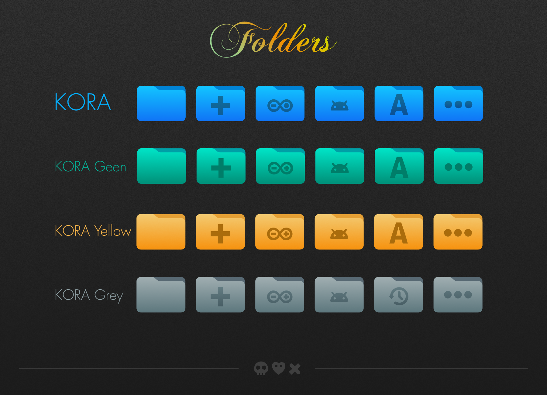
Description: Kora icon theme for dark and light UI.
*kora - for dark themes with dark panel *kora-light - for light themes with dark panel (depends on Kora) *kora-light-panel - for light themes with light panel (depends on Kora and Kora-light)
*kora-grey - icon theme with grey folder/places icons *kora-green - icon theme with green folder/places icons *kora-yellow - icon theme with yellow folder/places icons
Copy kora, kora-light, kora-light-panel and kora-pgrey subfolders to one of the following folders:
/usr/share/icons/ - icons available system-wide $HOME/.local/share/icons/ - icons only available to local user
___________________________________________ Check out free wallpapers or support on: Kofi
10Really great theme! But may I make some suggestions?
1. Make a purple folder variant => Same purple as the new gnome purple accent color
1. The previous and forward arrows on apps like nautilus are not the default arrows which in my opinion look much more modern and consistent with the whole theme. Can you change this?
Anyway keep up the good work!
Idea for a new icon for Kora: something that represents artificial intelligence.
The topic is hot, I'm creating a webApp to be on the Plasma taskbar, which will allow the user to select which platform they want to connect to.
The choice to be a webApp is due to the fact that most platforms charge for using an API.
I created a webApp, using electron, which allows the user to choose between 3 different AIs (I will add others soon), Maritalk, Gemini and GPT Chat.
This is the web page, I didn't use the API because I couldn't pay at the time.
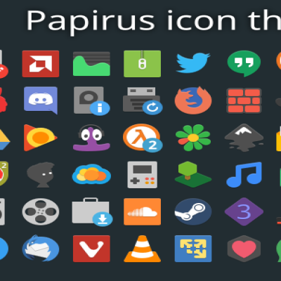
10These icons on my Linux Mint 22 look great. Very elegant and modern at the same time. Better than the classic as same as good Papirus (in my opinion).
Overall, it's a really good icon theme with a lot of work done behind it. I did find a broken icon in qbittorrent (resume/pause buttons) that I was hoping you could fix in a future release. :)
I'm posting an image just so you can see what I mean https://postimg.cc/gallery/sQtNsjc/02228e3d


Ratings & Comments
396 Comments
10 Great icontheme...I love it ! Many Thanks
10 10/10 Beautiful icon theme.
10 Really great theme! But may I make some suggestions? 1. Make a purple folder variant => Same purple as the new gnome purple accent color 1. The previous and forward arrows on apps like nautilus are not the default arrows which in my opinion look much more modern and consistent with the whole theme. Can you change this? Anyway keep up the good work!
10 Wow, that looks great! :))
Thank you!
Idea for a new icon for Kora: something that represents artificial intelligence. The topic is hot, I'm creating a webApp to be on the Plasma taskbar, which will allow the user to select which platform they want to connect to. The choice to be a webApp is due to the fact that most platforms charge for using an API.
Hi, there is no point creating icon that will point to nowhere. But if there is such application with specific name I will create the icon.
I created a webApp, using electron, which allows the user to choose between 3 different AIs (I will add others soon), Maritalk, Gemini and GPT Chat. This is the web page, I didn't use the API because I couldn't pay at the time.
10 Best icon theme. There's one thing, in the last version the "light" and "light panel" versions are missing from the default blue set
10 These icons on my Linux Mint 22 look great. Very elegant and modern at the same time. Better than the classic as same as good Papirus (in my opinion).
10 10 the best!
These icons are beautiful and modern. Congratulations! I would like to talk to a responsible person https://www.instagram.com/p/C5OTrXuOhzX/
10 This continually updated, gorgeous, colorful, detailed, coherent theme deserves the best. And its author too! :) Thank you!
Thank you! :)
10 Beautiful icons ! A pleasure to look at and use every day. Many thanks for this work of art :)
Overall, it's a really good icon theme with a lot of work done behind it. I did find a broken icon in qbittorrent (resume/pause buttons) that I was hoping you could fix in a future release. :) I'm posting an image just so you can see what I mean https://postimg.cc/gallery/sQtNsjc/02228e3d
Thank you very much for your work. Unfortunately the current kora-yellow-1-6-4.tar.xz is broken…
Hi, could you check again? I made new archives (size is different. Do not know what went wrong).
kora-yellow works now. Thank you again. :-)
10 Wonderful icon theme :) Fantastic work!!
10 this icon theme is very very nice! you have done an extremely nice job! Keep up the good work!
10 One of the best! Thanks bro!
Hello! I love this icon theme and I'm really thinking about adopting it in my distro, for the 2024 series. I will expand the color options.
I try many icon themes and I always come back to Kora,the best.Beautiful,clear and modern,what else??
10 Fresh, elegant, modern,