Description: GTK themes to match the Materia Manjaro Dark theme.
New High Contrast Style theme to match the Plasma color scheme
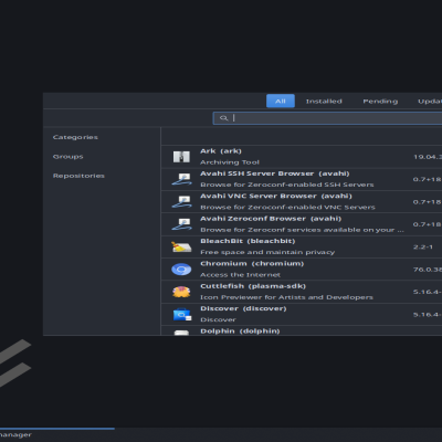
The screenshots will seem a blurry unless you click them and enlarge to get a better view of the theme. Flip thru the screenshots to see most of the stuff but it is not all because I did not have room.
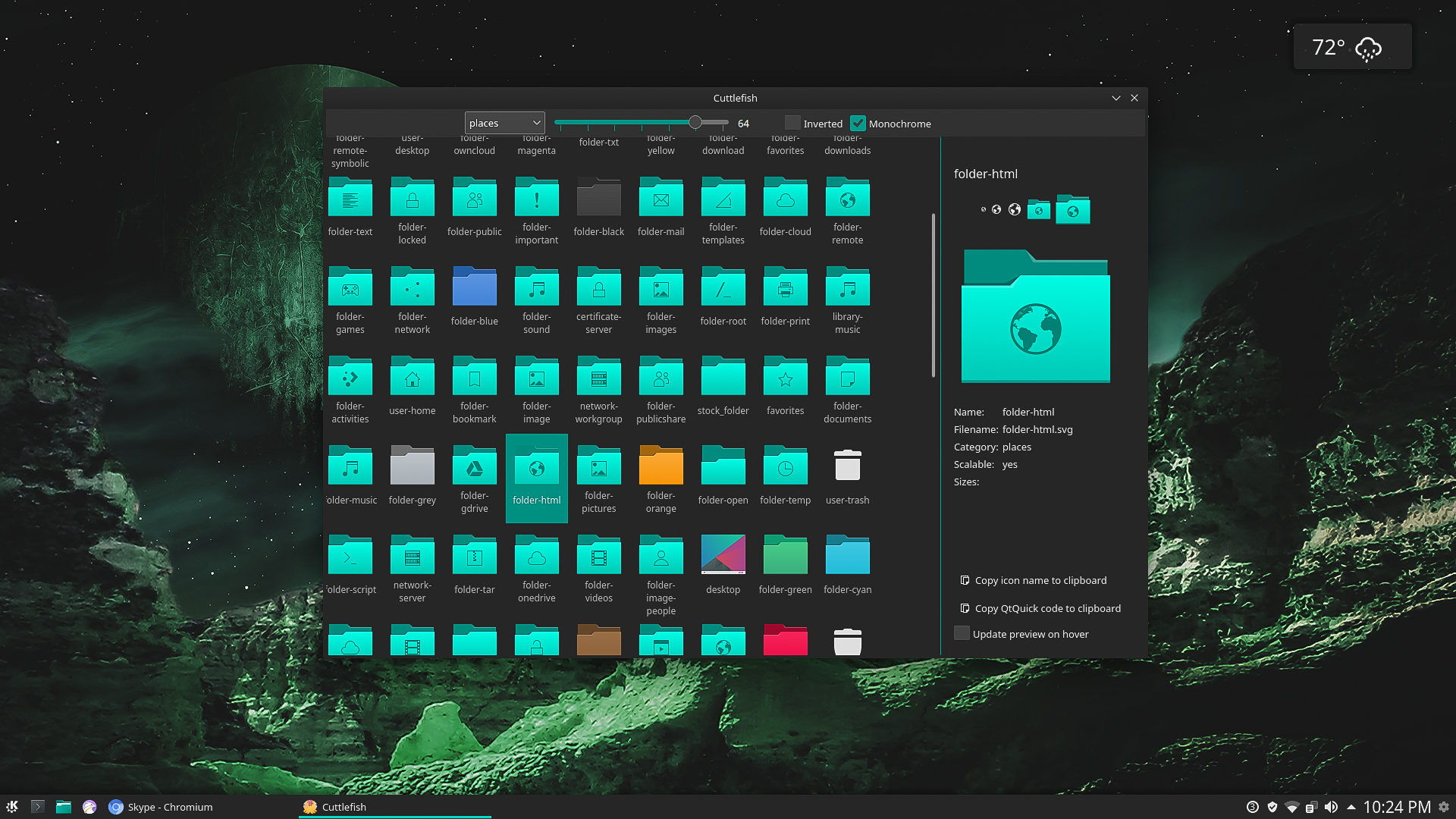
The new full icon set based on the Breeze icons that will match either the normal Materia Manjaro theme or this version which is the darker version is here: https://www.pling.com/p/1328981
The GTK themes are here: https://www.pling.com/p/1306506
The Konsole theme is here: https://www.pling.com/p/1322077
The look and feel theme is here: https://www.pling.com/p/1309269
The folder icons are here: https://www.pling.com/p/1313094
The Aurorae themes are here: https://www.pling.com/p/1309265
The Plasma themes are here: https://www.pling.com/p/1306505
The Plasma color schemes are here: https://www.pling.com/p/1306504
The theme also looks really good with Breeze window decorations.
I use Charlie Henson's wallpapers here: The theme has two wallpapers with it now so that is why you have different wallpapers in the screenshots. https://store.kde.org/p/1296893 https://store.kde.org/p/1319754
Thanks to the Papirus Development team for the use of there icons and widgets. You can find the original Materia KDE theme here: https://store.kde.org/p/122916Last changelog:
Used the latest commit for Breeze gtk so maybe the problems will be fixed.
Updated with upstream changes so maybe the problems will be fixed.
Guess that is why it is top 5 KDE theme and the one that is lighter is like number 12. That is only your opinion. The normal Materia Manjaro is the lighter one so there you go.
It has been observed that you go around to the dark themes and put some nasty comment on perfectly fine accessibility and dark mode themes. Your mental illness in not our problem. You are now being carefully watched, Mario Rouillardeau.
9ຂ້າພະເຈົ້າຫວັງວ່າທ່ານຈະໄດ້ພັດທະນາ ໝັດ ກັບລົດຊາດຂອງຄາບອາຫານນີ້. ຖ້າເປັນແບບຟອມບາງຢ່າງເຂົາເຈົ້າມາຮອດສະຖານທີ່ຂອງພວກເຂົາ. ຢ່າອອກໄປຫາພວກມັນຖ້າ rar ບໍ່ແມ່ນຂໍ້ບົກພ່ອງ!
sorry try english I hope you have developed a taste for this meal. If in some form they arrive at their place. Don't go out for them if rar isn't a bug!
9Great work, thanks a lot for sharing it with us.
Anyway I don't use it yet on my Ubuntu 19.04 because of incompatibility with my very favorite file manager (Double Commander aka. doublecmd-gtk, installed through apt, not by snap or appimage).
I don't understand what makes a dark theme work with this application or not but I see that Starlabs and Adwaita-dark are theming it perfectly. I don't know the difference with a theme like yours nor which files should be included or modified, sorry to be of no help.
Do you think that this issue with Double Commander could be fixed? I would be glad to use this theme as I really like it.
Here's a concrete example:
Materia Manjaro Dark > https://i.imgur.com/lQ9cUG3.png
StarLabs Dark > https://i.imgur.com/FGDgJHI.png
I've posted a message on application's forum to get more informations about the files to customize but nobody answered for now > https://doublecmd.sourceforge.io/forum/viewtopic.php?t=5769
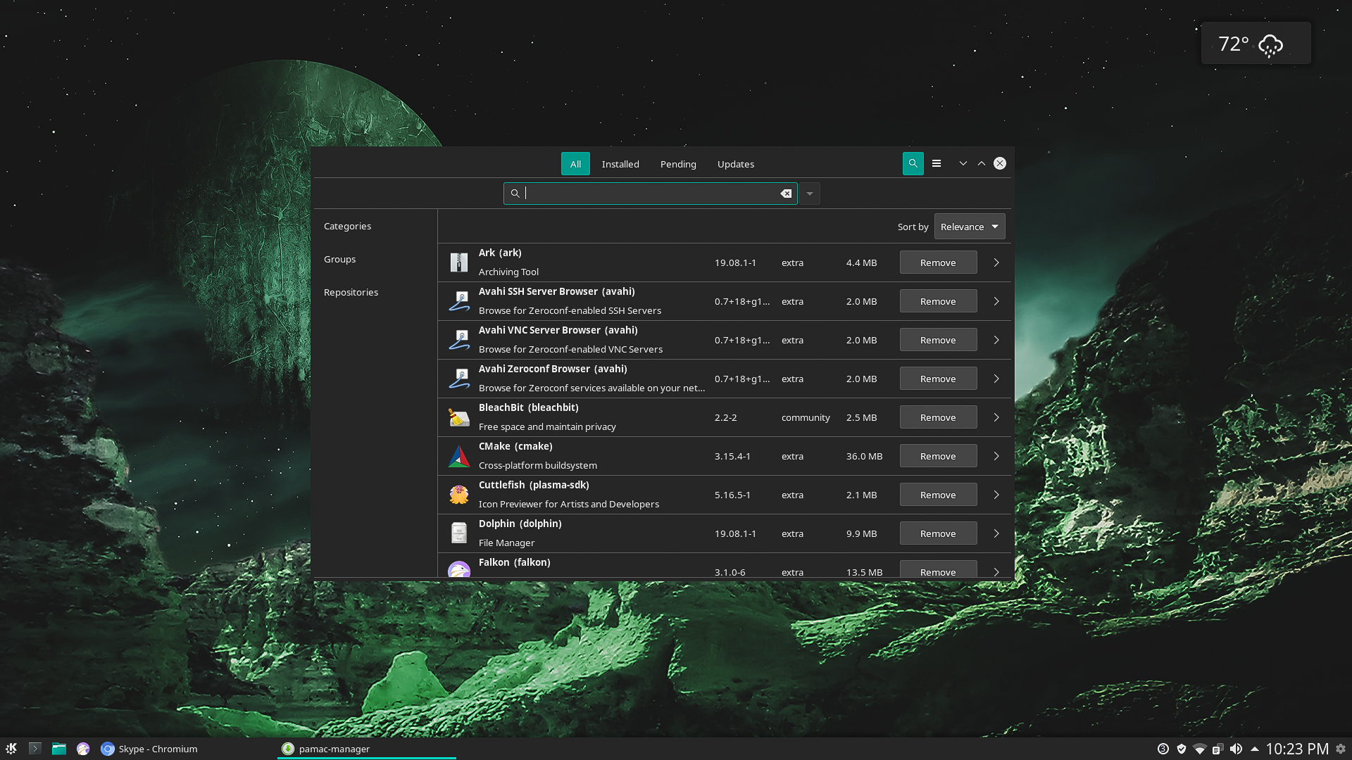
These themes are built for gtk in a QT environment and those GTK themes are different than normal GTK themes. I have asked numerous for them to add a 2 new categories for KDE GTK and and also they work in Lubuntu GTK. GTK's built for QT desktop are quite different than normal gtk's.
This theme has been updated and please rate the other themes. Not to be ungrateful but it does us theme makers no favors at all just saying you like them if you don't rate them. We need those ratings and we do appreciate you saying you like the theme but it is so simple to rate a theme.
I like them both a lot, thank you! I don't know how I missed those in looking around! Do you know of any icon themes that match that breeze blue color well?
Please rate if you like because it is the only way to show your gratitude unless you go to the github and and there you will see other ways to show thanks but just a big number 10 on the ratings is enough for me.


Ratings & Comments
48 Comments
9 9 excellent
10 10 the best
Thanks
10 10 the best
Thanks a lot.
Wifi & Notification icons doesn't change with this theme, Is there any solution to this?
Well what icons are you using ????
way too dark my friend
For you.
Guess that is why it is top 5 KDE theme and the one that is lighter is like number 12. That is only your opinion. The normal Materia Manjaro is the lighter one so there you go.
It has been observed that you go around to the dark themes and put some nasty comment on perfectly fine accessibility and dark mode themes. Your mental illness in not our problem. You are now being carefully watched, Mario Rouillardeau.
Thank you.
9 ຂ້າພະເຈົ້າຫວັງວ່າທ່ານຈະໄດ້ພັດທະນາ ໝັດ ກັບລົດຊາດຂອງຄາບອາຫານນີ້. ຖ້າເປັນແບບຟອມບາງຢ່າງເຂົາເຈົ້າມາຮອດສະຖານທີ່ຂອງພວກເຂົາ. ຢ່າອອກໄປຫາພວກມັນຖ້າ rar ບໍ່ແມ່ນຂໍ້ບົກພ່ອງ! sorry try english I hope you have developed a taste for this meal. If in some form they arrive at their place. Don't go out for them if rar isn't a bug!
Thanks for rating.
9 Great work, thanks a lot for sharing it with us. Anyway I don't use it yet on my Ubuntu 19.04 because of incompatibility with my very favorite file manager (Double Commander aka. doublecmd-gtk, installed through apt, not by snap or appimage). I don't understand what makes a dark theme work with this application or not but I see that Starlabs and Adwaita-dark are theming it perfectly. I don't know the difference with a theme like yours nor which files should be included or modified, sorry to be of no help. Do you think that this issue with Double Commander could be fixed? I would be glad to use this theme as I really like it. Here's a concrete example: Materia Manjaro Dark > https://i.imgur.com/lQ9cUG3.png StarLabs Dark > https://i.imgur.com/FGDgJHI.png I've posted a message on application's forum to get more informations about the files to customize but nobody answered for now > https://doublecmd.sourceforge.io/forum/viewtopic.php?t=5769
These themes are built for gtk in a QT environment and those GTK themes are different than normal GTK themes. I have asked numerous for them to add a 2 new categories for KDE GTK and and also they work in Lubuntu GTK. GTK's built for QT desktop are quite different than normal gtk's.
10 10 the best
Thanks.
Would there be a way to modify the theme color to something other than the manjaro green?
This theme has been updated and please rate the other themes. Not to be ungrateful but it does us theme makers no favors at all just saying you like them if you don't rate them. We need those ratings and we do appreciate you saying you like the theme but it is so simple to rate a theme.
8 8 great
Thank you and I already have. Materia breeze
I like them both a lot, thank you! I don't know how I missed those in looking around! Do you know of any icon themes that match that breeze blue color well?
Please rate if you like because it is the only way to show your gratitude unless you go to the github and and there you will see other ways to show thanks but just a big number 10 on the ratings is enough for me.
I have some icons some the Breeze blue is mainly matched with breeze icons.