Thank you very much for your hard work, A few comments on this version, if I may. It is all a matter of taste actually.
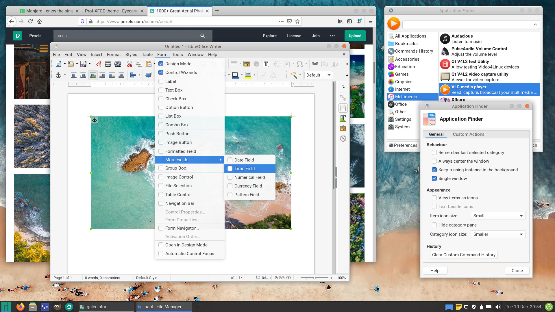
I prefer the larger titlebar and preferably change its MAC-OS gray for another matching color for a change. The bottom bar is unnecessarily too large and a smaller one could make room for more content in the main windows (nemo)
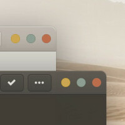
The top rounded corners are pretty rough and the saw-tooth pattern clearly visible. I am not a fan of dark panel since it also render invisible the tray icons from my theme. As a matter of preference, I think I will stick with your previous version for now.
TX
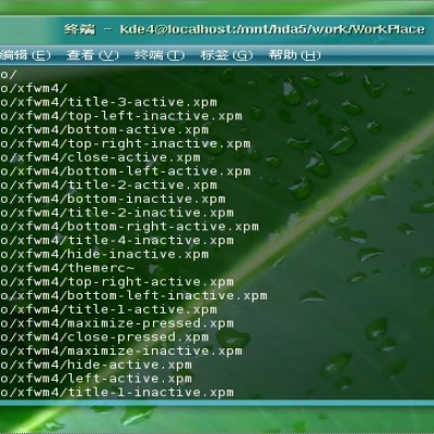
In XFWM4-theme the rough-pattern is identical in the previous (larger) window-theme. It is a longstanding issue with a (very) outdated XFWM4-window-manager, as it uses graphical (xpm's) elements to draw the window. Gnome or Vala are far better windowmanagers in this regard. Also, to provide enough thickness in the window-frame, the roundness is more pronounced. The window-frame needs to be tick enough so there is room for the resize-button-area.
So these are all compromises one must take to make a usable window-frame...
The dark panel does have a problem: there are not many decent icon-themes that work on dark panels. Which is not really my fault...
I will upload a version with the old (white) panel shortly. The larger titlebar is something you can choose yourself in the window-manager.
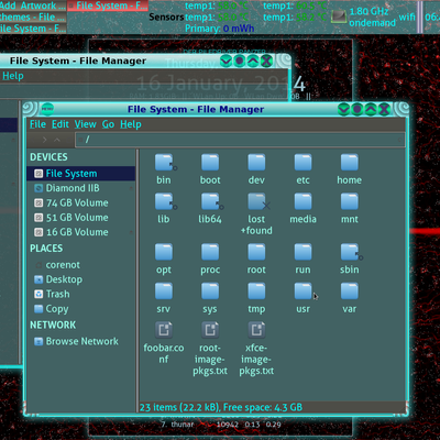
Nemo has no been on my list, really, because it is not a standard app in the XFCE-desktop. There is no code provided for nemo.
The sawtooth corners seems to be recurrent on almost all themes. I notice the larger the top band, the more it is apparent.
I note that you upload the white panel already. Thanks
For the icons, I found the Korla set to match your theme very well. It is even better because it include 3 sets for dark or light panels.
As for Nemo, your themes works perfectly as is. So no special treatment needed.
Tx
Wow ! Perfect ! On nemo, the smaller buttons, the dark highlight on the selected top buttons, new top band matching color, the smaller bottom band. Plus light and dark themes. There is nothing else to had. It's a work of love.I update three machines now. I use Zorin xfce on a very old mini laptop and your theme works much better then their default "all white" theme.
Thank you very much.
P.S Great idea to produce different themes names-versions which works independently. We can use all the versions to compare and chose any.
Yes you kept your word. Port to xfce, excellent. Thanks
I was looking at your others themes and a lot are for gnome only. They look very professional. It will be awesome if some of those could be port to XFCE, like Arongin, Telinkrin and my preferred one, Orangini. I notice that you have a preference for grey but it will be fun to explore others colours. It is really an art to pick a pleasing matching colours set. Btw, I don't like either all those dark themes which are moving to full black. Who use that ?
The thing is: you can not achieve the same level of theming with XFCE. Nautilus is allot easier to change than Thunar. XFCE-applications are more difficult to modify in CSS than Gnome-applications.
Things are changing however, as XFCE moved to GTK3. But most distributions stick to old fashioned applications. Still using GTK2 or QT, it is horrendously difficult to unify the look.
Themingwise my focus (lately) is to mimimize the graphics: this theme's GTK3- buttons, for example, are almost entirely written in CSS. Buttons, titlebuttons, sliders switches,... are pure CSS. This is meant to increase the snappiness of the theme. Next, this theme also uses REM (instead of pixels) at key-places , so it is better at changing, when you choose to increase the scaling.
Colourful themes ? Perhaps. I do prefer an easy-to-eyes-colorpallet.
Ok Paul, your call. I understand that it is not an easy task.
I think the most popular distros which have an Xfce DE have move to GTK3. (Manjaro, Mint, Ubuntu ?). I use Manjaro Xfce with Nemo (Thunar is pretty doll). I note the colourful themes that you create on pling. I am pretty bored with all those grey MAC alike themes. That's why I was asking for different colours. Not to critic the others developers by so far, there is a lot of uninspiring themes.
Thanks !


Ratings & Comments
28 Comments
Remove Rating
10 One of my favourite theme, great work!
Is there a dark theme for this? I'm really looking forward to it
10 10 the best
10 10 the best Another winner from paulxfce.
10 At last decided to change the look of my XFCE4 -- this theme goes best for me. Thanks!
Alt-Tab doesn't highlight the selected running application in Xfce 4.14 (gtk2 2.24.32-2, gtk3 1:3.24.16-1, Arch Linux)
10 10 the best
10 10 the best theme around, hand down.
thanks
Thank you very much for your hard work, A few comments on this version, if I may. It is all a matter of taste actually. I prefer the larger titlebar and preferably change its MAC-OS gray for another matching color for a change. The bottom bar is unnecessarily too large and a smaller one could make room for more content in the main windows (nemo) The top rounded corners are pretty rough and the saw-tooth pattern clearly visible. I am not a fan of dark panel since it also render invisible the tray icons from my theme. As a matter of preference, I think I will stick with your previous version for now. TX
In XFWM4-theme the rough-pattern is identical in the previous (larger) window-theme. It is a longstanding issue with a (very) outdated XFWM4-window-manager, as it uses graphical (xpm's) elements to draw the window. Gnome or Vala are far better windowmanagers in this regard. Also, to provide enough thickness in the window-frame, the roundness is more pronounced. The window-frame needs to be tick enough so there is room for the resize-button-area. So these are all compromises one must take to make a usable window-frame... The dark panel does have a problem: there are not many decent icon-themes that work on dark panels. Which is not really my fault... I will upload a version with the old (white) panel shortly. The larger titlebar is something you can choose yourself in the window-manager. Nemo has no been on my list, really, because it is not a standard app in the XFCE-desktop. There is no code provided for nemo.
The sawtooth corners seems to be recurrent on almost all themes. I notice the larger the top band, the more it is apparent. I note that you upload the white panel already. Thanks For the icons, I found the Korla set to match your theme very well. It is even better because it include 3 sets for dark or light panels. As for Nemo, your themes works perfectly as is. So no special treatment needed. Tx
Version 2.1 adds support for NEMO.
Wow ! Perfect ! On nemo, the smaller buttons, the dark highlight on the selected top buttons, new top band matching color, the smaller bottom band. Plus light and dark themes. There is nothing else to had. It's a work of love.I update three machines now. I use Zorin xfce on a very old mini laptop and your theme works much better then their default "all white" theme. Thank you very much. P.S Great idea to produce different themes names-versions which works independently. We can use all the versions to compare and chose any.
You're welcome..
10 10 the best
10 10 the best
Thanks
10 10 the best
thanks
Yes you kept your word. Port to xfce, excellent. Thanks I was looking at your others themes and a lot are for gnome only. They look very professional. It will be awesome if some of those could be port to XFCE, like Arongin, Telinkrin and my preferred one, Orangini. I notice that you have a preference for grey but it will be fun to explore others colours. It is really an art to pick a pleasing matching colours set. Btw, I don't like either all those dark themes which are moving to full black. Who use that ?
The thing is: you can not achieve the same level of theming with XFCE. Nautilus is allot easier to change than Thunar. XFCE-applications are more difficult to modify in CSS than Gnome-applications. Things are changing however, as XFCE moved to GTK3. But most distributions stick to old fashioned applications. Still using GTK2 or QT, it is horrendously difficult to unify the look. Themingwise my focus (lately) is to mimimize the graphics: this theme's GTK3- buttons, for example, are almost entirely written in CSS. Buttons, titlebuttons, sliders switches,... are pure CSS. This is meant to increase the snappiness of the theme. Next, this theme also uses REM (instead of pixels) at key-places , so it is better at changing, when you choose to increase the scaling. Colourful themes ? Perhaps. I do prefer an easy-to-eyes-colorpallet.
Ok Paul, your call. I understand that it is not an easy task. I think the most popular distros which have an Xfce DE have move to GTK3. (Manjaro, Mint, Ubuntu ?). I use Manjaro Xfce with Nemo (Thunar is pretty doll). I note the colourful themes that you create on pling. I am pretty bored with all those grey MAC alike themes. That's why I was asking for different colours. Not to critic the others developers by so far, there is a lot of uninspiring themes. Thanks !
10 10 the best