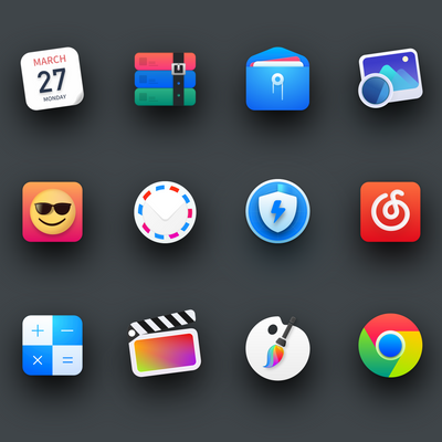
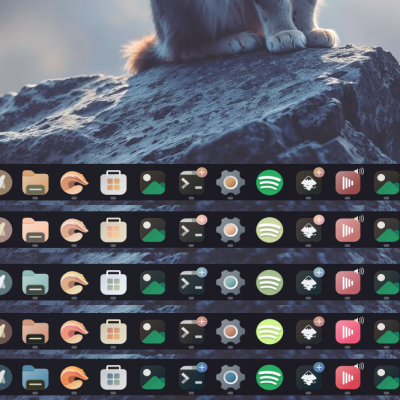
Description: icons extracted from the beta of Uos, deepin os v20,
This set is set for use in any distribution and DE that you wish to use, I can also install it in the current version of deepin. In addition to the original icons I have added some totally new and exclusively for this version.
the merit is for deepinos designersLast changelog:
6A few issues I've found:
#1 I don't agree with SimpleScreenRecorder icon, it looks like a camera. Not the best one to associate with a screen recorder application with IMHO; The Thunderbird icon is...I dunno. It just didn't need that.
#2 The folder icons are nice. Too bad no more folder color options are given;
#3 This is the one that probably is going to lead to uninstalling this theme on my computer: the cog icon. So, whenever I create a launcher for an application I compiled and installed myself - for example, scrcpy - for that launcher, I also attached an icon to help identify the app. And then I drag it onto the plank taskbar, it turns into this cog icon. Problem is, other themes don't do that and leave it as is (like Marwaita, which I was using before trying Uos), so why's this different with Uos?
#4 The 100%-charged-battery system notification icon: Dude, what the hell is that? I know you tried to make it look like a small battery icon with a plug on the inside to indicate it's plugged to the wall, but I'd much rather the lightning icon, which does a much better job.
#5 I like that this icon theme actually brings vibrant colors to the Linux Mint Menu; What I don't appreciate as much is the systray icons, but that's just me. If there ever is a 'dark' variant of this theme, please consider making them all white instead of colorful (again, this goes for system notification icons only).
That was my opinion on this theme.
I appreciate your hard work. Keep it up!


Ratings & Comments
53 Comments
10 Wow! Beautiful icons! :)
10 the themes has icons for most of the frequent apps i used except for freecad
9 manteb ini icons... berjalan dengan baik
10 5 max max max
10 Very nice icon theme :)
5 5 average
7 7 good
9 Excellent
thank you
10 10 the best
Thanks
10 10 the best
Thanks
9 9 excellent
Thanks
9 9 excellent
Thanks bro
why inkscape, freecad, gimp, godot icons didn't change !!?
10 The icons and cursor are awesome, keep creating!!!
10 10 the best
7 7/10 - Many icons has wrong names
10 Nice icon design!
10 10 the best
6 A few issues I've found: #1 I don't agree with SimpleScreenRecorder icon, it looks like a camera. Not the best one to associate with a screen recorder application with IMHO; The Thunderbird icon is...I dunno. It just didn't need that. #2 The folder icons are nice. Too bad no more folder color options are given; #3 This is the one that probably is going to lead to uninstalling this theme on my computer: the cog icon. So, whenever I create a launcher for an application I compiled and installed myself - for example, scrcpy - for that launcher, I also attached an icon to help identify the app. And then I drag it onto the plank taskbar, it turns into this cog icon. Problem is, other themes don't do that and leave it as is (like Marwaita, which I was using before trying Uos), so why's this different with Uos? #4 The 100%-charged-battery system notification icon: Dude, what the hell is that? I know you tried to make it look like a small battery icon with a plug on the inside to indicate it's plugged to the wall, but I'd much rather the lightning icon, which does a much better job. #5 I like that this icon theme actually brings vibrant colors to the Linux Mint Menu; What I don't appreciate as much is the systray icons, but that's just me. If there ever is a 'dark' variant of this theme, please consider making them all white instead of colorful (again, this goes for system notification icons only). That was my opinion on this theme. I appreciate your hard work. Keep it up!
10 10 the best