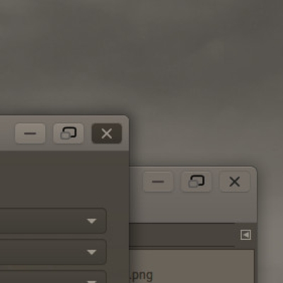
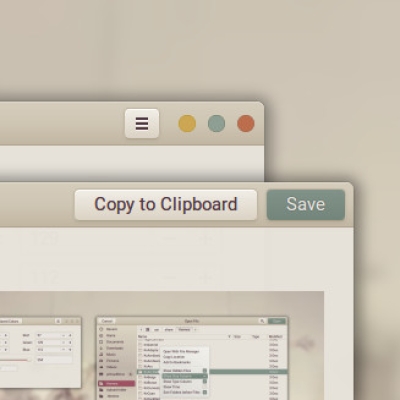
This is a fully functional and thoroughly made theme, more in line with the actual Mac-os-UI. This is a BETA-release because it has one particular difference: the font-rendering. The font is made thicker.
This is done by adding shadow to the text-colors.
The purpose is to make it look more like the font used in Mac-os.
IMPORTANT:
It is important to choose a good font-type. Roboto Regular (11pt) is the best. You can get it (just google it) for free.
This theme is developed for the gnome DE. It works on GTK3.22 to GTK3.29, and GTK3.32/34/36, NOT GTK 3.30. There is no dark theme or gnome-shell-theme for now.
How to install:
Download the theme,
Just copy the extracted file to a '.themes'-folder you make in your home directory. Then use Tweak Tool and select the theme. LOG OUT AND BACK IN for changes to take full effect !
Comments
Please comment if you like the idea of the font-rendering, or any other issue you might find.Last changelog:
Oh WOW!!! I remember suggesting something like this a while back.. Any chance you'll port to Mint-Cinnamon, as you have your with your main series???? (It doesn't seem to fully work on Mint 19 Cinnamon but I'm sure you'd already know that)
99 excellent
I appreciate the font readability improvement - even if I'm ignoring a more memory consumption eventually (?)... I understand that the overall direction is to remove the user's distraction by making less saturated or even black and grey items into the theme UI; but I cannot stand with removing color from the text input selected item, sorry... please keep at least the user's item selected color. Thanks and good luck :)
The text-shadow gives a slightly unsharp look for me. In any case, the typographic appeal of Mac OS is its tasteful variation in weights. Normal/400 weights allow tighter line spacing, another hallmark of Mac OS typographic design that so many themes ignore.
Thanks for your opinion. I tend to agree, but it depends on the font, and the fontsize, the DPI-scale that you can set with the tweak-tool. There is allot you can do, to set it to your liking.
I only made an account to comment on your thicker font rendering. It blew my mind and made my desktop look so much better and satisfying. Thicker font rendering is the secret ingredient that most MAC-OS like themes fail to deliver. Thank you for it. I hope you include the "thicker font-rendering" variant toyour MacOS-Ctlina and Prof-Gnome themes. If you don't plan on including those font variants. Can you at least show me what edits to make in the css file to enable those in the mentioned themes?
Thank you for replying. There are some issues (like f.e the Ubuntu-font (it is already a thick font, thus renders too much thickness that it becomes unreadable), and some applications (like transmission (when hovering over a selected download) have issues.
The effect is a using a text-shadow in all things that uses text in the UI. Just open the CSS-file and you will see numerous occasions where text-shadow is applied. So It is not something easy to change.
The purpose of offering this preliminary theme is to see how people react to the thicker font. If the general feeling is positive, I will continue..


Ratings & Comments
21 Comments
10 10 the best
Oh WOW!!! I remember suggesting something like this a while back.. Any chance you'll port to Mint-Cinnamon, as you have your with your main series???? (It doesn't seem to fully work on Mint 19 Cinnamon but I'm sure you'd already know that)
9 9 excellent I appreciate the font readability improvement - even if I'm ignoring a more memory consumption eventually (?)... I understand that the overall direction is to remove the user's distraction by making less saturated or even black and grey items into the theme UI; but I cannot stand with removing color from the text input selected item, sorry... please keep at least the user's item selected color. Thanks and good luck :)
9 9 excellent I like yours themes, realy. I prefer another color than gray. How to change ?
The text-shadow gives a slightly unsharp look for me. In any case, the typographic appeal of Mac OS is its tasteful variation in weights. Normal/400 weights allow tighter line spacing, another hallmark of Mac OS typographic design that so many themes ignore.
Thanks for your opinion. I tend to agree, but it depends on the font, and the fontsize, the DPI-scale that you can set with the tweak-tool. There is allot you can do, to set it to your liking.
9 9 excellent
9 9 excellent
Very nice. Are you going to port it it xfce ?
10 10 the best
10 10 the best
I only made an account to comment on your thicker font rendering. It blew my mind and made my desktop look so much better and satisfying. Thicker font rendering is the secret ingredient that most MAC-OS like themes fail to deliver. Thank you for it. I hope you include the "thicker font-rendering" variant toyour MacOS-Ctlina and Prof-Gnome themes. If you don't plan on including those font variants. Can you at least show me what edits to make in the css file to enable those in the mentioned themes?
Thank you for replying. There are some issues (like f.e the Ubuntu-font (it is already a thick font, thus renders too much thickness that it becomes unreadable), and some applications (like transmission (when hovering over a selected download) have issues. The effect is a using a text-shadow in all things that uses text in the UI. Just open the CSS-file and you will see numerous occasions where text-shadow is applied. So It is not something easy to change. The purpose of offering this preliminary theme is to see how people react to the thicker font. If the general feeling is positive, I will continue..
Please comment on the use of the thicker font-rendering...
9 9 excellent Waiting impatiently for dark variant. :)
And of course focus outline.
9 9 excellent
9 9 excellent
very nice i love it
nice theme as usual - love the Graphite buttons and hoping to see a dark version - Please continue the goodness
Please comment on what you think I should continue: the thicker font, or the normal one.