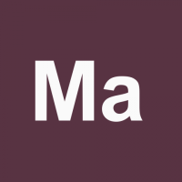
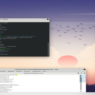
Description: With this color schemes I tried to maximize readability of text and desktop widgets. For this reason, the title bars have a distinctive color that doesn't blend with the window color and the focused window have always a colored titlebar. Same with the buttons, that have a different color than the window.
I choose the accent colors from this article: https://oscarliang.com/eye-pleasing-colors/ I also wanted to redeem that too much hated title separator line, making it a a distinctive feature.
There are three versions of every color accent: Normal - De saturated titebar color and grayish windows Strong - Accent titlebar color and grayish windows Stronger - Accent titlebar and de saturated accent color windows
For best result, enable the title separator, disable the gradient and set a "Normal" border size in your breeze window decoration.Last changelog:
Missing color scheme
I missed a color scheme in my previous upload. Re uploaded it to fix it.


Ratings & Comments
7 Comments
9 Magic Powder is very pleasing on the eyes!
8 Finally, pleasant colors and a very clear typeface. Thank you very much!
Thanks! If you are interested, I made an updated version (but with few color options) for the new breeze style of Plasma >= 5.21.
10 I loved the large amount of versions available!!! thank you so much. their color themes are amazing!
Thank you very much! :-)
8 8 great
Thank you!