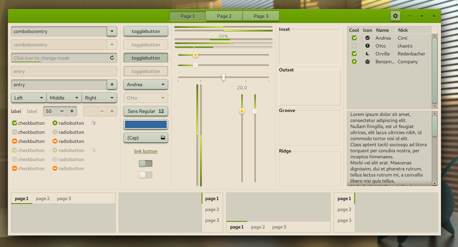
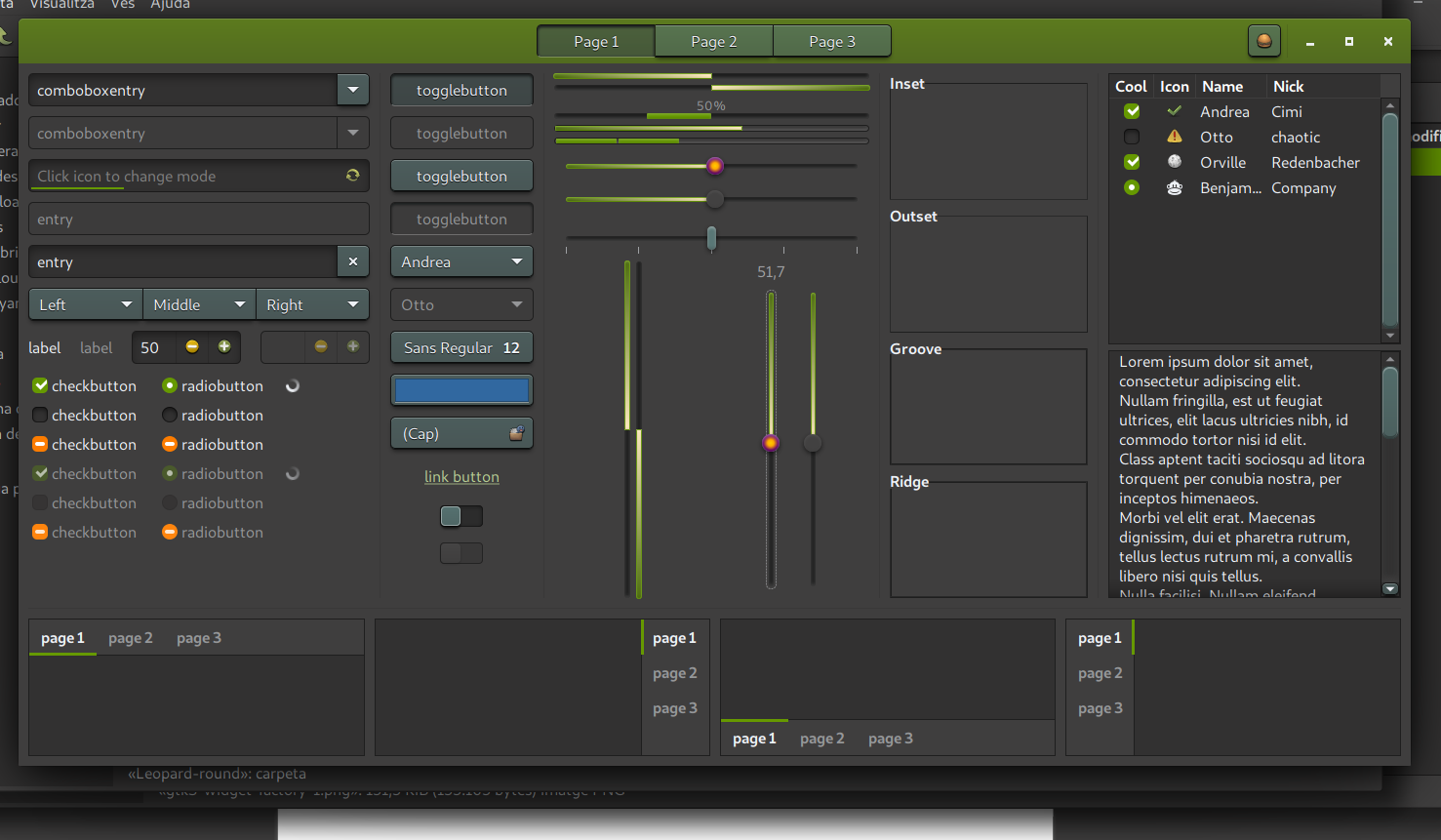
Description: This is another skeuomorphic theme. It's light, warm with green accents. It's easy on the eyes. This GTK theme is based on the wonderful pho series by GUILMOUR, such as Pho-Myrtus here: https://www.pling.com/s/Gnome/p/1240355/ This theme comes with a dark variant also. I have also published the dark theme as a standalone dark theme https://www.pling.com/p/1459383 I hope you enjoy non-flat themes as I do. I'm pretty sure they'll come back at some point!
This theme includes GTK3, GTK2 and XFMW (xfce window decoration). I have also prepared a KDE plasma color theme and QtCurve configuration for good desktop matching, but I still haven't published them properly, so I've included them in a folder called kde (the color theme is based on OpenSuse's default). You should import them from KDE's respective places It also includes Metacity, Cinnamon and Gnome Shell but they probably need work, I haven't reviewed them.
9I really like this theme. There is one tiny detail that I would like to change but I am no expert at these things. I am talking about the green-ish color of the fonts of the desktop icons on xfce (4.14). I figured it is some property in the gtk-contained.css file but I am unable to find which one (after some trial and error). Would you be so kind to point it out? Thanks!
Ah, well, if I see correctly what you mean: they're not exactly blurry, they are grooved. "It's not a bug, it's a feature" ;) Of course, maybe you don't like it, it's fine. I'll leave it like that, because I think this groove effect adds to the intentional 3D aspect of this theme.


Ratings & Comments
15 Comments
10 Accurate and comfortable for eyes.
10 10 the best
7 7/10, I would go 10/10 if the titlebars were not too large!
9 I like the style. Great work.
8 8 great
10 10, I really like it, how do I contact you?
Hi, you can send me an email at eudaimon ( at ) disroot.org
10 10 the best
10 10 the best
9 I really like this theme. There is one tiny detail that I would like to change but I am no expert at these things. I am talking about the green-ish color of the fonts of the desktop icons on xfce (4.14). I figured it is some property in the gtk-contained.css file but I am unable to find which one (after some trial and error). Would you be so kind to point it out? Thanks!
Iep, certainly, and I don't know where it is. When I have time, I'll try to find it.
9 9 excellent
9 great theme, easy on the eyes, but in xfce (4.16) i got blurry fonts on the buttons https://i.postimg.cc/HnXQD91W/Screenshot-2021-01-05-15-02-44.png
Ah, well, if I see correctly what you mean: they're not exactly blurry, they are grooved. "It's not a bug, it's a feature" ;) Of course, maybe you don't like it, it's fine. I'll leave it like that, because I think this groove effect adds to the intentional 3D aspect of this theme.
10 10 the best