


Please visit this product's page for final installation instructions: https://www.pling.com/p/1473003/
This theme requires Kvantum. If you are using Ubuntu, Kvantum can be installed with the following commands:
sudo add-apt-repository ppa:papirus/papirus
sudo apt update
sudo apt install qt5-style-kvantum qt5-style-kvantum-themes
Then switch to Spectrum Malice in the Kvantum Manager application.
Here is the link for the Kvantum Theme
Installs:
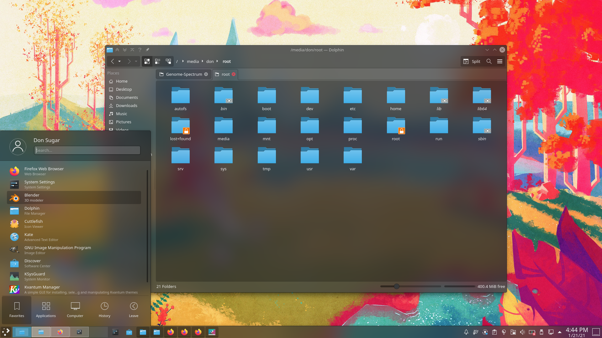
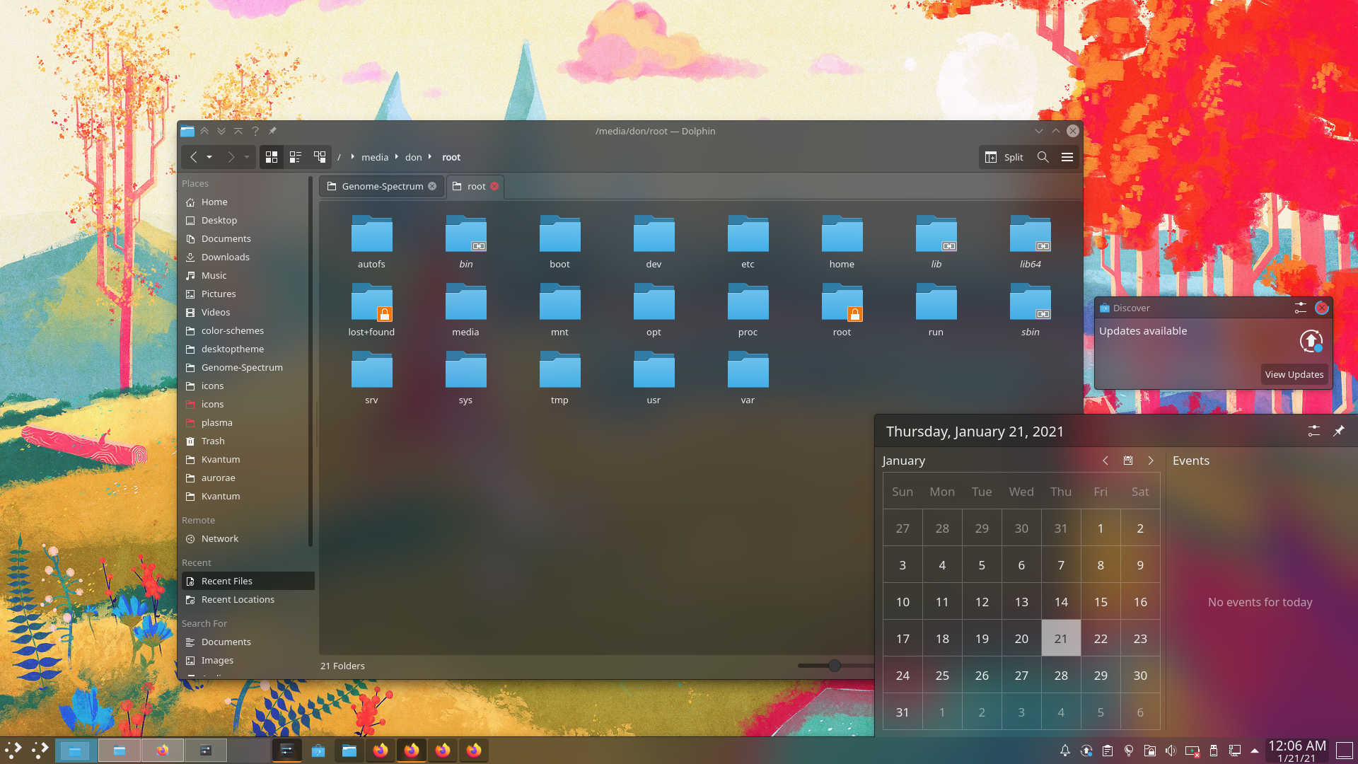
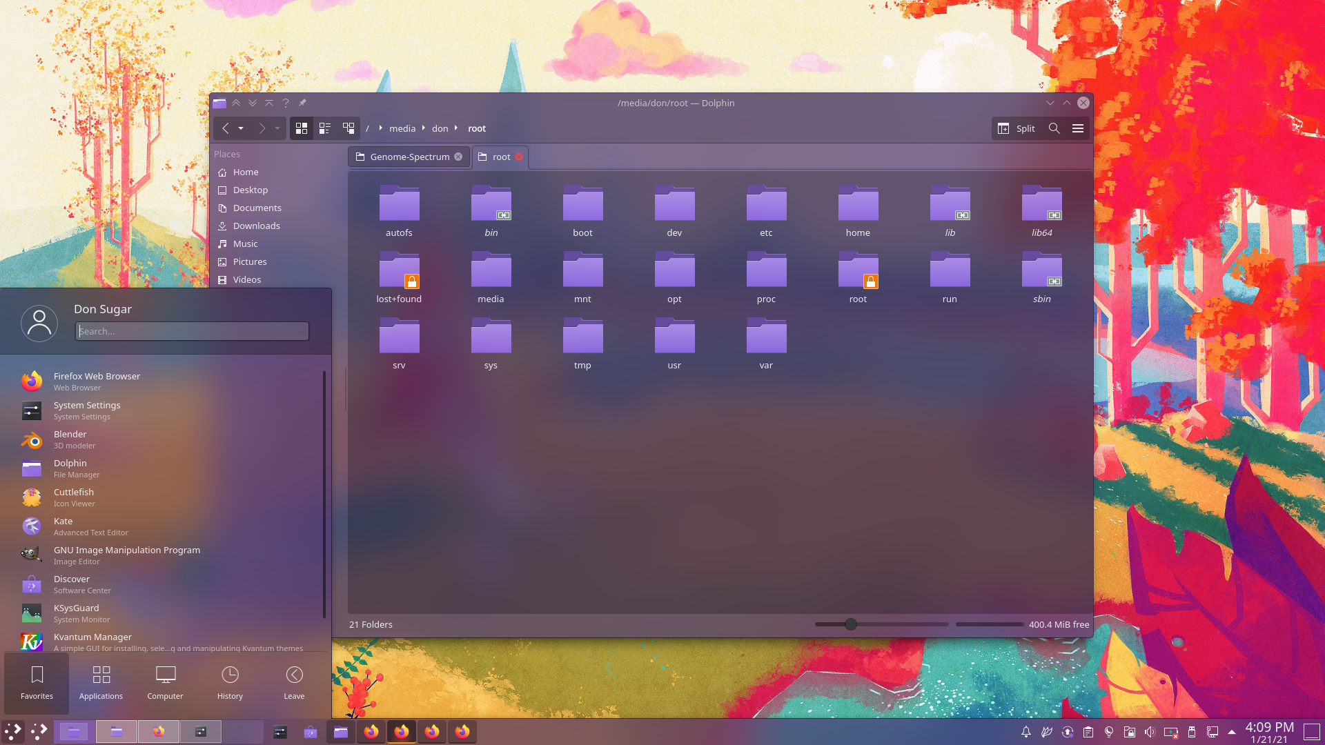
Malice and Spite Aurorae Theme
Genome Dark Color Scheme
Malice Plasma Theme
Spectrum Dark Icons
Manual installation needed:
Kvantum Theme Manager
Malice and Spite Kvantum Themes
Configuration and Recommendations:
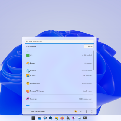
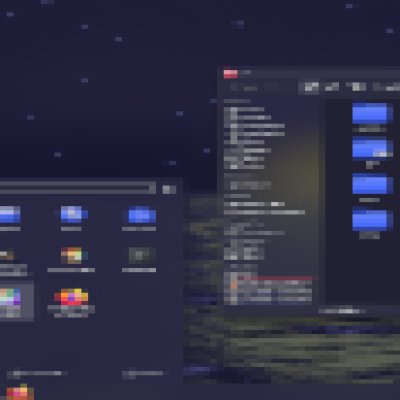
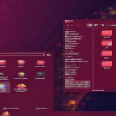
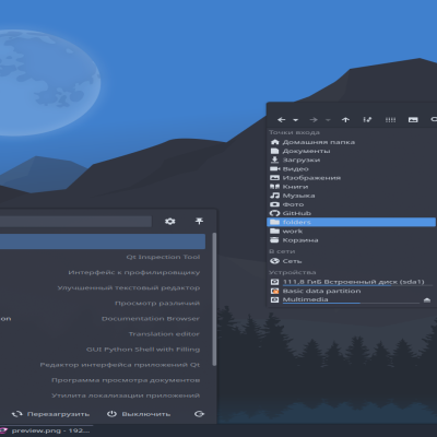
Light and vibrant wallpapers are recommended for this theme.
Under Appearance: Application Style > Window Decorations
"No Side Borders" is the recommended window border size for this theme.
Workspace Behavior > Desktop Effects > Blur
Reducing blur strength can give the illusion of increased transparency. Decreasing the blur effect can also make rounded window corners of Aurorae themes look better since when is no mask for the corners. Noise can also be controlled here. The screenshot shows a very low noise setting.
In the Kvantum Manager application: Configure Active Theme > Compositing & General look
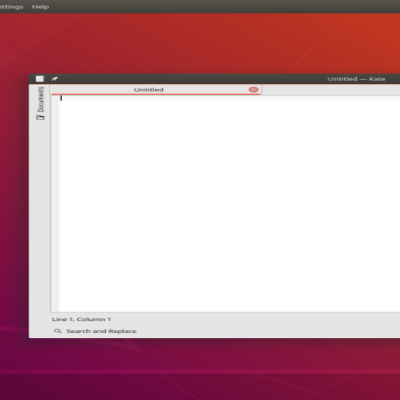
Opacity of windows and menus can be adjusted through Kvantum. However, the Aurorae theme must be adjusted manually. The default opacity of the theme is 75%. A quick method to change the Aurorae transparency to match can be done by opening "decoration.svg" (~/.local/share/aurorae/themes/SpectrumMalice/) with Kate and using the "Search and Replace" function. Put "opacity:0.75" in the Find box and in the Replace box, place "opacity:0.75", replacing "0.75" with your desired percent (e.g. 75% = 0.75, 15% = 0.15). Be warned: updating Aurorae themes may require many reloads.
Troubleshooting:
Have you tried turning it off and on again? Sometimes plasma assets will not update and some may still be themed according to something you previously had set. This can usually be fixed by restarting the applications that used the asset (e.g. Dolphin).
Logging out and logging back in can usually update all applications with the theme.
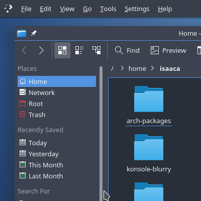
However, as with all completely translucent themes, numerous contrast issues can be found and many applications may appear broken, as not everything can be properly styled by Kvantum.


Ratings & Comments
7 Comments
9 9 excellent
Thanks!
C'mon, it isn't that bad. Needs a little more polishing, but definitely not BAD. If nothing else, some elements can be salvaged for other themes.
In my opinion, Malice and Spite are bad because there is virtually no contrast and because the way the tabs came out is not my favorite. Other than that, I think the theme is fine. What do you recommend I change?
Since it interferes with Kirigami apps anyway, I would make the window content area much more opaque, with rounded corners, whilst keeping the transparency on the sidebars, statusbars, tool area and titlebar. I also think that the toolbar buttons and the selected items in lists and sidebars would look better if they were more opaque. This would increase contrast where it matters. I would decrease the contrast between the header area and body of Plasma applets and notifications, round off the corners of the Workspace Switcher applet, and change the tabs to a more traditional look, maybe by removing the extra frame around inactive tabs, or making it less prominent. I have to do more testing to point out more possible improvements, but otherwise I think it is okay. Maybe to around with the shadows a bit?
Thank you. I will change the header area for Plasma applets. I think the one issue with this theme is that it tries to be color-compatible with Kvantum, which basically means everything is monochrome and minimally opaque so color from the window base can show. Charoite is shown in the 3rd screenshot. If I remember correctly, rounding corners on the switcher applet produces odd effects where corners are round but content is still only shown in the small rectangle in the center. I actually started out avoiding outlines, but ultimately decided I liked outlines better, haha. I will take this into consideration for my next theme.
C'mon, it isn't that bad. Needs a little more polishing, but definitely not BAD. If nothing else, some elements can be salvaged for other themes.