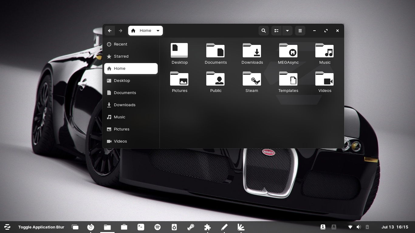
Description: Shade of Z - Desktop is a GTK/Gnome-shell theme for Zorin OS 16 but should work with all Gnome 3/4 DE
This is a fork of Zorin OS Desktop theme(s) and is modified by me. It adds opacity to the GTK theme and Gnome-shell menus. All credits goes to the Zorin OS team.
The icon theme you'll find here: https://www.pling.com/s/Gnome/p/1516492 To set up your Zorin OS 16 Desktop as shown in the video, please check: https://forum.zorin.com/t/how-to-setup-a-shade-of-z-desktop/5387Last changelog:
Version 1.4b
Minor changing --------------------- Decreased Zorin logo in size
8I fell in love with this theme. I love Zorin, and I appreciate all the work done. But. I agree that both versions have very agressive glass/transparency. It would be better if a solid version be available, o a version with very limited glass/transparency (or semi-glass/semi-transparency would be the best, like only glass/transparency on left sideboards or applications title, pretty much like Windows or Mac style). The reason: Maybe it's still not completely compatible with Gnome 40, and the content cannot be distinguished (Is it because Zorin 16 is based on Gnome 3.38?) Some elements (the Extensions application, for example) handle the aidwata theme by default. And. It does not support blur ("Blyr" only avaiable at 3.36, "Blur My Shell" doesn't apply the effect and "Blur Me" tries to handle it but it's very glitchy). The white frame around the windows doesn't match much and it is not so aesthetic (or is it a visual glitch?). Maybe some parts would be better being much more solid (or very limited glass/transparency) rather than the whole window, just like I suggested, like a combination between sideboards with glass/transparency and the rest of the window pretty much solid or as solid as it could be. For the rest, I love and appreciate that the Zorin theme is available in Gnome-look and I support it, because it is one of the most beautiful themes there is around here. Any plans to import the rest of accents colors? Good job!
Thanks for your honesty. I don't think I can't make it more solid without it become completely solid, but then it would be the exact copy of Zorins theme and then it would be like "stealing" their work and smack it up on Gnome-look. I havn't got the chance to test it on other than Zorin (due to limit of time and I got some icon themes to maintain as well). The blur me extension is not my work so I rely on others work. or me it's more an experiment that it can be done ;)
Just curious, did you re-use/copy any resource from Zorin theme? If so, whether transparent or not. It is already stealing.
On the other hand, if you create your theme from scratch then this is a different issue. Some may say copyright infringement, some may feel flattered b/c your work help to spread their name. Either way, I think you can do whatever you want. The day you get sued, just take it down.
Or maybe is it possible to make a parameter in the gtk.css file so that the user can edit and replace transparency by solid. With that the burden of copyright or copycat fall on the user.
It's license under GPL, so I modified the source code and published it. The Zorin Team is well aware of that (as I'm on the staff of the community team). I'll look into how I can implementing a solid version.
Hi! Sorry if my comment was lengthy. I went into Zorin's Github and applied their dark-gray (solid) theme. Searching how to do a work-around, in the process I saw you on the forum in a post where you already thought to implement my suggestion ("How do I make the sidebar transparent?"). I really do not know anything about the topic (how to make themes nor icons), but if I can help with something, even asking in other forums, I will try to check if I find something and help you to implement it. I'm figuring it out because I would also like to do other personal (example, the same dark background with other accent colors, because the other dark-color Zorin themes don't match me). Again, good job, thank you!
very beautiful theme, one ive been looking for in age, i just wish the three {minimize, close, maximize} buttons at the top right corner were the type like mac os like almost every other themes
9.5 This is so sleek and beautiful! Love the attention to detail everywhere! Only note is that it would be so great to have a version with much more subtle transparency and also with darker greys. Thanks so much for the extension!
Thanks for the kind word. Lets see what the future brings ;)
At the moment I'm revamping my whole Shade of Z icon theme(s) which brings more transparency to the game. It's a tedious job running through 1000s of icons :)
9This is actually pretty nice. It just needs to be a little less transparent. The gnome 40 docks looks a little weird on the light shell. The dock itself is dark and its background is light. I love how you are the only person I know who actually changed the app folder background to white (to match the shell) on a light shell, thanks for that, it looks gorgeous with newaita icons.
One last thing, you should add the icons you are using in the screenshot for us to download, or at least mention their name so we can find them
Thanks for the kind words. The icon theme goes under same name: Shade of Z.
It have only been tested in Zorin OS 16 so far. But when I get my main computer fixed (broke down yesterday), I'm going to fire up VM for other DE's.
I can't set the variable for it higher unless you want it solid. As far as Iknow you can't blur in gtk.css...maybe if I use an image to draw the background,I'll try that but I can't promised if it will work.
No worries. Try and I'll test. I guess the gnome team will need to be a little more flexible like the plasma folks. It sucks that you can't even blur things and are limited when theming. I'd also take a look at the gnome dock on the light shell. It is too light for the dark background behind it. I'd dim it a little to not be too contrasty.


Ratings & Comments
41 Comments
the best theme ever, i always wanted a transparent theme. but one thing i noticed is that some apps aren't changing to dark mode , they remain white
10 So beautiful... Thank you so much! :)
8 I fell in love with this theme. I love Zorin, and I appreciate all the work done. But. I agree that both versions have very agressive glass/transparency. It would be better if a solid version be available, o a version with very limited glass/transparency (or semi-glass/semi-transparency would be the best, like only glass/transparency on left sideboards or applications title, pretty much like Windows or Mac style). The reason: Maybe it's still not completely compatible with Gnome 40, and the content cannot be distinguished (Is it because Zorin 16 is based on Gnome 3.38?) Some elements (the Extensions application, for example) handle the aidwata theme by default. And. It does not support blur ("Blyr" only avaiable at 3.36, "Blur My Shell" doesn't apply the effect and "Blur Me" tries to handle it but it's very glitchy). The white frame around the windows doesn't match much and it is not so aesthetic (or is it a visual glitch?). Maybe some parts would be better being much more solid (or very limited glass/transparency) rather than the whole window, just like I suggested, like a combination between sideboards with glass/transparency and the rest of the window pretty much solid or as solid as it could be. For the rest, I love and appreciate that the Zorin theme is available in Gnome-look and I support it, because it is one of the most beautiful themes there is around here. Any plans to import the rest of accents colors? Good job!
Thanks for your honesty. I don't think I can't make it more solid without it become completely solid, but then it would be the exact copy of Zorins theme and then it would be like "stealing" their work and smack it up on Gnome-look. I havn't got the chance to test it on other than Zorin (due to limit of time and I got some icon themes to maintain as well). The blur me extension is not my work so I rely on others work. or me it's more an experiment that it can be done ;)
Just curious, did you re-use/copy any resource from Zorin theme? If so, whether transparent or not. It is already stealing. On the other hand, if you create your theme from scratch then this is a different issue. Some may say copyright infringement, some may feel flattered b/c your work help to spread their name. Either way, I think you can do whatever you want. The day you get sued, just take it down. Or maybe is it possible to make a parameter in the gtk.css file so that the user can edit and replace transparency by solid. With that the burden of copyright or copycat fall on the user.
It's license under GPL, so I modified the source code and published it. The Zorin Team is well aware of that (as I'm on the staff of the community team). I'll look into how I can implementing a solid version.
Hi! Sorry if my comment was lengthy. I went into Zorin's Github and applied their dark-gray (solid) theme. Searching how to do a work-around, in the process I saw you on the forum in a post where you already thought to implement my suggestion ("How do I make the sidebar transparent?"). I really do not know anything about the topic (how to make themes nor icons), but if I can help with something, even asking in other forums, I will try to check if I find something and help you to implement it. I'm figuring it out because I would also like to do other personal (example, the same dark background with other accent colors, because the other dark-color Zorin themes don't match me). Again, good job, thank you!
very beautiful theme, one ive been looking for in age, i just wish the three {minimize, close, maximize} buttons at the top right corner were the type like mac os like almost every other themes
8 8 great
Thanks :)
10 Really Awesome theme. Love the icons.
Thank you very much :)
9.5 This is so sleek and beautiful! Love the attention to detail everywhere! Only note is that it would be so great to have a version with much more subtle transparency and also with darker greys. Thanks so much for the extension!
Thanks for the kind word. Lets see what the future brings ;) At the moment I'm revamping my whole Shade of Z icon theme(s) which brings more transparency to the game. It's a tedious job running through 1000s of icons :)
9 This is actually pretty nice. It just needs to be a little less transparent. The gnome 40 docks looks a little weird on the light shell. The dock itself is dark and its background is light. I love how you are the only person I know who actually changed the app folder background to white (to match the shell) on a light shell, thanks for that, it looks gorgeous with newaita icons. One last thing, you should add the icons you are using in the screenshot for us to download, or at least mention their name so we can find them
I meant the app folder overview background (the background of an open apps folder in the apps menu)
Thanks for the kind words. The icon theme goes under same name: Shade of Z. It have only been tested in Zorin OS 16 so far. But when I get my main computer fixed (broke down yesterday), I'm going to fire up VM for other DE's.
No problem and good luck. I am running Fedora with gnome 40. I'd working on improving it for Gnome. Let me know if you need testing.
yes OC just make it little trasparent in dark version and update. i will be waiting
Try the source now. I have made it a little bit less transparent.
Try the source now. I have made it a little bit less transparent.
Still too transparent. Could you try blur? Is it doable on gnome?
I can't set the variable for it higher unless you want it solid. As far as Iknow you can't blur in gtk.css...maybe if I use an image to draw the background,I'll try that but I can't promised if it will work.
No worries. Try and I'll test. I guess the gnome team will need to be a little more flexible like the plasma folks. It sucks that you can't even blur things and are limited when theming. I'd also take a look at the gnome dock on the light shell. It is too light for the dark background behind it. I'd dim it a little to not be too contrasty.
Actually i could make the white theme more transparent than the dark theme. It seems it's harder for the white color to be transparent.