
Vistar8
Source (link to git-repo or to original if based on someone elses unmodified work):
Available as/for:
Description:Based on the Vistar7 decoration.
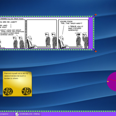
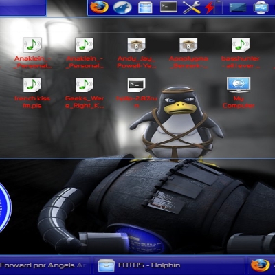
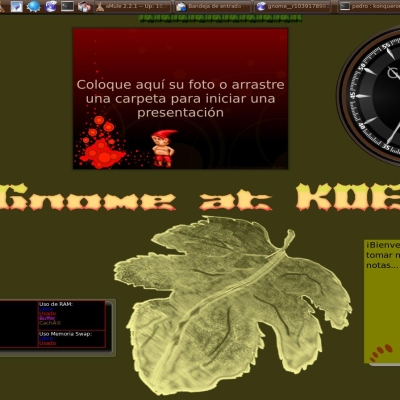
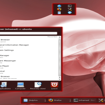
1.Clear separation of task buttons with an outline. Clear separation of pager desktops.
2. Clear difference between foreground, background, hovered and attention requesting task.
3. No difference between minimized and non-minimized tasks, don't artificially increase the number of combinations.
4.Clear difference between pager items, and clear colouring.
5. Big and clear button for the system tray.
6. Big minus: lost space between two task buttons and also between the taskbar and the system tray.
7. Did not touch anything else. I do not care about plasmoids too much, and my next target, if ever, would be to change the taskbar to real Qt buttons.
Low Inkscape skills and short time. For me, much more usable than anything I have tryed until now on KDE 4.
0.2
1.No longer difference between minimized and background tasks.
2. Solved problems with too much transparency on panel.
0.25
Improved colouring.











Ratings & Comments
4 Comments
I very like the concept, althought it really need some work, for example to soften edges of app entries in panel, but the idea of different colors is something I must appreciate. Please make newer version, with some improvements, tell me if there is something I can help u with.
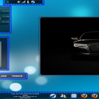
What does this theme looks like with desktop effects turned on, the screenshot isn't clear.
Hi, I'll upload a new version and new screenshot. Otherwise, it is just like the original, I only touched the panel. I only noticed later, the panel is very transparent, so a bright picture/window under the panel will make it harder to use. I'll upload an improvement.
Sorry I fogot. A big thank you to the original author of Vistar7 :).