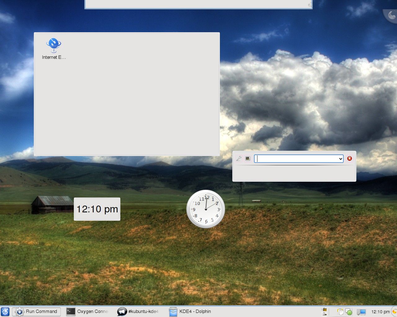
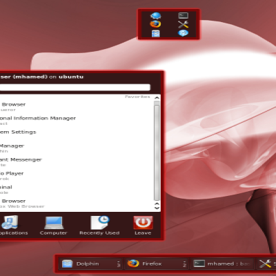
I worked especially hard to make the taskbar entries look good/Oxygenish, so be sure to check them out!

Oxygen Connections
Source (link to git-repo or to original if based on someone elses unmodified work):
Available as/for:
Description:I worked especially hard to make the taskbar entries look good/Oxygenish, so be sure to check them out!
0.5: Initial Release
-Widget background
-Dialog background
-Panel background
-Krunner background
-Full task manager background
-Systray background
0.6:
-Stole Aya's shutdown dialog
-Fixed the theme for non-composite systems
-Use the new naming convention in the .desktop file





Ratings & Comments
2 Comments
this is a very nice theme. I do miss the gradient in the background of Oxygen, though. It makes the applets still look a bit out of place. Als I'm not a big fan of the blue border above the panel - just use the same thing the plasmoids have, and as thin as possible to not waste space...
Thanks. :) Yeah, I'll try to improve the applet background in future releases... My main focus for this release was getting the panel stuff done. And about the blue border on the panel. I put that there because without it the panel blended in with full-sized windows a bit too well... I was thinking about making it a gradient instead of a straight line in future releases. If you have a better solution I'd be glad to listen. :) I also need to do something about the logout dialog, because I failed to foresee the issues setting the text to black would cause with it...